
Best Practices in Website Design for B2B

A web design project is a complex process with many different steps and phases. Many things can go wrong, meaning it’s essential for design teams to follow a series of web design best practices to maximize the chance of a project’s success.
As a B2B web design company with decades of combined experience, we have identified a few important practices you cannot overlook when doing website design for B2B companies. In today’s post, we will discuss three of them:
- Audience research
- Creating a detailed needs outline, and;
- The design elements.
While it may seem strange to talk about web design best practices by talking about two areas that are not traditionally linked to the field—audience research and requirements outlining—successful web design projects start from the ground up.
One of the most common mistakes designers make is skipping these steps to go straight to the design and build phases.
Audience Research
Without a strong understanding of your unique audience and their needs, any further work on your website becomes unfocused, diminishing its success.
All of us are consumers and have a general understanding of how research and shopping tend to work in the realm of personal goods and services. However, B2B markets differ significantly from B2C markets, and trying to use the same strategies is a big mistake.
Here are a few customer journey patterns we have identified in our work as B2B website designers:
- A B2B customer tends to be active during normal business hours: Monday—Friday, 9:00 am—5:00 pm. If you check your site traffic, you will likely notice spikes during these times. This is because B2B users tend to research products and services in the course of their jobs.
- Unlike B2C consumers, potential customers in the B2B space do not impulse buy. Instead, B2B buyers are likely to research and evaluate many options before choosing a company to partner with. These users are likely to be comparing costs, benefits, features, and even the responsiveness of customer service teams across candidate companies.
- Those doing the initial research are often not the final decision-makers. Many companies, for example, will task interns or junior employees with conducting research and putting together a series of options for comparison. Senior executives will then make the final purchasing decision.
Because of this, those doing the research are often relying on Google and might also be working on other tasks at the same time. This means that these users are highly motivated to get the specific information they need, as quickly as possible.
Outside of this general buyer journey, there will be other variables you need to consider depending on what type of companies you are targeting as prospective clients.
If you are marketing consultancy services to financial or technology companies, for example, informative and authoritative content that demonstrates your expertise will serve you well. Meanwhile, if you are targeting manufacturing clients, your certifications, range of services, and geographical location are likely to be important factors.
User research is time-consuming and resource-intensive. Still, you can start gaining insight into your customers straight away in several ways:
- Talk to your sales team: These customer-facing representatives are well-placed to understand the common pain points your prospective clients have. Understanding what questions clients are asking during the sales process gives you a valuable window into the type of information your website should be putting front and center.
- Ask for feedback: If you are currently using email marketing, ask those on your mailing list for a few minutes of their time to fill out a survey focusing on what they think of your website, what they would like to see from you in the future, or what their biggest challenges are.
- Talk to your customers: Reach out to your existing clients and ask to schedule a short call or meeting to take a “temperature check” with them. This can be an open-ended conversation, or you can structure it with a few key questions.
Humans are social creatures, and you might be surprised how much valuable information you can glean simply by asking the question and showing up ready to listen. If you find it difficult to schedule these meetings, sweeten the deal by offering a small incentive (gift cards to their preferred coffee shop or retailers like Amazon tend to go down well) in exchange for their time. This small expense can buy you incredibly valuable insights.
While we are discussing audience research in the context of web design best practices, this information can also inform all the other aspects of your business. Robust audience data can lead to better B2B marketing messages, more insightful questions from your representatives during the sales process, and even innovative ideas for new products or services.
Create a Detailed Outline of Your Needs
Once you have a strong understanding of your audience’s needs, you can start considering the most important elements that will make up your website. There are a few key areas you need to be aware of at this stage.
First, outline the most essential tech functions your website will need. For example, do you have an existing enterprise resource planning (ERP) or customer relationship management (CRM) system that the website will need to link into? Do you need a solid search system so users can find what they need amidst a vast product catalog?
Will there be landing pages linked to particular marketing campaigns, helping you track the performance of your advertising efforts?
Next, outline the key insights gleaned from your user research efforts. This should cover:
- which business industries do you target
- what types of users tend to interact with your sales and marketing teams
- what questions do these individuals have
- what user needs do you need to meet
Finally, specify the goals you hope to achieve with your new website. If you are looking to attract new users and inform them about your offering, you may want your website to offer useful, free resources such as downloadable reference documents, white papers, and blog articles. If your goal is to generate solid leads, you’ll need to ensure you have lead-capture pages for users to connect with you. And so on.
After you have outlined your needs for your new website, go one step further and rank those needs in order of priority. This gives you flexibility and helps you identify which items are the most important (the must-haves) and which can be tackled at a later date if necessary (the nice-to-haves).
The Design Phase
Now that you understand your audience and your web design project requirements, the visual design phase—also known as the fun part of the process!—can begin. While every company and project is different, there are some common design best practices we’ve identified.
Avoid the Use of Slideshows and Hidden Content
One very common user interface mistake companies make is adding slideshows to their websites, particularly on the homepage. While this design trend can have its uses in some cases, in general slideshows and other types of UI patterns annoy users and negatively impact load times.
This is because slideshows effectively hide important and informative content from prospective customers. It forces users to put additional effort into finding the content on their own and slows down the user journey. It also unnecessarily decreases your website’s speed, which negatively impacts your SEO.
Many of our B2B clients will ask for slideshows as a way to showcase different stakeholding departments in their company. While we can understand this as a valid internal concern, in web design, it is vital to put users’ needs first.
If you think you need a slideshow on your website, consider why. More often than not, we find that there are much better ways to achieve those goals without impacting your site speed or user engagement.
Have a Clear Call To Action
The call to action on your website has a huge impact on your conversion rates. Simply directing viewers to your website isn’t enough in digital marketing — you need to invite them to take action and engage with your services.
Here are the best CTA practices that’ll help you get more clicks.
- Use action words – The best CTAs use the fewest words that generate the most urgency. Using action words is a great way to achieve this — use snappy phrases like “Buy Now, Add to Cart, Get Started, Swipe Up, Learn More, Download, Subscribe, Shop, and See More” to motivate your viewer to do exactly what you need.
- Keep your audience in mind – Is the user ready to “Buy Now” or do they need to “Swipe Up” to learn more about the service? Anticipate your audience’s need and readiness, and word your CTA accordingly.
- Make your CTAs easy to find – Strategically design your CTA buttons using contrasting colors, designs, and sizes. Place the action button in the viewer’s line of sight and make it hard to ignore by using plenty of white space around it. You can also consider placing the CTAs as interactive elements.
If you need inspiration, Miro’s design technique is an excellent B2B website example with a strong CTA.
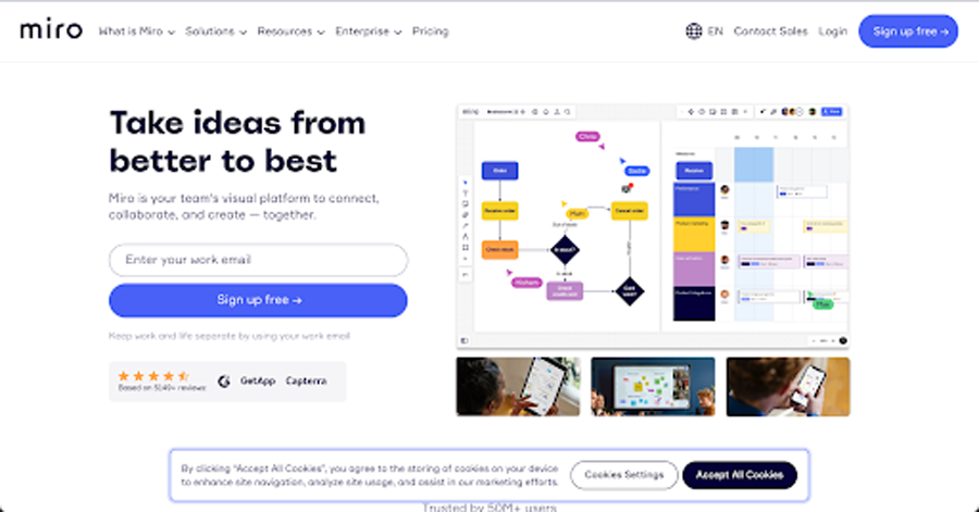
The “Sign Up Free” button is displayed clearly on the website header and its blue color against a white background immediately catches the viewer’s eye. With a simple, well-positioned CTA button, Miro can nudge viewers to take the action the brand needs.
Implement Responsive Website Design
As of 2023, over 55% of website traffic comes from mobile devices. Google has also reported that responsive sites preserve canonical URLs compared to mobile sites, which further increases the chances of your site landing on top of search results.
And, with Google implementing mobile-first indexing, being mobile-friendly is not a choice anymore for companies serious about business growth.
Your B2B website must therefore implement a responsive design to rank higher in search engines, deliver an enhanced user experience to potential buyers, and get more traffic. You can create a responsive website design by:
- Optimizing for touchscreens
- Using a predesigned layout optimized for mobile devices
- Picking an appropriate typography that’s easy to read for mobile users
- Starting with a fluid grid
- Setting appropriate responsive back points
Allow for Easy Navigation
Your website shouldn’t be a maze that visitors have to navigate through — or they’ll simply click away.
Making your website easy to navigate is not only good for SEO and online presence, but also motivates viewers to spend more time on your website and make a purchase.
Make sure your web pages are well-arranged, organized, labeled, and linked, so viewers know exactly where to go to get the information they want. Use clear categories, enlarge and bold important information, use graphics and multimedia alongside text, and avoid long drop-down menus and confusing lists.
Take a look at Grammarly’s website for inspiration.
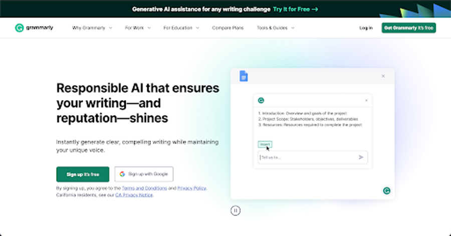
This website boasts a sleek, minimalist design with contrasting colors, well-spaced-out assets, and simple navigation that takes users where they want with a few quick clicks.
Cross-Link Pages to Relevant Content
We know that B2B users tend to be crunched for time and have many other responsibilities and demands on their time. This means it is vital to ensure that their user journey through your website is easy and seamless. One great way to do this is to provide alternate types of valuable content and calls to action on key website pages.
For example, let’s say a user navigates to a particular product page. They will see a description of the product, the benefits of using it, and specifications to help them identify whether it meets their needs.
By providing additional resources such as case studies, detailed technical document downloads, and links to similar products, you are easing the cognitive load required to make a decision.
That’s what the legendary B2B manufacturer Hockemeyer does on their website.
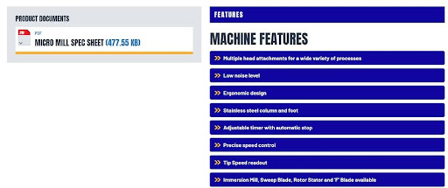
You can learn more about how we approached the Hockmeyer website design in this case study.
Clear and straightforward calls to action on your pages will also show the user exactly what they need to do next to contact your company for more information or get a personalized quote.
Talk About the Customer, Not Yourself
Have you ever been to a party and gotten stuck in a conversation with someone who only talks about themselves? I would bet money that it wasn’t a very engaging experience! But this is exactly what your website is doing if the messaging is focused purely on your company, your expertise as a business owner, or how great your products are.
Instead, focus on messaging that centers the customer. This shows you recognize your audience’s problems and then position your products or services as the solution. Writing with users’ needs at the forefront of your mind is a tried and tested technique that many B2B businesses forget.
As an example, consider Slack, a B2B company that sells a team communication tool to businesses of all sizes. On Slack’s homepage, all of its marketing messaging focuses on the customer’s needs: improving communication, efficiency, and productivity. They also address their customers directly with words like “you” and “your”.
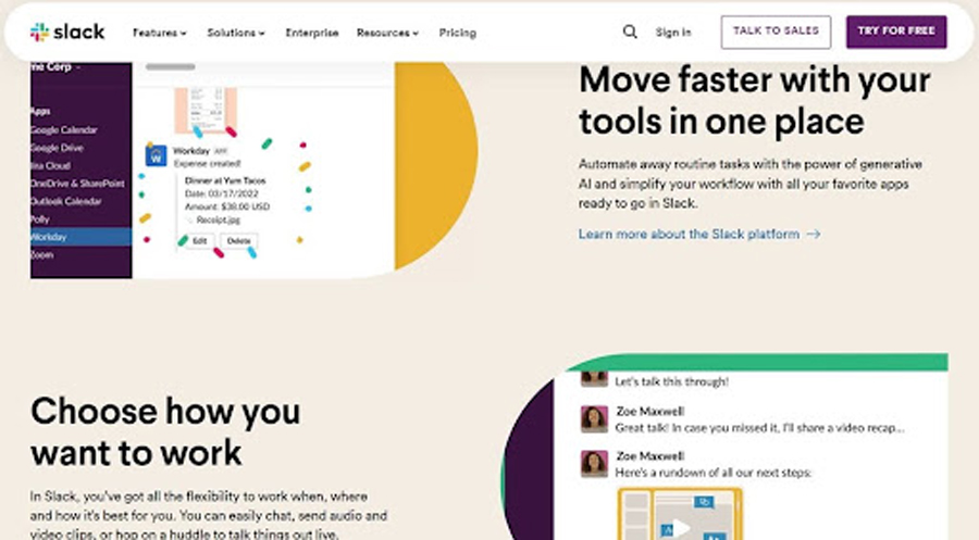
This shows users that Slack understands their specific problems and needs, making them far more likely to give its services a chance.
Focus on Content Quality
When I undertake a content audit for a client, I often find two areas that are in dire need of improvement: content quantity and content quality.
Simply not having enough content on a site can be a big problem. Product descriptions that have only a few words, resources that are months or years out of date, blogs that are never updated, and few or no downloadable resources are common culprits in this area. Having sufficient content on your site allows you to showcase your expertise and to better meet your prospective clients’ needs. It also gives your SEO a big boost.
I also often find that the content that does exist is of poor quality. The most common issues that we find include poor grammar and spelling, and the overuse of jargon, acronyms, or other verbiage that only people with a high level of existing knowledge would understand.
These problems are understandable. B2B companies are often so focused on operations and sales that the content they are putting out becomes an afterthought. It is added as needed and often written by people who do not fully understand the complex topics concerned.
However, a low quantity or poor quality of the content (or both) can seriously hold your business back. If all your content is outdated, customers may assume that your business practices will be similarly dated… or even that you are no longer trading! Poor quality content undermines trust and calls your expertise and ability to meet client needs into question.
When you update your website, hire a copywriter (or a web design company that offers copywriting services within their packages). This will take a lot of the burden off your shoulders, ensuring you receive sufficient content of a high enough quality to play well with your audience and be seen as valuable by Google. It’s a win-win.
In Closing
As you can see, there are many important phases to a B2B website design and build project. There are numerous points at which things can go wrong, and many different factors to consider as you make decisions about your project.
Many of the worst ways web design projects fail can be avoided with little know-how and careful planning. By undertaking meticulous audience research, creating a detailed outline of your needs, and carefully avoiding a few common mistakes in the design phase, you can ensure that your new B2B website is a success that drives your business forward and gets results.
Are you ready to dive into your website redesign with an experienced and professional team of New Jersey web designers beside you? Drop us a line to get started.