
7 Best Manufacturing Website Design Examples & Templates
New technologies like AI, 3D printing, robotics, and automation continue to change the manufacturing industry significantly. As the industry evolves, so must your approach to online representation and marketing.
Recent statistics show that 76% of consumers will search for a company website before visiting their physical location. Therefore, it makes sense to start there – have a website that acts as the first point of contact for potential customers.
A great manufacturing website will also help you showcase your products, services, and capabilities efficiently and creatively. This makes it a powerful tool for establishing credibility, attracting customers, and driving business growth.
But how do you know you have a great website?
This article will discuss manufacturing website designs, how to choose a template, and provide great real-life examples you can emulate.
What is a manufacturing website design?
A manufacturing website design is a design specifically tailored to meet the needs and objectives of companies in the manufacturing industry. A good design should clearly represent a company and its product offerings to online users.
Some of the critical pages a great manufacturing website design must have include:
- A homepage: The homepage helps you make a strong first impression on your website visitors. It should provide a concise overview of your manufacturing company, including customer testimonials, product offerings, and unique selling points.
- Products and services overview: An effective manufacturing website should have a page showcasing the company’s products and services, with high-quality images and detailed descriptions. This allows visitors to explore your wide range of offerings and actually understand their features and benefits.
- “About us” section: It provides background information about the manufacturing company, like its history, mission, values, and team members, which helps build trust and credibility.
- Blog page: A blog page provides a platform to share relevant company and industry news or insights. This helps you build authority and trust in your expertise, boosting your online visibility and search engine rankings.
- Contact information: This page should include contact information such as phone numbers, email addresses, and a physical address. The design can also have a contact form or live chat option for visitors to reach out with inquiries or requests for more information.
These components will help you create an engaging and effective manufacturing website that attracts and retains customers.
7 Manufacturing website design examples & templates
Now, let’s look at six great manufacturing website design examples and templates, analyzing what they got right.
1. Glauber Equipment Corporation
Glauber Equipment Corporation designs, manufactures, and distributes custom-engineered systems for various industries. Some of its offerings include centrifugal pumps, compressors, and blowers.
The first thing you notice when you land on the website is the clean design due to the ample white spaces.
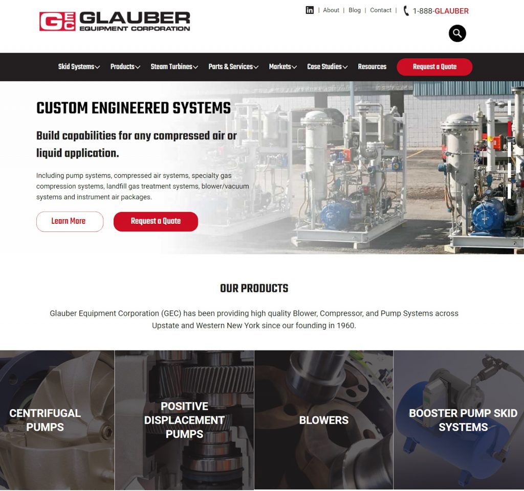
Besides that, the bold-colored CTA used on the navigation menu, and the hero image section also easily capture your attention.
The website is also quite minimalist. For instance, you’ll notice the hero image section is a slide show, which briefly but efficiently communicates the brand’s offerings and unique value proposition.
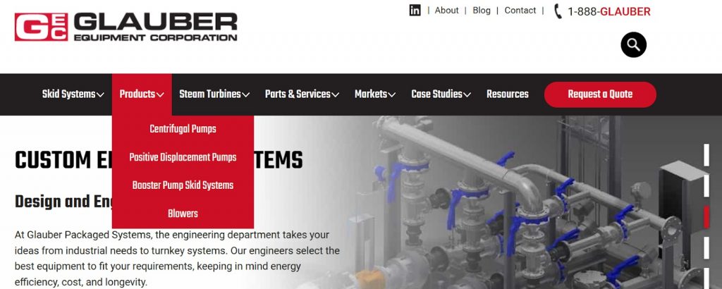
Additionally, they’ve used the drop-down menu style, shown below.

This allows Glauber to group similar products and services under one menu, which boosts accessibility. Users don’t have to go through the entire website to find the information they want.
2. Hockmeyer
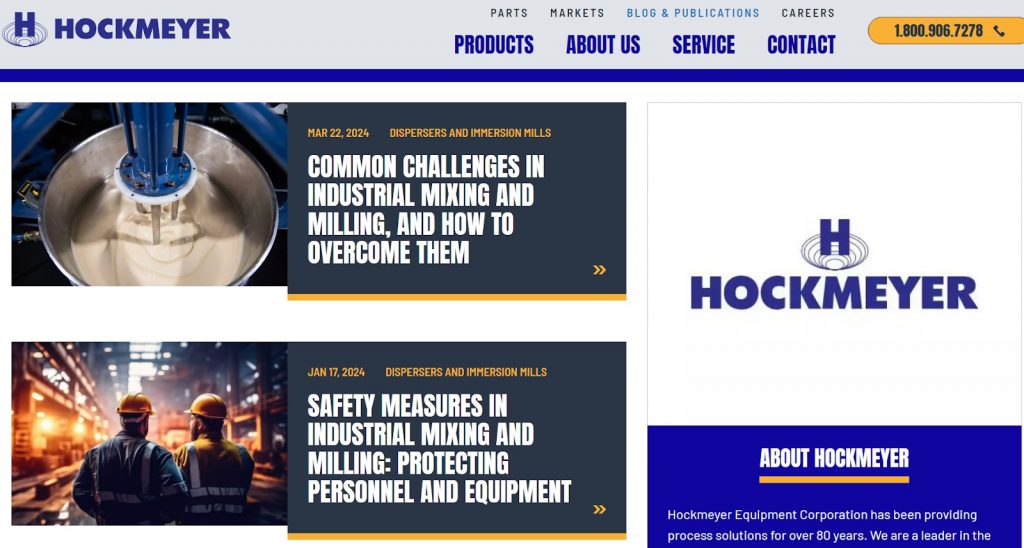
Hockmeyer is a leading manufacturer and supplier of immersion mills, dispersers, mixers, and tank washers. We worked with them to create a sleek, modern website that offers a great user experience. The priority was making it easier for prospective clients to view sample products and contact Hockmeyer.
You can tell we delivered that the moment you land on the website, see the ‘see our products’ and contact CTAs.
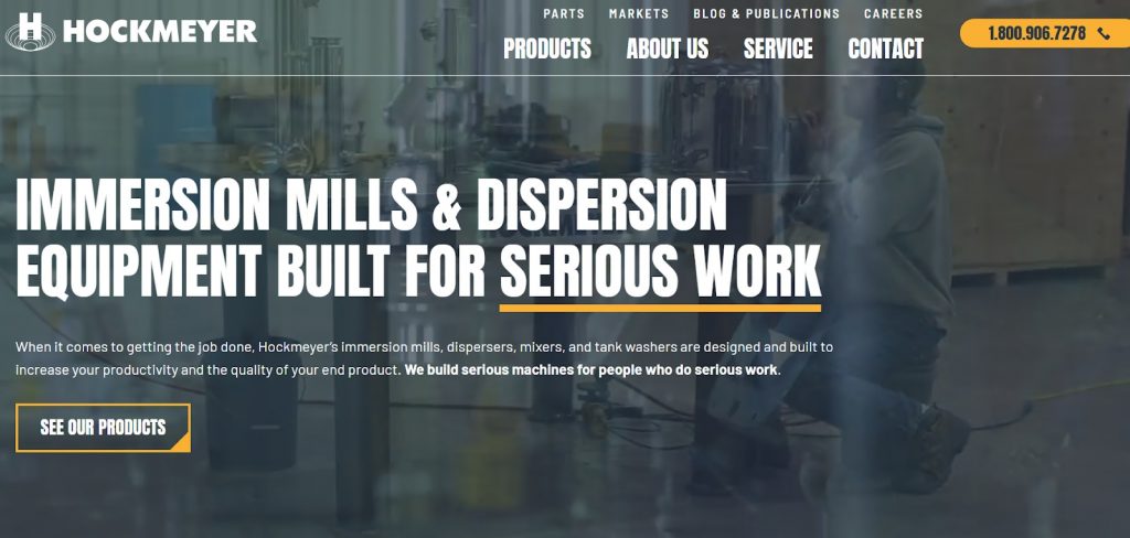
We also included an original background video in the hero section, which adds a level of authenticity to the site. It blends in without distracting from the copy.
Additionally, we ensured the website looked organized and clean by adding ample white spaces and an intuitive navigation menu. The product pages were not left behind. We categorized them by their uses, making finding a specific product easy.
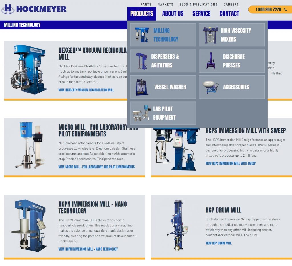
We also included a dedicated blog and publications page to help Hockmeyer build customer trust and brand authority in its market.
Are you looking to create a website that matches this great example? Reach out to us today for custom web designs that communicate your value, impress your web visitors, and eventually convert them.
3. AngloAmerican
AngloAmerican is a global mining company that focuses on safe and sustainable mining.
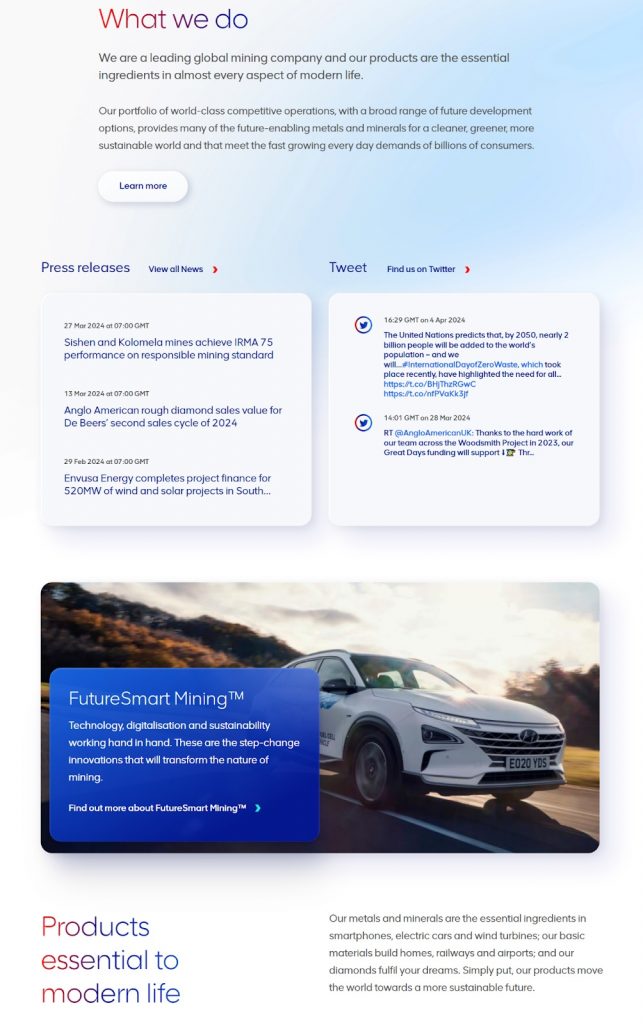
When you land on the website, you first notice the hero section with the original image. It also includes a clear, unique value proposition that compels you to click on the CTA to learn more.

The content sections are a great element since they provide clear entry points to different parts of the content. The digestible content chunks also help enhance the website structure.
You’ll also notice that AngloAmerican has localized websites for its different operating locations and certain metals and minerals.
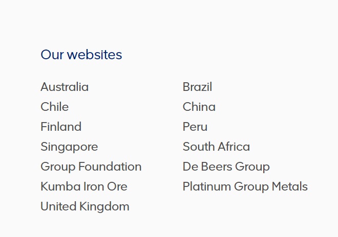
Doing this helps them create a better and more authentic user experience for all website visitors.
4. Lockheed Martin
Lockheed Martin is a leading aerospace, arms, defense, information security, and technology corporation. You can tell this as soon as you land on the website, thanks to the video in the hero section.
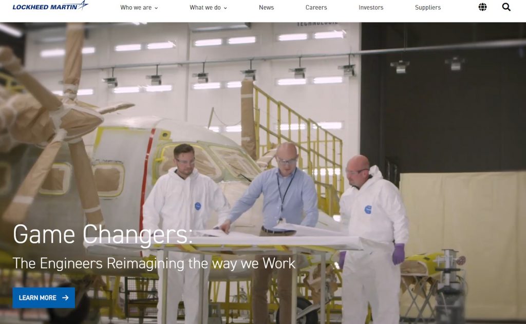
The website’s continuous theme is the strategic use of video, which makes what would otherwise be very complicated content more engaging and digestible. They even have a YouTube Shorts section.
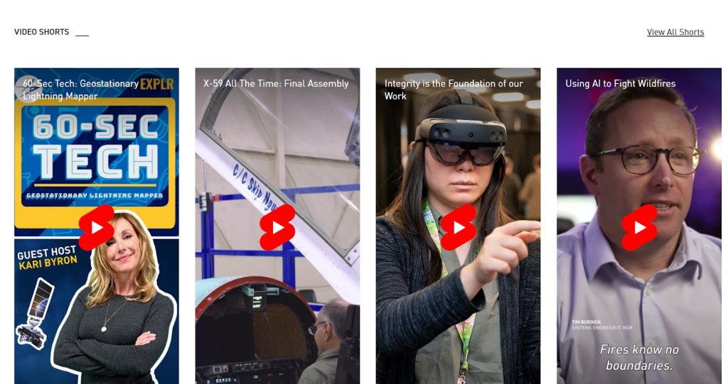
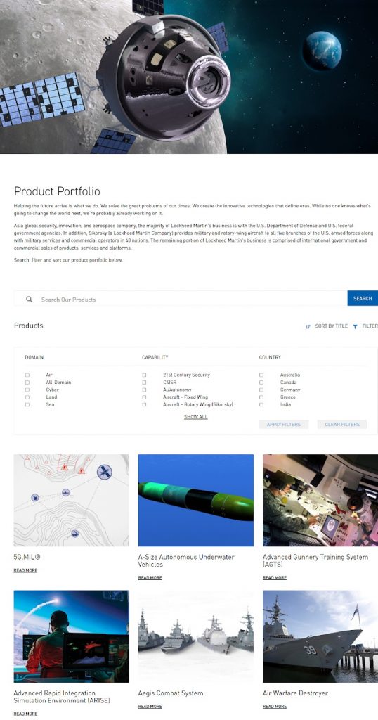
Besides that, the website has a great product page design and search filters that make it easy to find what you’re looking for among their wide range of products.
Their news page is also a great inclusion that leverages content to highlight the company’s expertise and innovations.
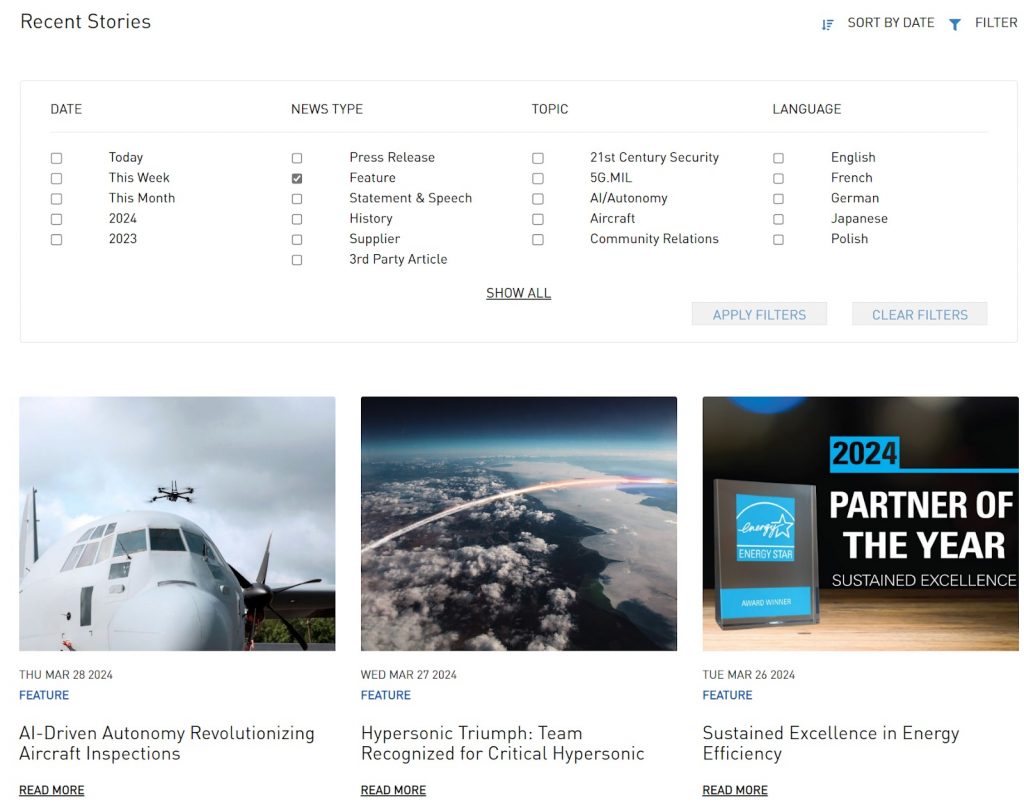
As a result, Lockheed Martin builds its authority in the market, making it easier for web visitors to trust them and convert into leads.
5. Mac Instruments
Mac Instruments is a leading provider of high-temperature humidity measurement and steam flow meter equipment. They work in various industries, from power generation to food processing, refining, and even metalworking.
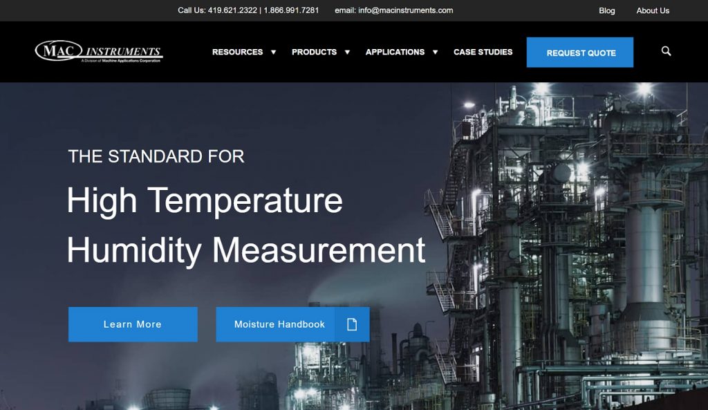
As you can see above, the company’s hero section follows a dark and bold theme, which makes the copy, CTAs, and images stand out.
The drop-down menu items also make navigation easier.
Like most of the other great examples we’ve seen, Mac Instruments uses content sections to facilitate accessibility and navigation. However, this one specific section stands out.
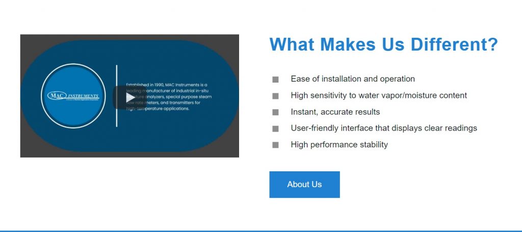
Instead of the typical brief “about us” section, they choose to highlight what makes them different. They do this in bullet points, which makes it more readable. Additionally, they back it up with a short video, which makes the section even more engaging.
6. Advanced Robotic Solutions
Advanced Robotic Solutions provides cost-effective, client-specified robotic solutions. The website stands out among other industrial companies due to its professional but simple design.
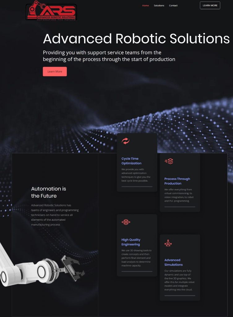
The website design is quite easy to navigate since it only has three key web pages and very informative but brief and well-organized content sections. This simplicity makes the website easy to interact with, even for new web visitors.
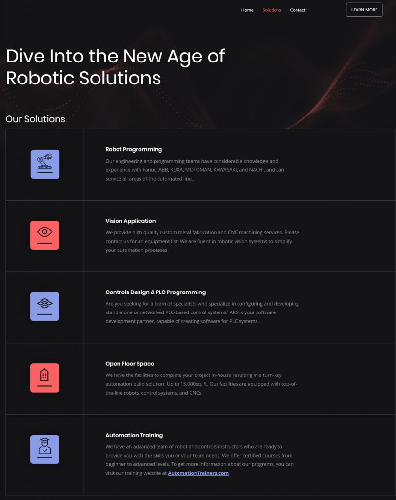
Motion graphics throughout the website also help encourage a more interactive experience since they capture user attention more effectively than static images.
7. Golden West Packaging Group
Golden West Packaging Group manufactures high-quality custom packaging for brands. Its website does a great job of drawing attention to its products and services as well as its unique selling points.
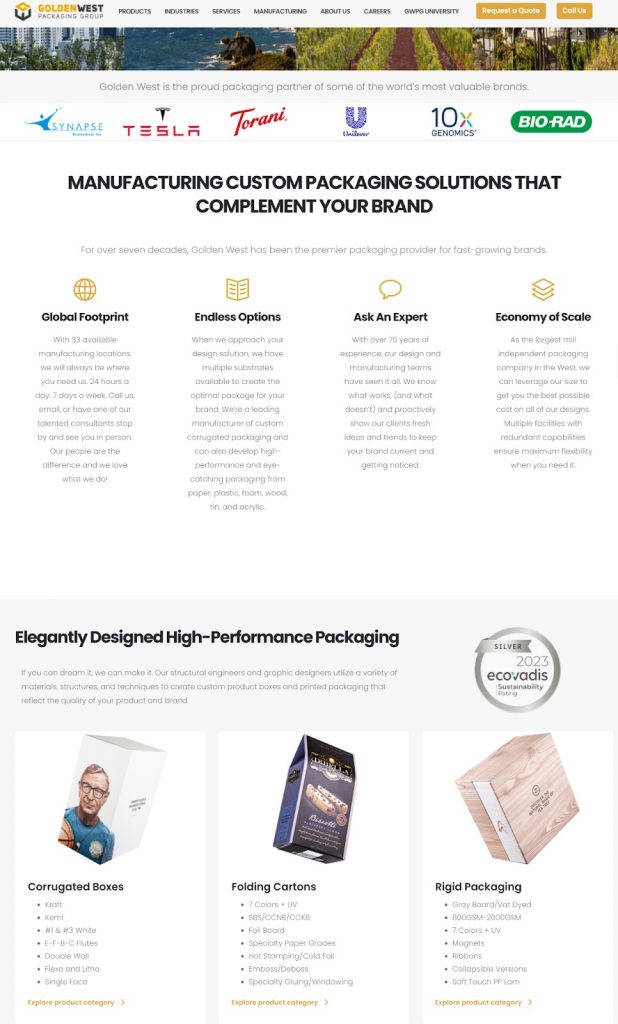
The intuitive navigation menu is also a great idea, considering they serve multiple industries globally and offer a wide range of products and services. Therefore, the menu design comes in handy when users want to easily find what they’re looking for.
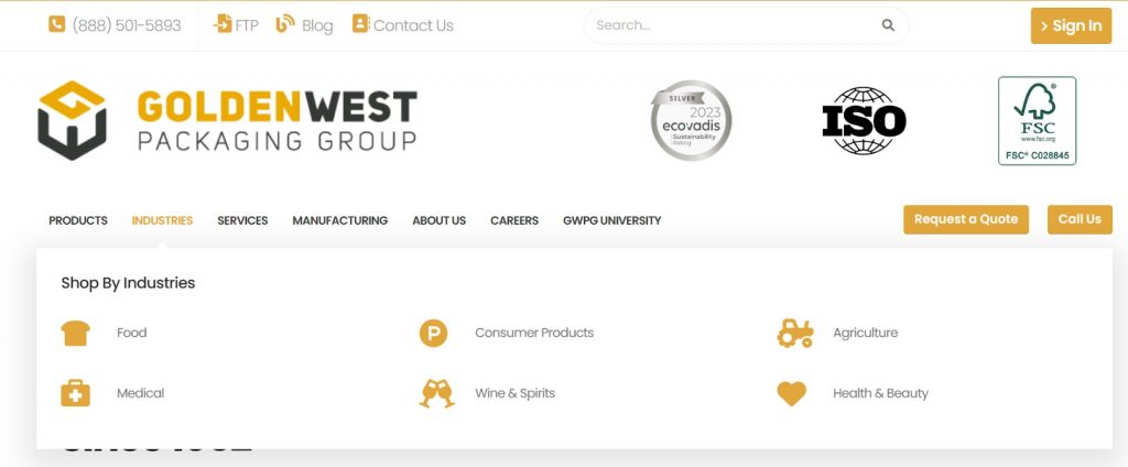
The website also has an active blog page with relevant and informative posts about packaging. This has helped the company distinguish itself from similar companies while forming a loyal customer base.
How to choose a manufacturing website design template
There’s no shortage of templates you can use to create your manufacturing website. However, you can’t just go for the first website design you see. You must consider several factors to ensure you choose a great manufacturing website. Some of the key ones include:
-
Your business goals
It’s important to remember that your website is there to serve your business. So, consider your business goals before anything else.
Do you want your website to primarily showcase your products, generate leads, provide customer support, facilitate online sales, or all the above?
Defining your main goals will help you prioritize the right features and functionalities when evaluating design templates.
For instance, if lead generation is your primary goal, prioritize templates with built-in contact forms, CTAs, and other lead capture techniques. If it’s showcasing products, then choose templates with a great product gallery layout and detailed product pages.
-
Industry relevance
Next, consider industry relevance. Industry-specific templates will come with features and functionality tailored to the unique requirements of manufacturing businesses.
These include product pages, CAD file downloads, RFQ forms, and integration with inventory management systems.
Choosing a relevant template will streamline the user experience and ensure your website meets industry standards. Additionally, you will save time you would otherwise have to use on customization.
-
Customization options
Speaking of customization, only choose a manufacturing website design that allows you to make adjustments to ensure it reflects your brand identity and unique offerings.
Whether it’s your font, color schemes, or layout, the template should be easy to customize. You shouldn’t require advanced coding skills to do so.
-
Responsive designs
With 96.5% of users accessing websites via mobile devices, choosing a template with a responsive design is non-negotiable.
The template design should be optimized to display correctly on various devices and screen sizes, including desktops, laptops, tablets, and smartphones.
-
User experience
Don’t be one of those companies with a website that’s always a pain to use–eventually turning potential customers away. Instead, ensure your website keeps visitors engaged and guides them toward desired actions.
To achieve this, choose a template with intuitive navigation, clear CTAs, great structure, and concise content sections. Also, factors such as page load times, readability, and website accessibility should be considered to ensure a positive user experience.
-
Technical support
The truth is you’ll probably face some technical issues at some point, which is why you require reliable technical support. So, choose a template with documentation, tutorials, chatbots, and dedicated experts to help you out when you encounter any issues.
The web developer should also offer regular theme updates to ensure your website keeps up with new industry trends.
-
Your budget
Finally, you must consider your budget constraints when choosing a manufacturing website design template.
For instance, if you’re strapped for cash when starting, you can choose a free and low-cost template. Then, over time, you can update to a premium version with additional features, customization options, and services that better align with your needs and goals.
Considering these key factors while evaluating your options will help you find the ideal website design template for your manufacturing business.
Conclusion
A well-designed manufacturing website establishes a strong online presence and fosters customer engagement. You can easily create yours by customizing a great online template.
However, while choosing the templates, pay attention to key factors like your business goals, customization options, budget, technical support, industry relevance, and user experience. Additionally, draw inspiration from the great manufacturing website design examples highlighted above.
Remember, you don’t have to struggle to do it all on your own. You can reach out to us anytime to create an exceptional custom manufacturing website for your company.
