Why We Follow Web Design Conventions, Not Trends, When Building B2B Manufacturing Websites
In web design, as in so many other spaces, trends come and go. One week, everyone is obsessed with hyper-minimalist designs, while the next week it’s all about neon color palettes and auto-scrolling banners.
At Lform, we don’t believe in following trends. There are a number of reasons for this, and we’ll get into them a little later in this post. Instead, we believe in following web design conventions when we build sites for our clients.
We primarily design websites for B2B companies in the manufacturing and industrial spaces. Therefore, we have approached this subject through the lens of our experience, expertise, and client base. What works for us and our clients may not always work for other sectors with very different needs and norms.
What’s the Difference Between a Trend and a Convention?
The core difference between a trend and a convention is that a trend is fleeting, while a convention stands the test of time.
Web design trends change rapidly and are influenced by numerous different factors, many of which have little to do with the most important role of any business website: to attract customers and drive conversions. Web design conventions, on the other hand, are standards that are universally understood and change very little, if at all.
Five Tried and True B2B Manufacturing Web Design Conventions We Stand By… And Why
At Lform, we have been building websites for manufacturers in the B2B industrial and manufacturing spaces for over 20 years. In that time, we have seen countless trends come and go. We have also developed an intuitive understanding of the conventions that matter and that will, we believe, stick around for the long haul.
Here are five of the conventions we stand by, and why they work.
Prominent and Easy-to-Follow Navigation Bars

B2B buyers are busy people and do not want to spend a long time browsing a website. These customers prefer to land on your site, find the information they came for, and leave. If they cannot find that information quickly and intuitively, they will likely simply leave and not come back, ultimately giving their business to one of your competitors.
Good user experience (UX) conventions dictate that the website’s main menu should be intuitively located and easy to navigate. In most cases, the best place for the main menu on a desktop interface is in a horizontal bar at the very top of every page. (You can see this design convention in action here on the Lform page!) For a mobile interface, the convention is to collapse the menu into a “hamburger” icon (three horizontal lines) and to place this icon in the top left or right corner of the mobile interface.
These menu conventions are so well-understood that most users will look for your navigation menu in those locations without even needing to consciously think about it.
The right kind of creativity in your website design can go a long way in differentiating your business from its competitors. Your menu, however, is not a place to get creative. Don’t be tempted to give your site’s various pages creative names that could confuse visitors. Labeling your menu buttons simply and descriptively (About Us, Services, Contact Us, etc.) is one convention you should stick to. Save the clever turns of phrase for your actual website copy.
Contact Information
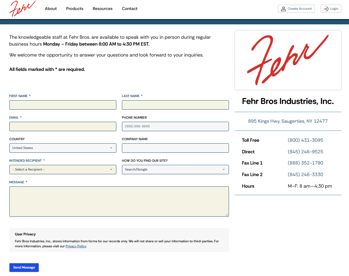
In the B2B industrial space, sales cycles are long and impulse purchases are virtually unheard of. This means that, when a prospect first lands on a manufacturer’s website, the immediate next step is likely to be something other than a purchase: requesting a quote, requesting additional product specifications, or scheduling a needs assessment, for example.
Never make your prospects guess what you want them to do next, and never make it difficult for them to take action. This means that following conventions in the placement of your contact information is essential.
Most website visitors expect to see a phone number displayed prominently at the top of the page, and further contact information in the footer of every page as well as on the dedicated “Contact Us” page. If you make your prospects search for the information they need to take action, most will simply not do so.
Visual Hierarchy
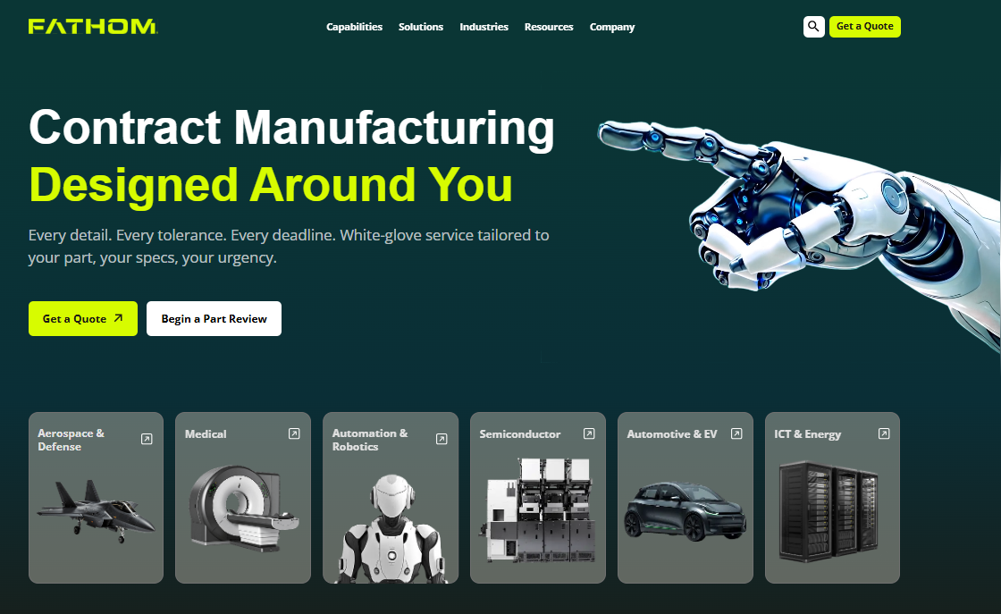
Did you know that, according to research, 94% of first impressions from website visitors are related to design? And, with users forming opinions about your site in as little as 50 milliseconds (that’s just 5% of one second), first impressions really are everything.
Visual hierarchy refers to how information is organized on a website, with the most important information displayed in the most prominent position. It guides how visitors navigate your website, where they look, and which links they click on, without them ever needing to consciously think about these decisions.
Visual hierarchy conventions include factors such as:
- Size, with larger elements (such as images and text) drawing the eye first
- Contrast, such as using bold colors to ensure headlines and calls-to-action stand out
- White space, or the empty space between design elements
- Typographical choices such as fonts
- The use of H1, H2, H3 (etc.) headings to break up the content
If the most important elements of any given page are not immediately apparent, the business will likely lose customers.
When it comes to visual hierarchy in website design, less can be more. Many businesses make the mistake of treating everything on a page as equally important, resulting in a loud and cluttered site on which, by trying to make everything stand out, nothing ends up standing out.
Visible Trust Signals
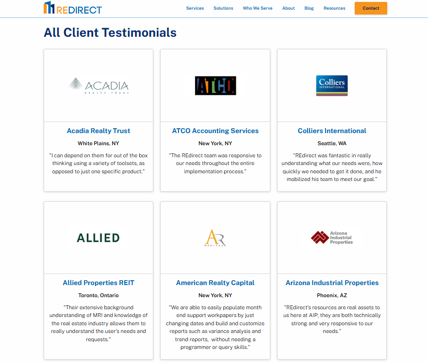
Unlike their B2C counterparts, B2B clients are not typically browsing to kill time or surfing the web for fun. They are looking for specific solutions to specific problems. B2B manufacturing purchases are often high-ticket items stretching into tens or hundreds of thousands of dollars, and may go through many layers of approval before a final purchasing decision is made.
This means that B2B buyers need to feel a high level of trust in the companies they purchase from, and they need evidence to back up that trust. This is why we always encourage our clients to place visible trust signals prominently on their websites.
Visible trust signals show prospects that your business is legitimate, and can include:
- Detailed customer reviews and testimonials, ideally with real names, pictures, and company names attached
- Logos of recognized clients and/or partner brands
- Compliance badges for relevant standards
- Membership of relevant professional bodies
- Industry awards
- Media mentions
- A verifiable physical address
Clean, Professional Aesthetics
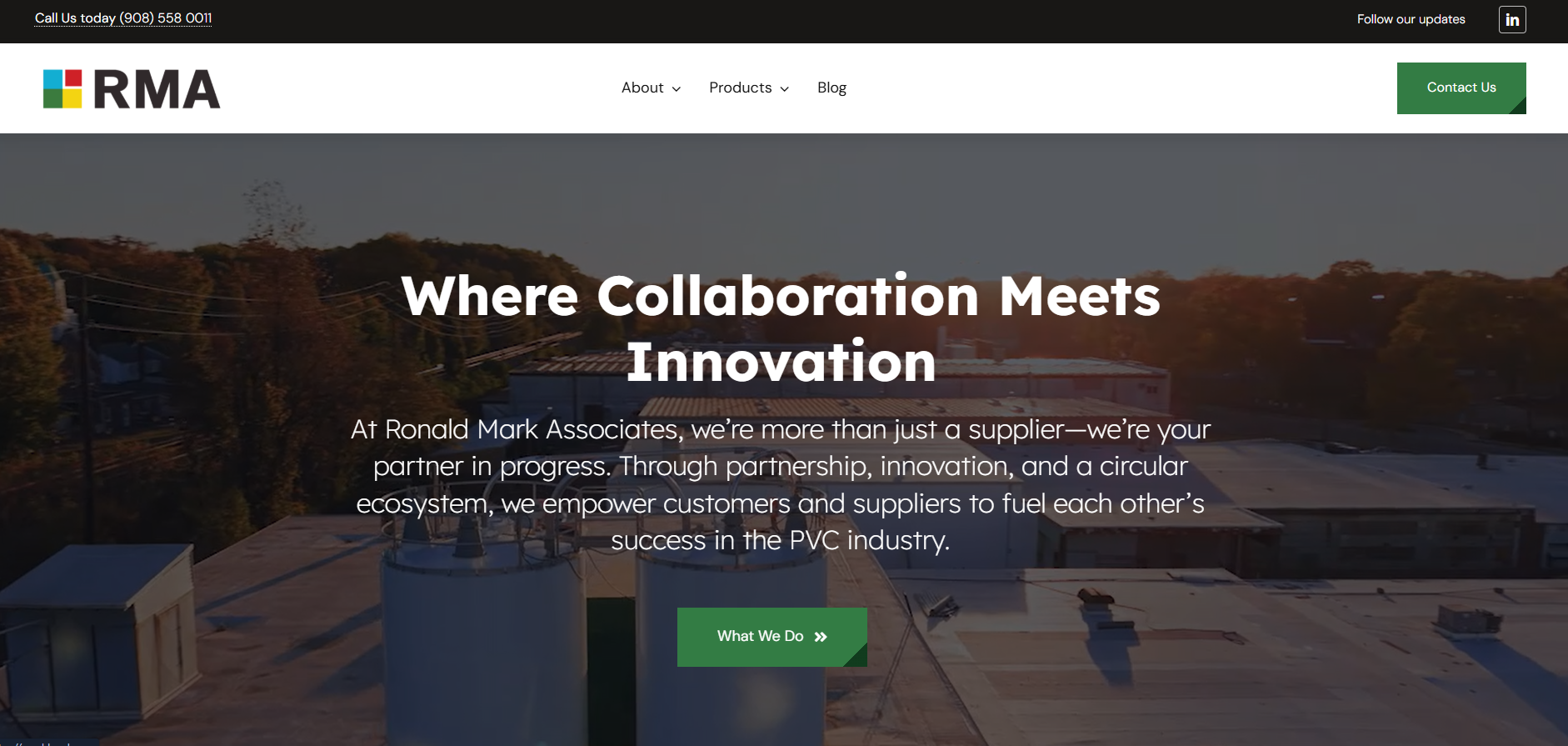
In the B2C world, website aesthetics can vary tremendously depending on exactly what the business sells and the audience it is trying to reach. In the highly technical world of B2B manufacturing, however, we recommend that companies stick to sleek, clean aesthetics that invoke seriousness and professionalism.
We often build clients’ websites around their existing color palettes, which tend to include neutral shades and sometimes high-contrast accent colors (such as our own orange and white color scheme). Clean typefaces and plenty of white space are also crucial.
Many B2B companies do not realize the importance of imagery on their websites and resort to using low-quality product photography or generic stock images. In fact, high-quality original photography and videography can be a game-changer. Think high-quality product images, close-ups, action shots, factory floor or workshop photography, user interfaces, data visualizations, and so on.
Why We Don’t Follow Trends (And You Shouldn’t, Either)
As we have established, web design conventions become conventions because they work. They speak to buyer expectations, support a positive user experience, and increase conversions. Fleeting web design trends, on the other hand, can harm a site’s performance and credibility.
We’re not saying you should never use trending web design elements. After all, every accepted convention was once a trend. However, we advocate approaching them with caution and recommend that you ask an experienced web designer to determine their validity and shelf life before they are implemented.
Imagine basing your website around a certain fad that ends up fizzling out faster than it came onto the scene. Once it fades, you are left with a dated site and a huge bill. Figuring out how to best design your website for your target audience is definitely best left to the professionals.
1. Trends Make Your Website Dated Quickly
When you build your website around trends, there is a high chance that those trends will go out of fashion again just as quickly as they became popular. Once the fad fades, you’ll be left with a large bill and a website that already looks dated and out of touch.
Conventional B2B website design is timeless and, with the right maintenance, can serve your organization well for many years.
2. Trends Are Not Always Good for the User Experience
Trends are often based on superficial factors rather than functionality, performance, or longevity. Trendy website design features can negatively impact page speed, loading time, readability, and navigability. And, with a B2B website that loads in one second enjoying a conversion rate three times higher than one that loads in five seconds, this can have a serious detrimental impact on a business.
Before you decide to implement any trendy feature into your website, consider how it will impact the user experience. Anything that slows your site down or makes it more difficult to navigate should be a no-go.
3. Trends Are Not Always Conversion-Focused
Website design trends arise for a wide variety of reasons, and those reasons often do not include “they demonstrably help businesses to increase their conversions.” Instead, trends often prioritize aesthetics and novelty value at the expense of leading buyers through a logical process that begins with information gathering and ends with a purchase.
4. B2B Manufacturing Clients Do Not Prioritize Trend-Based Marketing
In many consumer spaces, following trends can be beneficial in building a connection with customers and capitalizing on “moments” to make sales. B2B manufacturing and industrial clients, however, have completely different priorities than everyday consumers.
B2B buyers in highly technical spaces are seeking reliability and proven expertise. They want to know that your company is a serious player in its industry and that your products will stand the test of time. Trend-based marketing often inadvertently sends the opposite message.
5. Trends Can Make Your Website Look Exactly Like Everyone Else’s
Trends become trends when they are repeated again and again. This means that following them can mean your website ends up looking exactly like hundreds or thousands of others. Even in niche and technical sectors, having a recognizable brand identity is critical.
“But,” you might be wondering, “does following conventions not also make my website look exactly like everyone else’s?” No, because proven conventions go far beyond just the aesthetics.
Following conventions that have been shown to work creates a framework and structure within which you can showcase the personality, brand identity, and unique value proposition of your business.
Evolutions in B2B Manufacturing Web Design We Think Are Here to Stay
While we embrace proven conventions and broadly eschew fleeting trends, we also consider it a part of our job to stay on top of developments in the web design industry and particularly in web design for manufacturers and industrial clients. Here are a few emerging developments that we believe will become lasting conventions.
Web Design Built Around a Deep Understanding of the Buyer Journey
As we have already mentioned, B2B sales cycles tend to be longer and more involved than their B2C counterparts. They are often non-linear and involve multiple stakeholders, all of whom will research and evaluate the various options long before a final purchasing decision is made.
Increasingly, B2B industrial websites are being designed to address specific stages of this buying journey: technical evaluation (“will this product meet our needs to the standard we expect?), commercial validation (“will this product be a sound investment?”), stakeholder approval (“can we make a business case to organizational leadership for this purchase?”), and after-sale support (“will this company assist us if we have a question or something goes wrong?”).
Problem-Led Navigation Over Traditional Product Catalogs
Traditional product catalogs assume that buyers already know what they need to solve their problem. However, this is often not the case. Many buying journeys begin with the prospective customer understanding they have a problem and researching possible solutions, without understanding what those solutions might be.
Problem-led navigation begins with the problem your product or service solves, then guides the prospective buyer to the product page.
Searchable and Downloadable Product Specs
Many B2B buyers want to be reasonably sure a potential purchase meets their needs before they ever make contact with a salesperson. This often means that they want to evaluate the technical specifications on their own.
Making these specifications easily searchable allows prospects to narrow down their search quickly and easily based on their priorities, and making them downloadable ensures they can play a central role in validating and making the business case for a purchase.
Product Demo Videos
The most important question prospective B2B buyers are likely to have is “how exactly does this product work and what can it do for me?” Historically, this has often meant pouring through dense technical documentation or requesting an in-person demonstration.
Now, however, more and more manufacturers are addressing this question by including product demo videos on their websites. They are particularly useful for the problem-aware but solution-unaware buyer we mentioned above, allowing them to visualize exactly how your product will solve their problems.
Book a Consultation with Lform for B2B Manufacturing Web Design Built on Decades of Expertise
For a website build or redesign based on deep industry knowledge, decades of combined experience, and a comprehensive understanding of what actually gets results for today’s B2B manufacturers and industrial businesses, please book a needs assessment or let us know how we can help you.
About Jess Amy Dixon

Jess Amy Dixon is a freelance copywriter and SEO content specialist with a BA and MSc in Creative Writing and a PhD in English Literature. A full-time writer since 2020, she brings rare academic depth and editorial precision to every piece, crafting content that’s sharp and strategic.