UI Design Tips That Maximize B2B Audience Engagement

When your solutions cater to a professional audience, your sales approach must differ from standard, B2C-oriented marketing practices. After all, B2B users rarely make purchasing decisions based on emotions or whims, or without diligent research.
Quite contrarily, they evaluate products and service providers for weeks (sometimes even months), knowing that they’re not just signing up for a one-time purchase. Instead, when investing in B2B solutions, these buyers commit to a relationship that’s likely to last for years.
That’s why they need concrete proof that the products they’re spending money on will deliver, that they’ll have access to first-rate support, and that they’ll have the option to upgrade or change their contracts to accommodate future growth.
The great thing is that UI (user interface) design can help you introduce your solutions in ways that will appeal to professional prospects.
By combining visual and functional elements, UI can give you that edge you need to present your company in the best possible light, maximize B2B audience engagement, and successfully sell your product.
The following are the most effective UI design tips you can implement on your website to engage your B2B audience and ensure the highest conversion rates in your industry.
Provide a Meaningful Product Evaluation
When you are developing webpages that target professional users, it’s essential to understand that the B2B purchasing process differs from the B2C buyer’s journey.
Professionals and organizations generally go through five phases before deciding which product to buy:
- The Research Phase: Users recognize and define a pain point they have.
- The Evaluation Phase: Organizations consider possible solutions and explore their benefits.
- The Discussion Phase: Stakeholders (6.8 people, on average) agree on what solution to invest in.
- The Purchase Phase: Customers meet with sales representatives and negotiate terms.
- The Post-Purchase Phase: Clients interact with product suppliers for technical support, guidance, education, and upgrade and maintenance issues.
The role of a B2B website is to employ SEO to reach potential buyers in the research phase. Moreover, it needs to engage audiences in the evaluation phase. And it must move buyers through the remaining stages of the B2B sales funnel by making it easy for them to get in touch with company representatives, get the support they need, and present them with valuable information that holds the potential to boost customer experience.
Exceptional UI design can do all this. But its main potential lies in making the product evaluation process meaningful and streamlined to ensure the highest possible chance of engaging potential leads.
Providing web visitors with relevant and professionally presented information will help them recognize the value offered by your product. But if you really want to take your site’s UI to the next level, you should consider including a product preview on your landing pages.
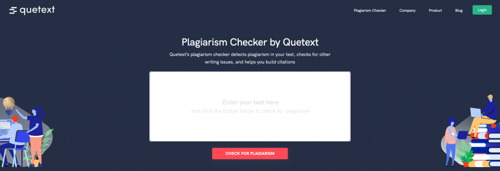
An excellent example of how you can do this comes from Quetext. This brand allows potential clients to test its product for free—no download, trial sign-up, or credit card required. The trial consists of nothing but a powerful demo that presents users with data, showcases the product’s capabilities, is professional, and is easily accessible.
Prioritize Clarity and Simplicity
Good UI design places users in control of websites and allows them to comfortably interact with the content without causing them to become cognitively overwhelmed.
So, to create a website that appeals to business users and engages audiences, the best way to achieve this effect is to create visually and functionally streamlined pages. This can mean several things:
- Prioritizing minimalistic design, which reduces visual complexity, relies on prototypicality, and uses negative space to ensure high-value elements (like unique sales propositions and calls to action) stand out.
- Writing copy that scores high on readability tests and makes it easy for potential customers to understand the benefits offered by your products.
- Providing subtle UI cues, such as headers, visuals, or having content peek into the hero section to indicate there’s more to see below the fold.
- Reducing both visual clutter and meaningless sales phrases. This is essential because business customers tend to be busy and want to optimize the amount of time they spend researching solutions.
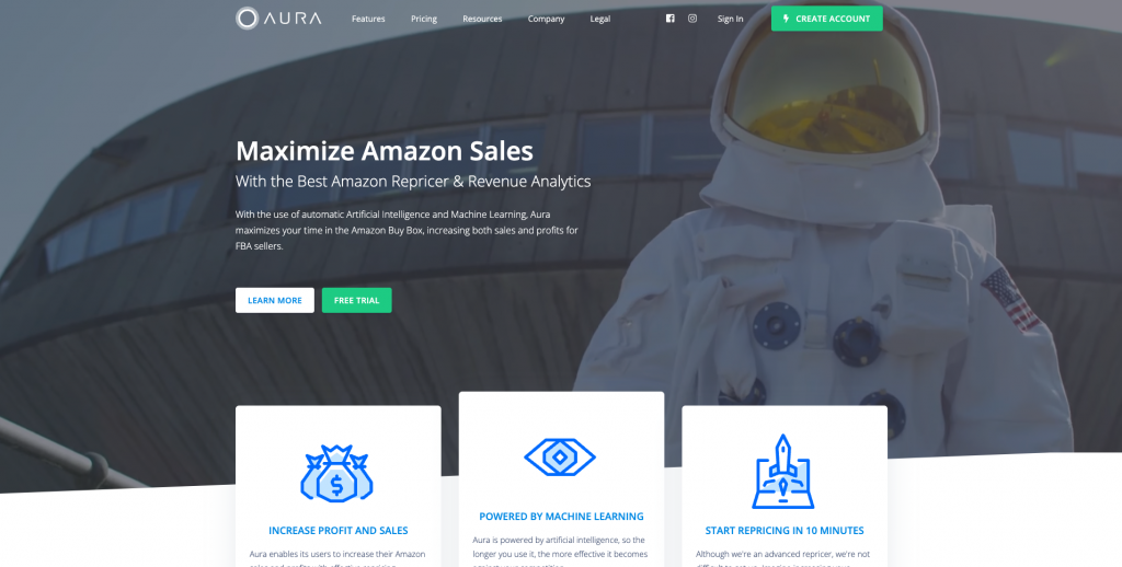
If you check out the Aura homepage, you’ll see that the brand adheres to all of these rules. It uses a lot of negative space to highlight the benefits offered by the solution. Interacting with the website is intuitive, thanks to its adherence to widespread UI practices.
The product is presented in a concise manner that’s easily understood. And the main product benefits are presented using concrete facts instead of washed-out marketing speak or empty promises.
Provide Relatable Social Proof
Social proof plays a huge role in engaging audiences.
According to G2’s B2B-specific research:
- 92% of business users are more likely to purchase a product or service after reading trusted reviews.
- 71% of them look at product reviews during the consideration phase of the buyer’s journey.
- 61% look for a large volume of reviews when evaluating solutions, seeking between 11 and 50 reviews.
Considering this data, it’s evident why adding testimonials to your B2B website is essential.
However, when choosing what types of social proof to employ on your site, you must remember that the best way to engage B2B audiences is to prioritize relevance. And great UI design can help you highlight this relevance by providing simple guidelines on presenting the instances of feedback you add to your landing pages.
For example, while business ratings and user stats may do an excellent job of convincing general consumers to convert, B2B prospects won’t be looking to purchase a solution just because it’s the most popular option of its kind.
However, presenting them with case studies, customer stories, and detailed testimonials that discuss the specific benefits or product features will help B2B users understand what value they stand to gain from their investment.
For a good example, look at the Affinda homepage. As an “AI-First Company,” it’s clear their target audience consists of mid-to-large-sized businesses. To add credibility to their products and solutions, they have highlighted a pretty impressive array of customer logos immediately below the fold.
Doing this adds a large dose of B2B credibility to the brand’s image. And more than that, it uses the success of the brand’s clients as a powerful piece of evidence that Affinda truly delivers everything it promises.
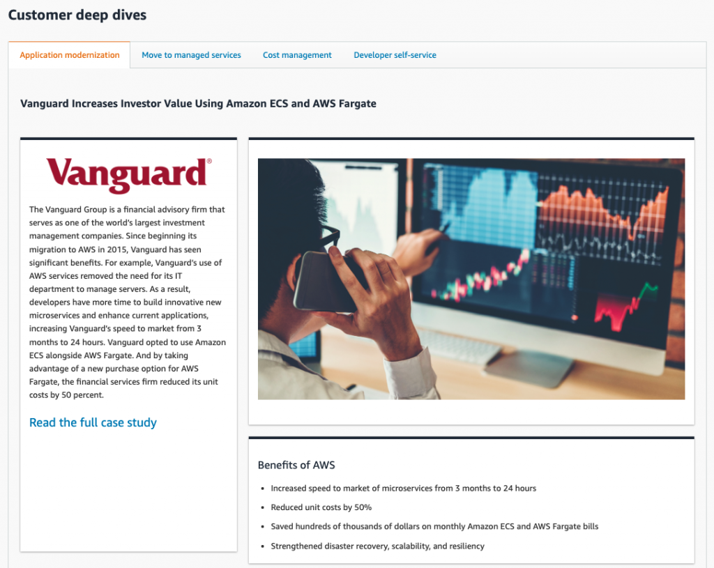
Or, for a slightly different approach, check out how Amazon Web Services presents customer deep dives on its dedicated social proof page. Here, it introduces B2B clients, presents their pain points, and describes precisely how its solution benefited the customer.
What stands out is the “Benefits of AWS” section that presents convincing social proof in the form of bullet points, as well as a direct quote about the quality of the AWS product from one of the client’s employees.
Embrace Video to Explain Your Products
If you’re looking for UI design tips that will help with B2B audience engagement, now might be the time to start embracing video on your landing pages.
According to a 2022 report from Vidyard, 70% of marketers believe video converts better than any other type of content. And Wyzowl took an even more detailed look at the benefits of using video. According to the brand’s research, including videos on websites helped brands:
- Increase traffic: 87%
- Boost dwell time: 82%
- Drive product/service understanding: 94%
- Successfully generate leads: 88%
- Reduce support calls: 49%
But how does using video promote better UI design? Well, there are two main reasons for video enabling a more enjoyable website user experience.
The first one is that video can replace long walls of text and explain complex solutions by combining the power of auditory and visual information (which has been proven as the superior way to drive information retention compared with text).
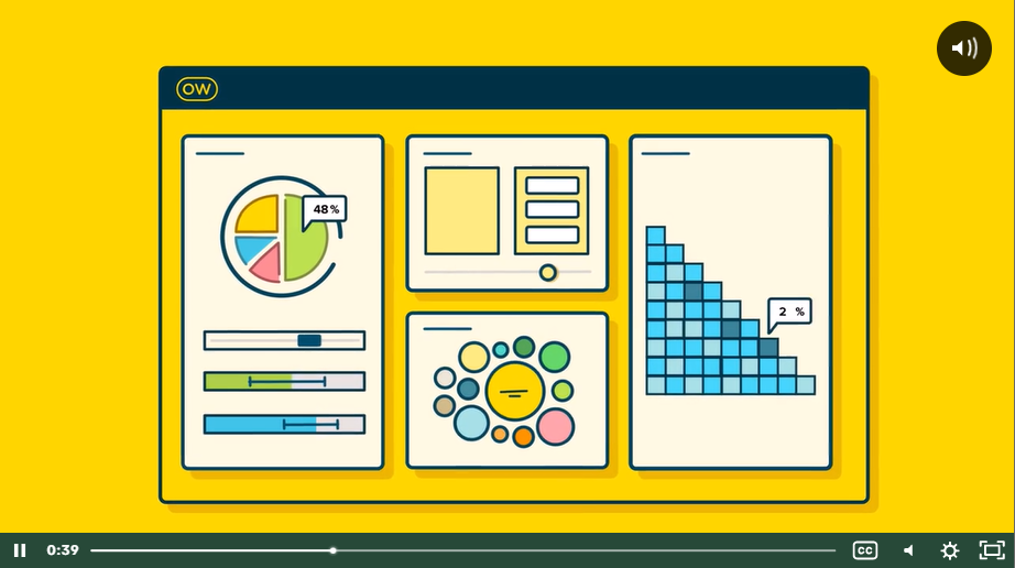
For example, check out how effectively Optimal Workshop introduces its (fairly complicated) product with a two-minute explainer video that addresses audience pain points and presents them with an effective solution.
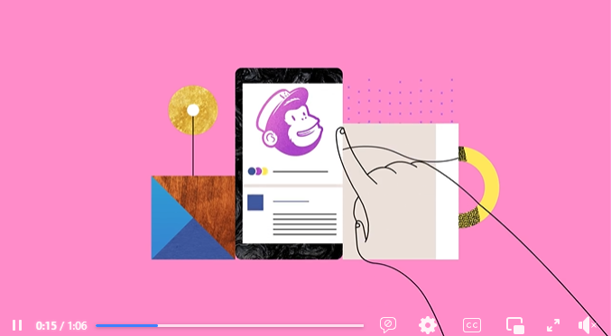
The second advantage of using video over text to engage web visitors is that people prefer watching it to reading text. Video is quick and easy to consume. And, when made to look aesthetically pleasing—like the example from MailChimp below—it will naturally attract and retain user attention, ensuring that your value proposition is heard and understood by your potential B2B clients.
Promote the Human Sales Touch
Website UI design that promotes self-service is super popular in 2022. Considering that 81% of people try to resolve issues on their own (before reaching out to a customer service representative), this is no surprise. So, one excellent UI design solution for business websites is to provide both existing and potential clients with easy and immediate access to information through knowledge bases and training materials.
However, when optimizing the sales process, you have to remember that with B2B clients, you’re looking at a longer sales cycle than with B2C customers. So, to ensure your prospects remain engaged throughout this decision-making process (and to boost their chances of converting), it’s not a bad idea to introduce high-touch sales points onto your website.
The great thing is that doing this doesn’t have to be complicated from a UI design standpoint.
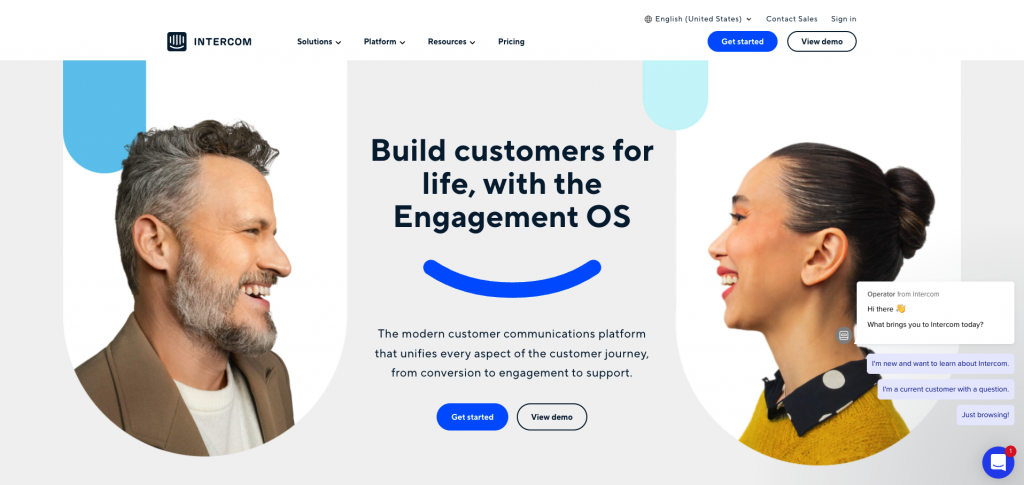
Something as simple as showing contact information in multiple spots on your homepage can be more than enough. Just check out how well Intercom does it, with both a “Contact Sales” CTA and an automated chatbot feature.
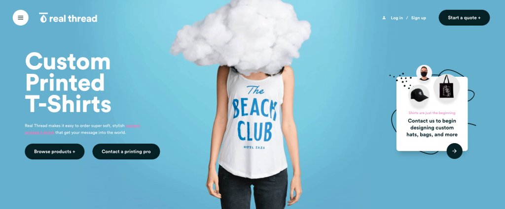
And Real Thread promotes the human sales touch even better. It includes three call-to-action elements on its homepage, nudging visitors to interact with its sales team. The brand also uses visual design and copy to make these CTAs highly compelling and to point out the expertise and experience of the company’s representatives.
Highlight Measurable Benefits
Finally, as you look at UI design tips that will engage B2B audiences, don’t forget that most organizations aim to make data-based decisions when investing in products or services. So, it’s not a bad idea to present your value proposition in a way that focuses on quantifiable rewards for your potential customers.
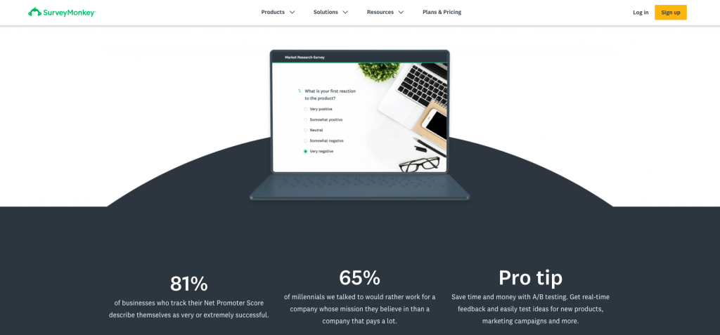
For an example of how you can do this, check out the SurveyMonkey website. Knowing that businesses want solutions that will help them reach specific and measurable goals, this brand includes statistical data about the benefits it offers.
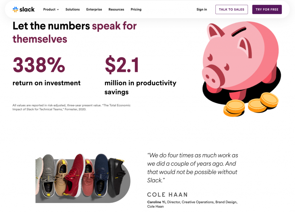
And Slack goes a step further, presenting research data from a third-party source coupled with feedback from industry leaders (like the director of Cole Haan) to give potential B2B customers a taste of what they can achieve if they try the solution out (for free).
Conclusion
These UI design tips are all easy to implement. However, the results they promise are sure to have a positive effect on B2B audience engagement on your website, ensuring that your potential clients recognize the value your brand offers and have the highest chance of converting.
Nonetheless, if you feel unsure about the exact UI tweaks that will have the biggest impact on your site, it might not be a bad idea to employ the services of a professional, B2B-oriented web design team.