Top 10 Leading Web Design Trends for 2022
Top 10 Leading Web Design Trends for 2022
Web design is an intersection point between technology and creativity. Considering the rapid development of new technologies so far, we can expect design to flourish in the following years as well.
Designers have a lot on their minds for 2022. There’s something for all tastes and needs: vintage, futuristic, experimental, and more. In all that variety, there seems to be one common element: Many of the trends will oppose minimalism, which has been ruling the modern web design trends for some time. People have had enough restraints and desire more vivid designs.
Now let’s learn more about trends that will shape the look of business websites in the following year.
1. The Spirit of the ’80s Is Alive Online
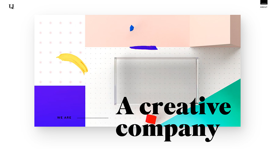
One of the main characteristics of the joyful Memphis style is soaring colors and shapes. This style focused on adventure, authenticity, and positive energy.
Traditionally, Memphis design playfully opposes the minimalistic aesthetic. The founding father of this trend was Ettore Sottsass, who in 1981 gathered a group of artists and designers to discuss how to blend Pop Art, Art Deco, and other influences to make a new postmodern interior design style. The group accepted the name Memphis because during their first meeting, Bob Dylan’s song “Stuck Inside of Mobile With the Memphis Blues Again” played in the background.
This design style stands for spontaneity, friendliness, and accessibility. There’s no way a visitor could forget a powerful explosion of colors on the screen when they open a page designed in Memphis style. Therefore, this style is particularly suitable for websites that are hosting audiences mostly comprising young people, creatives, or those that feel that way.
2. Borders Are Revealed
The age in which we currently live is marked by demands for greater transparency in online life as well as in politics and society in general. These trends leave their mark on web design as well.
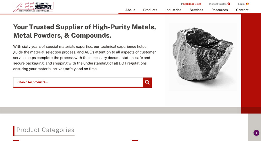
Put in a humorous way, this style implies UX/UI designers are becoming more honest with website users. Namely, the page blocks, segments, and borders they usually work with are now becoming visible for visitors as well. The borders that clearly mark out the grid that organizes the page leave an impression of tidiness and order.
Being slightly retro as well, this design is especially suitable for websites that need a strict way to arrange great amounts of content.
3. The Digital Return of Brutalism
Brutalism is one of the most controversial architectural styles, dating from the ’50s and ’60s. Its name doesn’t come from English “brutality” but instead from the French word “brut,” which means “raw.” This architectural style spilled into digital design around 2014 and has been attracting a lot of attention ever since.
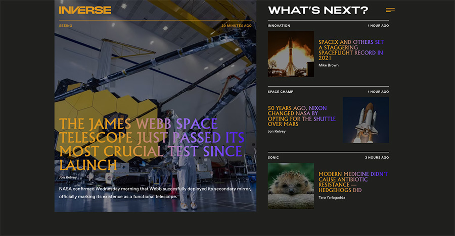
The so-called “neo-brutalism” is based on and can combine several principles:
- Exposed HTML
- Austere and simple layouts
- Asymmetry
- Default fonts such as Helvetica
- No photoshop
- Overlapping elements
In essence, neo-brutalism is straightforward, simple, and structured. Websites are easy to navigate, without any excessive animation or decoration. What color, animation, and decoration they do have is carefully considered. Therefore, it is perfect for selling platforms and editorial sites that aim for wide audiences that aren’t especially skilled to navigate complex online design. At the same time, neo-brutalism is capable of impressing a highly educated audience as well, as it is a well-known style that marked the development of world modernity.
4. Homepage Videos
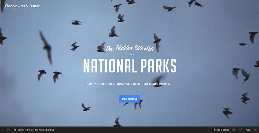
Embedded videos are a great element of surprise for a homepage; they can make a big impact when we have a lot to say and show in a short period of time.
For example, videos are great media for showcasing the company’s culture: In a matter of seconds, we can see the employees, the interior, the tools they use, etc. The same thing can be communicated through words; however, it wouldn’t be as appealing or effective as it is with a video.
While homepage videos are more common these days, they do take a lot of work to make sure that they don’t slow your website loading speeds, but when well implemented and optimized, they can be impressive to users.
5. Animation and Interactivity
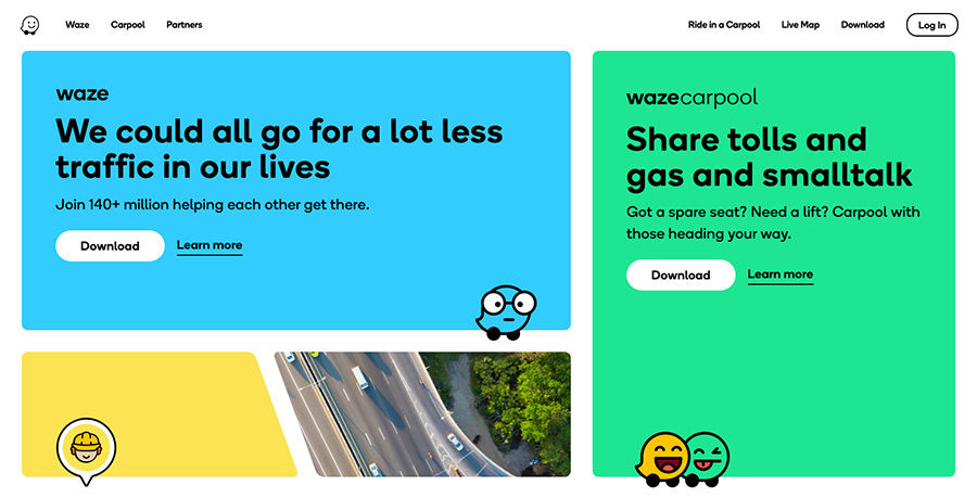
Unlike the tech-nostalgic trends, this one embraces the power of the most recent animation. Animation is not only eye-captivating—it is also a great way to engage people with interactive content. With animation, the potential for interactivity is limitless. There could be peculiar clicks, scrolls, or WordPress sliders, and much more. The page should have a drop of an enigma in it and thus require the visitor to play with it in order to figure out how it works.
A word of caution: It’s important not to exaggerate with interactive effects, as they could take away too much attention from the website’s content. If they do, all benefits of SEO-optimized content could be potentially wiped out.
6. Partying Like It’s 1999
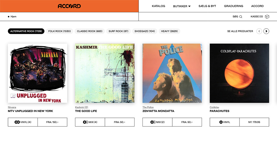
Nostalgia for the old days is an inevitable syndrome of everchanging modernity, and the World Wide Web is no exception. In several decades of existence, the internet has changed a lot, and some designers decided to remind us how it all looked back at the beginning.
This style is popularly known as the ’90s Web 1.0. It is inspired by the rudimentary look of initial websites.
Paradoxically, although it is inspired by old-school web design, this is a highly innovative trend. We haven’t seen much of Web 1.0 since it first came into being. On the one hand, this means that it is still open for contributions and new conceptualizations. On the other hand, the style is not yet fully defined, which brought many comical design failures. Therefore, this style is great for websites of those businesses that favor tech-savvy, informal, and playful content and audiences.
7. Animated Text
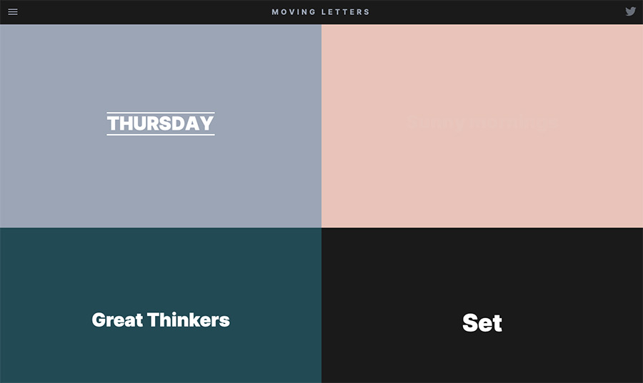
As 2022 will keep bringing down boundaries between text and images, we will see much more animated text. Moving lines we usually see in the news will now come to websites as well. Designers noticed that they have a great power to seize people’s attention and are, therefore, further able to leverage audience retention and appreciation. Animated typography, either linear or circular, is an eye-catching alternative to overwhelmingly complicated animation.
This is another innovative trend for the following year, as animated typography wasn’t seen much in the previous years.
8. Next-Level Scrolling Experience
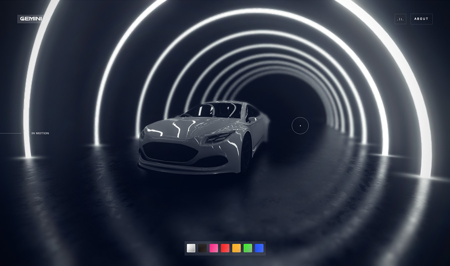
(Note: Turn your sound off if you don’t like autoplaying music!)
The scrolling design solutions take a flat-screen website page and make a tube out of it. This means that navigating the site takes you on a 3D journey.
Although not new, scrolling experience websites are supposedly going to become very popular in 2022. Their highly creative and innovative solutions attract people willing to experiment. The visitor is exploring the site’s content as well as design, making the scrolling experience highly engaging and entertaining. For such reasons, it is appropriate for niche businesses and those with any type of highly innovative content. Artists, creatives, designers, and people with very specific interests and hobbies are a perfect audience for this kind of design.
9. Handmade Imperfection Is Desirable
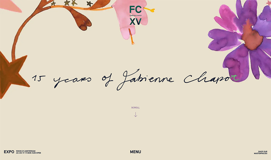
Year by year, technology is cutting deeper into our lives. It provides so many opportunities and solutions, but sometimes people miss the human touch. Rather than avoiding it, this design style uses imperfection to its best advantage.
Instead of templates made by digital design tools, some audiences want to see hand-drawn artworks. Scribbles, casual drawings, imprecise cuts, lack of templates, and spontaneous creativity—that’s what this trend is all about.
10. Words Take the Place of Images
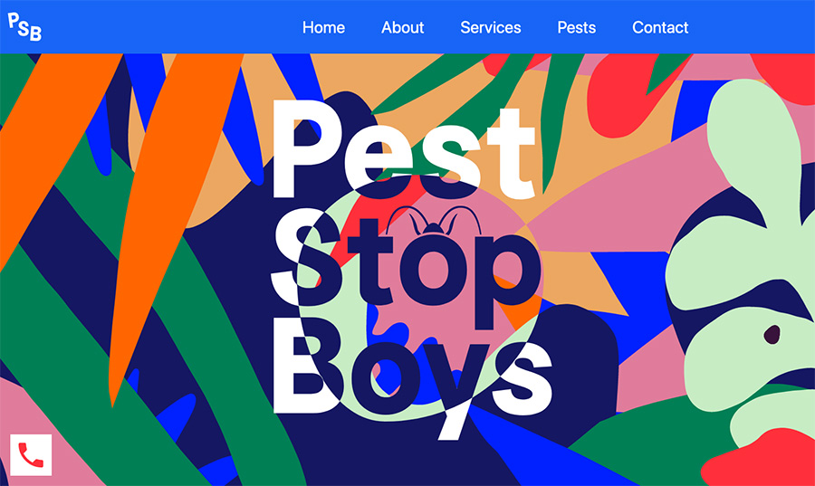
Some web designers decided to reconceptualize the hero images. Instead of letting pictures speak a thousand words, they let the words speak for themselves. The resulting websites welcome visitors with simple yet very bold statements. This is another form of postmodern minimalism.
The words that take up the space of former hero images are written in large font sizes. They attract our attention, the same way breaking news and striking headlines do. Subconsciously, we have learned that large captions carry important and urgent messages.
As the letters come to the forefront, designers put special attention on colors and font styles. This postmodern typography-based style offers a wonderful opportunity to experiment with innovative yet elegant fonts.
Conclusion
Based on web design trend predictions, we have a lot to look forward to in 2022. Web design will be highly innovative and will require web design project management teams to think outside of the box. It will seek to create joy and strive toward accessibility. Artistic trends have always been products of their social environment and historical circumstances—the coming year won’t be an exception. The unconventional world will produce unconventional design solutions.
Want to get ahead of web design trends in 2022? Give the custom web design professionals at Lform a call.

