UI vs UX: 3 B2B Usability Issues to Be Aware of
Even though everything is clickable, loads and looks great on an app or website, it only “works” if it leads customers to the desired outcome. If potential customers don’t book a consultation, can’t find the information they’re looking for, or leave your app or website quickly, there must be something wrong. How do you find out exactly what it is without having to start from scratch?
There has yet to be an app or product that was perfect right away and left untouched after launch. Even after a careful development process, you can always run into some bugs, or at least see room for improvement. You live and you learn—the same goes for your product.
The goal is to prevent having to make major changes after launch. Not only to avoid confusion for your customers, but also for yourself. Fixing bugs can cost a lot of time and money, so it’s best to prevent them as much as you can.
Usability issues can be flaws in the design, code, or backend. They can cause frustration amongst your users, and you could be missing out on sales or valuable interactions with your customers. It can be pretty disastrous, especially if you realize that potential customers only give you so many chances before they completely give up on your app or website.
Before you launch your product, make sure you’ve done extensive usability testing. Let’s look at how to do that in the most efficient way.

Back to Basics: Four Steps to Identify a Problem
1. Identify what undesirable outcomes potential customers are experiencing
This starts with knowing what the desirable outcome is. Here’s an example: usability testing is not about finding out if your app works. It’s about finding out if users can succeed in their desired actions or intentions in an intuitive way. It’s about them—not you.
There are different indicators of usability issues, one of which is the number of sessions a user engages in and the duration of those sessions. Does a potential customer leave the app or website before making a purchase or before they reach the “final” page? If so, there’s a bump in your roadmap that needs to be addressed.
2. Identify where the problem is
If the problem is obvious like a broken link or a piece of code that’s not working, consider yourself lucky. Issues are often hiding in plain sight. A design might look flawless at first glance, but once you start using it, you realize it’s not intuitive and doesn’t provide a pleasant user experience. Maybe your copy is too confusing, or maybe you’re using uncommon icons that potential customers don’t recognize. Practicality and functionality must always come first.
3. Determine which segments experience issues
Who is experiencing issues? If it’s everyone, move on to point number four. But if you notice that it’s specific segments of your target or testing group, you’ll want to give them some extra attention and consider their user journey when making changes to your website’s usability.
4. Assign a severity level
Some issues deserve more and quicker attention than others. Front-end problems can wait if there are issues that kick your users out of your app. Prioritize by using these three factors to figure out what to fix first:
- Frequency: how often does the problem occur?
- Impact: what does this mean for your desired outcome?
- Persistence: does the problem drive users away, or can they get over it?
There are five categories in which you can place the issues you find:
- Non-issue: feature requests or reported issues that turn out to impact very few users.
- Low: problems that often have to do with your product’s appearance. It might not be the prettiest thing in the world, but it gets the job done. Typing errors or pictures that are blurry or cropped in a funny way don’t impact usability, but are of a slight annoyance to users.
- Medium: these problems are more frustrating. The user can still get to the desired outcome, however there may be ways to streamline the process for them in the future.
- Serious: issues you want fixed ASAP. They make your potential customers frustrated enough to leave because they can’t reach the desired outcome.
- Critical: if a potential customer can’t complete the necessary tasks to reach the desired outcome, you want to fix it right away. Proper quality assurance testing should find these critical errors before a product launch, but if they arise they are of this highest priority.
Now that you know what to look for, it’s time to actually start testing. Here are three ways to do so:
Strategy 1: Use the Wireframing Testing Method
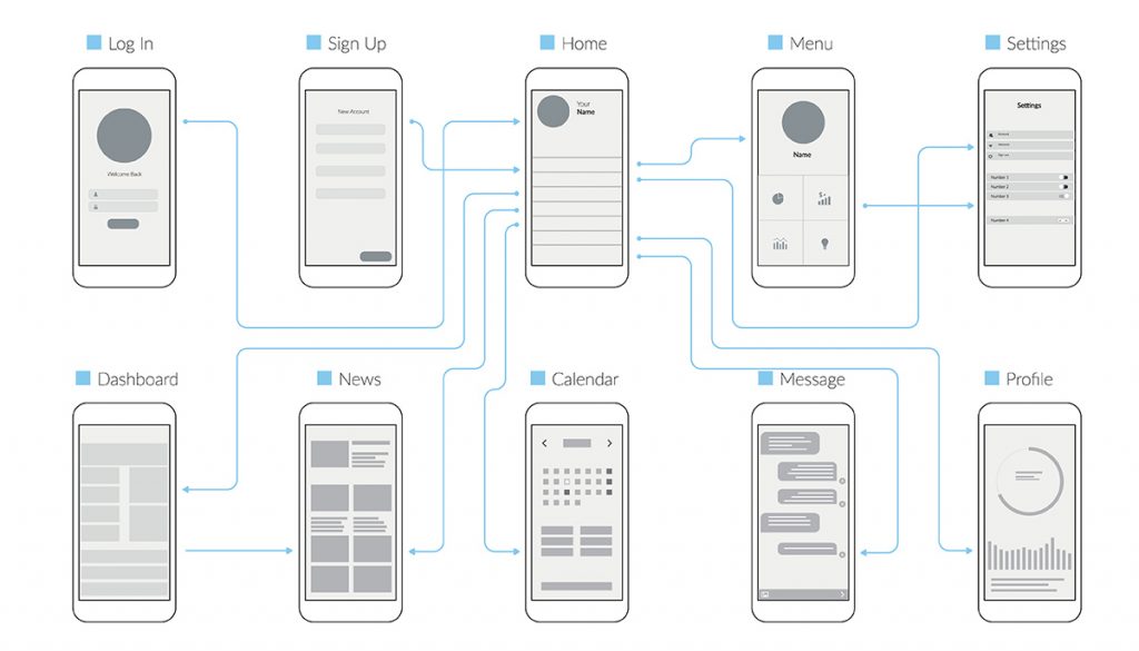
Before you spend all of your time and money on testing a seemingly perfect design on your target audience, use the wireframing testing method by testing the basic framework of your design. For this, you only need the simplest version of what your design will look like.
You’ll make a simplified version of your app or page that only includes:
- Layout: how all relevant elements are distributed on the page.
- Functionality: how each element will work.
- Information Architecture: how information will be presented to the user.
- Flow: what steps a user has to take to come to the desired outcome.
That’s it. No styling elements, fancy fonts, or colorful graphics. Think about it this way: by concentrating on how something functions and how it looks you can identify many issues before more time is dedicated to a final UI design.

Strategy 2: Use Tools to Test Usability
Usability testing doesn’t have to be done manually. Whether you are in the stage of qualitative or quantitative testing: there’s always a tool that can make it easier.
If you’re only planning to do qualitative, in-person usability testing, all you’ll need is a prototype of your product to present to your target audience. However, if you have to conduct your testing sessions remotely, or you don’t have the time to sit down with dozens of potential testers to collect a large amount of data, you’ll want to use a usability testing tool.
Usability testing tools help you test and validate usability metrics with feedback and supporting data. Here are some tried—and—tested tools you could use:
- Maze: this user research platform enables you to collect qualitative and quantitative usability data and even test copy. Want to learn more about testing? Everything you need to know is in their Maze prototyping guide.
- Lookback: see how users interact with your product in real-time.
- UserTesting: see, hear, and talk to customers as they interact with your product and get qualitative data—even when testing remotely.
- TrymyUI: want to see if and how potential customers reach the desired outcome? This tool lets you run usability tests that give you videos of your target audience completing the tasks you’ve created.
- Hotjar: heatmaps can be incredibly useful in tracking how your website is being used. Hotjar is the perfect tool for this.

Strategy 3: Guerrilla Usability Testing
Wireframing and using tools to test your prototype can be pretty time-consuming. In the end, finding the right audience to test your prototype can be quite a hassle. But what if you become a little less picky and simply gather a bit more data?
Guerrilla usability testing is a fast solution for usability testing that’s perfect for teams who want to launch both quickly and carefully.
Even if you test your prototype of your product on participants who aren’t your target audience, the data you collect may still be helpful.
- They have never seen your product or design. Seeing how they react to it can easily highlight flaws that you have become blind to.
- They don’t know what is expected of them, so you’ll see them use the app in a more realistic environment.
- They could still be a potential customer that provides valuable information.
Guerrilla testing derives its name from the army. The term, “guerrilla” is used to describe a small group of armed forces who launch quick, unexpected strikes. They lack resources but make up for it by aiming at specific targets.
In the past few years, the term has been adopted by the marketing industry to describe impromptu and unconventional marketing efforts. Now it’s made its way into testing as well.
Ready, Set, Test
Once you’ve identified and categorized all of your usability issues, it’s time to start fixing them. Having an overview of what the issues are and their levels of severity can help you tackle them more efficiently. Fixing one issue might subsequently fix smaller ones as well—saving you even more time.
Luckily, Lform can help you save even more time by doing the hard work for you! Take a look at our design and marketing services and contact us today to learn more.


