UX Writing Tips: 8 Ways to Engage Users with Microcopy
User experience is a key factor in any brand’s digital presence that should never be overlooked. Websites are designed to attract, engage, provide ease of navigation, and be filled with content that will educate, entertain, and inspire. The goal is to turn first time and returning visitors into customers. There may be several conversions in between all of this such as free downloads, limited time offers, marketing email subscriptions, or other types of channel funnels.
All of this content can be termed “macro” and it can include not just text but also lots of visuals and media, all of which help keep users coming back for more.
But there is another type of copy that can be just as compelling and should not be underestimated as part of how users can be engaged and motivated to convert. This is known as microcopy.
What is Microcopy?
When you arrive at a website, you are greeted by a myriad of content. Most of it is in the form of macrocopy such as blog posts—like this one you’re reading—or on page content such as products, services, and information on a company’s history. But there are also small bits and snippets of copy that can help customers move along their website journey and are important for the user experience—captions under pictures, short little snippets that accompany displayed products, call-to-action button copy, even the verbiage in form fields that tell a user what to enter.
These pieces of microcopy are used to engage, cue, or guide users and keep them informed of what is going on as they take action and it does impact user experience, probably more than most UX designers might think.
Consider when you place a product order on an e-commerce site. This is a website flow you might expect:
- You choose a product and click the “Add to Cart” button.
- The cart informs you with a small “1” that an item is in your cart..
- You are then asked if you want to “Continue Shopping,” “View Your Cart,” or “Checkout.”
- You decide to check out.
- From this point, you are taken to a page where you choose whether to check out as a “Guest” or “Login” to or “Register” an account.
- You then proceed through the checkout process, selecting your preferred payment method. You also enter other information that is required to complete the order.
- Finally, your order is “Confirmed,” along with an order number and a statement that you will receive via an email confirmation.
All of these small messages are examples of microcopy, and they provide the user with instructions and important information. When customers are not given the right microcopy, they may become frustrated or confused and abandon their carts rather than try to figure out what to do next. Obviously, this impacts sales and profits.
Microcopy Goes Beyond Just Instructions
Instructions are functional microcopy, meant to assist the user if their next step isn’t completely clear. They just need to be seamless and serve the user’s needs. But there are types of microcopy that may also require some creativity and even some psychological elements. Here are some important examples that can make a difference for your brand’s customer experience:
1. Calls to Action
From a psychological standpoint, users do not want to feel forced into actions that make them uncomfortable. Asking for information, such as an email address, too early will turn them away. However a well placed and written call to action will let the user know what action they need to take in the conversion process.
Here are some tips on common CTA microcopy uses:
- Having a CTA that directs a user to “Register” on your site before they get to the shopping or checkout process can cause them to leave. The better microcopy is to offer the options, such as whether or not to receive special offers much later during the checkout process.
- “Start Your Free Trial” is an engaging piece of microcopy. “Start Your Free Trial: No Credit Card Required” is much better. Too many consumers have gotten into monthly payment plans through free trials, and it’s bothersome to cancel them. This small note lets them know those risks have already been mitigated for them.
- When purchasing a service with different plans and pricing, it is better to direct customers to information on the pricing plans before directing them to sign up. They want to see pricing first, and have a right to this information before the “Sign Up” CTA.
2. Search Boxes
This is one of the most commonly used microcopy features on sites that offer a variety of products or on large blogs that have categorized their topics for users to search. And it is one of the most important microcopy features that large retailers must make easy for consumers.
Here is Amazon’s search bar:
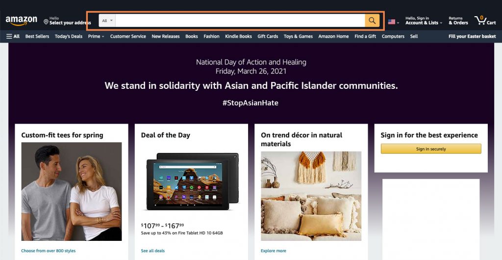
The most important element of this snippet is the “all” with the arrow. This allows customers to search by alphabetized categories. And many of those categories are further broken down, such as technology (monitors, computers, tablets, phones, etc.). The more detailed a search can be made, the happier the customer.
Now, check out the search feature on The Home Depot.
It begins with this:
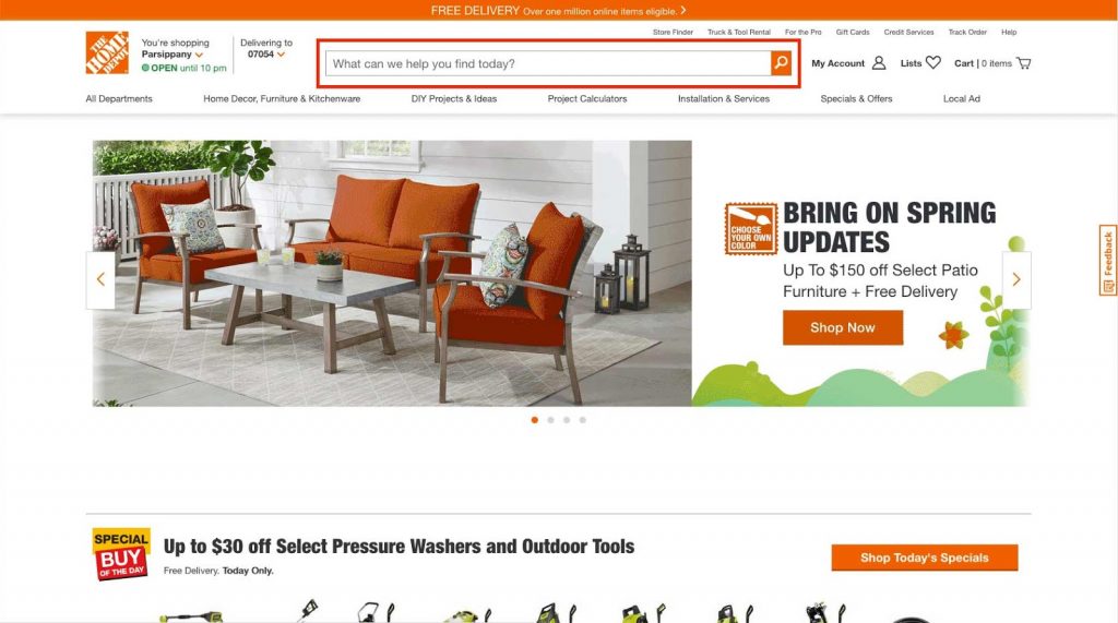
Alternatively, to accommodate any user’s style of browsing, the website also offers the most common search categories right underneath.
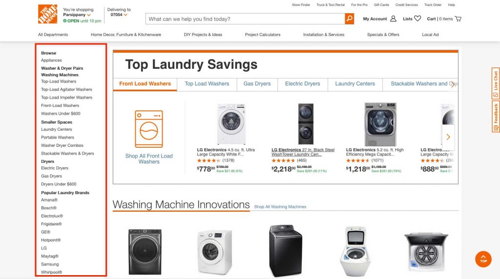
Once a consumer has conducted this initial search—let’s say for appliances (under all departments) or just by typing in the appliance he is looking for in the main search bar)—they are further directed to greater detail. When a customer is looking for a washer or dryer, for example, here is what appears on the sidebar.
If he wants a built-in dishwasher and clicks that category, he will then be directed to the appropriate page, but is given further search options on a new left sidebar – brand, price range, color, and even type of finish.
By the time this customer’s search is completed, they will have narrowed the options to those few that meet their requirements. All of this provides a great user experience and gets them to exactly the right place.
A key point in these examples: your search bar must be quickly seen, not hidden somewhere on the side, and the more options a customer has, the more detailed you will have to get with additional search categories.
3. Picture Captions
Here is where you can get a bit creative and more engaging than just focusing on functionality. If your site provides photos of your products, how can your captions allure a customer?
Target, a brand many consumers are highly familiar with, often uses language that helps their brand message and engages their target audience:
Writing microcopy that properly reaches our to your target audience can be a difficult staff. While some companies (such as the above) employ professional writers, you may need to hire professionals to help. Whether that is freelance writers or a dedicated partner company (like Lform Design!) achieving those engaging captions could be well worth the cost and effort required.
Moving on to Some General Microcopy “Rules”
The three tip categories above should give you a general idea of what microcopy is and why it is so important to the user experience.
Now, let’s look at some general “rules of the road” as you design your own:
1. It Must Be Concise
There is no room for wordiness. Get to the point and be compact and be clear. Wordy, fancy microcopy may do more harm than good.
2. It Must Be All About the User
When you craft microcopy, you must keep in mind not what you want but what the user wants. What are his goals in navigating around and getting the information he needs—quickly and seamlessly?
3. Be Clever if You Can
Of course, you cannot always be clever and concise at the same time, especially when dealing with a checkout process. But if you can, do so. Remember those Target picture captions?
4. Match Your Audience’s Voice Tone
When crafting microcopy (and as a rule any branded content), matching your audience’s voice tone is key. For B2B companies, a more casual and inviting tone may be apropos while in the B2B realm a more professional and straightforward tone may work better. Doing proper audience research can help with understanding your customers.
5. Keep it Simple
Users don’t want to be confused, suspicious, or anxious. They need to know exactly what to do; they don’t want to give up personal information early on; and they don’t want to leave after making a purchase, wondering if it really went through and if they will get a confirmation.
The Ultimate Goal of Good Microcopy
Online shopping has exploded in this past year, and it is likely that as more and more consumers become comfortable with this venue, it will remain at such high levels after we return to some semblance of normalcy from the current global health crisis.
And this is why microcopy has become more important than ever. It is those small snippets that achieve two goals—customer trust and satisfaction.
People do worry about getting scammed; they worry that their emails will be stuffed with promotions or, worse, shared with other vendors; they worry that they will get locked into long-term purchasing commitments; and they worry that their financial information could be compromised. Microcopy that sets them at ease (e.g., “we never share our customer emails”) can go a long way to promote trust.
People also want to be satisfied. This happens when the microcopy directs them quickly and seamlessly to what they want and makes it easy for them to “get there.”
UX designers should take long hard looks at their microcopy and achieve these two goals.
About Kristin Savage

Kristin Savage is a writer, editor, and marketing consultant to a number of small-to-mid-sized online companies in their copywriting efforts. When not working, she subjects her friends to her gourmet cooking experiments and plays the keyboard with a local band.