Branding 101: Create a Memorable Brand with These Tricks

Whether you are looking to launch a web based business or traditional brick and mortar shop you need to pay attention to branding. To stand out from your competitors you need to create a recognizable and memorable brand. This is easier said than done. Branding isn’t just simply a bunch of pretty designs and marketing slogans. Building brand recognition takes times and effort and needs to be done in a consistent manner. Let’s explore some branding best practices to help you set your brand in the right direction from the start.
Figure Out Your Messaging First
During the startup phase most entrepreneurs just want to be hands on and get lots of things done to get the venture off the ground. When it come to branding it’s best to take a step back and to slow things down. Before your start with any graphic design you need to figure out your messaging. If your designs don’t aligned with what your business stands for it won’t resonate with your core demographic. The first step is to define what you want to say with your brand. What are your core values? What’s your mission and vision statement? With those in place you can clearly define your messaging and then choose your creative direction accordingly.
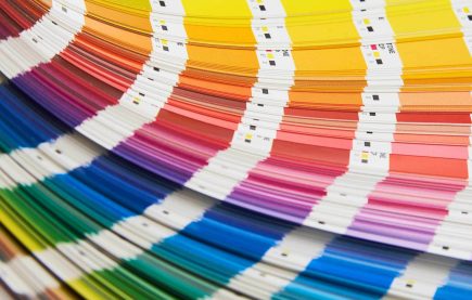
Your Brand Colors Are Crucial
Once you have your messaging in place it’s time to choose your branding colors. Don’t make the mistake of simply choosing a few pretty colors for your logo and other branding assets. It’s important you take some time to understand the psychology of color and how it influences buyer decisions. Colors all have different meaning and evoke different emotional responses. For example blue is a color that is used by many financial and insurance providers because it stands for reliability, trustworthiness and dependability. Purple on the other hand coveys the meaning of nobility, royalty and often represents luxury. With an understanding of what different colors mean choose your core branding colors and then a matching set of accent colors.
Set the Right Creative Direction From the Start
Now that you have set some parameters around color choices it’s time to jump into the fun part of branding – the design process. Whether you are taking a do-it-yourself approach or hire a professional designer start your branding design exercise with your logo. Your logo is your foundation for your entire branding and sets the creative direction. If your logo and other brand assets don’t match you’ll end up with an inconsistent brand, which will look unprofessional. When it comes to your logo design keep some design rules in mind. In order to create a memorable logo it’s best to keep things simple. Simple and clean lines and shapes are much easier to remember. If you are going with a brand mark design or combination mark make sure your logo graphic is simple in nature. In addition to using a simple graphic don’t overdo colors and effects. Try to avoid using more than three colors, any more and the design can quickly get too busy. The same goes for effects and heavy use of gradient. If you are going to do it make sure it’s done in a subtle way.
Build Out Your Branding Assets
Once you have finalized your logo it’s time to approach all of your other brand assets. There are lots of brand assets you may want to create but it’s best to start with the ones that are most impactful. Start with your website and make sure you create a cohesiveness between your logo and website. Upload your logo in high resolution format and use your core color throughout your website. With your website up and running as your first branded promotional asset it’s time to build out other important items like business cards, social media accounts, presentations, brochures and more.
Here are some tips to create consistency across all of your branded designs:
- Use Images: In addition to implementing your logo and core colors across all of your branding material make use of images. Don’t simply choose random images but find a set of professionally shot photos that you can use across all of your designs. These images will have the same style and feel since they are most likely shot by the same photographer. Try a site like Gratisography to find free photos with commercial rights.
- Implement Icons: You can elevate any design with the right use of icons. It’s important you use professional icons and not clipart style designs. Just as with pictures it’s best to find a set you like and to use those icons exclusively. This will give your brand even more consistency. Try a free icon source like Icon Monstr to get you started.
- Use Fonts as a Branding Aid: Fonts are often overlooked when it comes to creating a memorable and consistent brand. Choose a couple of different fonts that you’ll use across all of your content pieces from your blog articles, social media posts, presentations and email newsletter.
In order to create a memorable brand your implementation has to be consistent and deliberate. If all of your branding material showcases your logo, brand colors and makes clever use of visual aids like images, fonts and icons in a consistent way you’ll create a memorable brand over time.
Lilliana is a recent graduate of the University of Virginia. She’s passionate about entrepreneurship, has a keen eye for design, and enjoys writing in blog post format. She loves freelance writing because it allows her to produce helpful content, especially for female entrepreneurs.