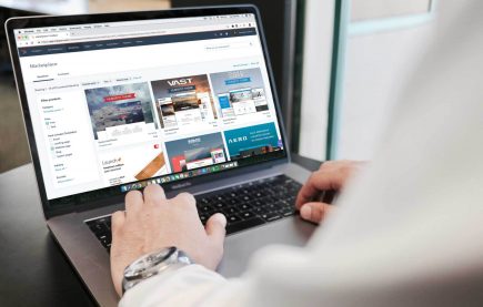
9 Usability Issues To Get Right To Convert in E-Commerce
E-commerce websites are not bound by location, making it possible for budding entrepreneurs, small business owners and huge organizations alike to use the internet to make sales.
However, there are an estimated 12 million to 24 million e-commerce websites worldwide, with thousands of new brands gaining traction every day. In this competitive market, e-commerce businesses need to do everything they can to stand out from the competition.
E-commerce websites are also a firm favorite for consumers because they are convenient and allow them to get pretty much anything they need delivered to their door. Who doesn’t love doing their shopping from the comfort of their own sofa?
The problem is, with so many choices, consumers can afford to be fussy about which websites they use and where they shop. This is why businesses need a strong website that offers the best possible user experience, making it easier to convert visitors to customers.
If you see lots of traffic to your website but you’re not getting the sales you want, you might have usability issues. Here are nine common issues you need to fix if you want visitors to convert.
1. Put Time Into Your E-Commerce Homepage
Your homepage is your first impression; it sets the tone for the rest of the website and can attract and engage users or deter them. If it’s difficult to use or poorly designed, you could see a much higher bounce rate. Your homepage must be easy to navigate with a primary navigation menu that gets users on their way.
It should quickly display your products and any relevant sales or important information. It also needs to be attention-grabbing and match your branding.
2. Optimize Web Fonts for Legibility
Another common pitfall for e-commerce websites is not choosing the right fonts across the website. Of course, having a well-designed and attractive website is crucial, but choosing the right fonts is a massive part of this as it determines its readability.
All writing on the website needs to be in a clear font that is easy to read, but it also needs to grab the user’s attention. This means getting the balance right between color, size, visibility, and font type. This ensures that your visitors can find all relevant information in the shortest possible time.
Whether you created the site yourself or hired a web developer, if you get this basic aspect wrong, your site will be far less usable and, therefore, less likely to convert.
3. Don’t Overcomplicate Your Navigation
Your website needs a straightforward, easy-to-use navigation menu to help customers get from your homepage to make a purchase. This means a simple and neat structure that makes sense.
Your most important categories should make up the headings of your primary menu. Then, where appropriate, add subcategories.
For example, a clothes retailer might include Men’s, Women’s, and Children’s categories in their primary menu. Then, underneath these, they could list subcategories, such as Tops, Pants, and Shoes.
4. Implement a Search Bar for Easy Navigation
Some customers will come to your site already knowing what they want to buy, so they don’t want to spend ages sifting through your categories and navigation bar. In these instances, when users want quick results, they’ll look for a search bar.
If you don’t have a search bar or if it’s difficult to find, they might become frustrated with your website and leave to shop elsewhere. By ensuring your search bar is clearly visible, you can instantly improve the user experience.
Not only this, but if the search bar provides no results, users may get disheartened, so it’s a good idea to provide alternative suggestions whenever possible.
5. Make Sure You Have a Guest Checkout Option
We’ve mentioned that some people know what they want and are looking to get their shopping done quickly. In these cases, it can be frustrating to have to create a user account and fill in lots of unnecessary information.
Offering a guest checkout option can make it much simpler for those who don’t want to sign up for an account. This makes it quicker for them to complete their purchase, making them more likely to convert.
In fact, a recent survey found that 43% of consumers prefer to check out as a guest, and 72% of those will choose this option even if they have an existing account on the website. So, e-commerce websites that don’t offer a guest checkout are likely to see higher bounce rates and more abandoned carts.
6. Produce High-Quality Product Thumbnails
Customers like to shop through e-commerce websites to replace having to go to a physical store. But this doesn’t mean they want to shop blind without seeing the products first. Of course, you can provide pictures of the goods, but it’s also a good idea to include thumbnail images for every product.
This way, if a consumer is quickly searching for items, they can easily see whether the thumbnail image matches what they’re looking for. This allows them to add the item to their basket without clicking around too much.
7. Labeling All the Steps in Your Checkout Process
An unclear checkout process can cause customers to abandon their carts quickly. Therefore, it’s important to label each step of the checkout process and guide users along the journey—even if it seems self-explanatory.
Each process along the way must have a clearly labeled heading and a button that moves the customer to the next window. This makes checkout a smoother experience for the user.
8. Consolidate Form “Name” Fields
It might sound silly, but when customers are trying to check out and they’re in a hurry, they don’t want to waste time filling in lots of unnecessary fields.
Using a single field for all their names, rather than having three fields for their first, middle, and second name, can make a huge difference.
9. Show Recently Viewed Items
Finally, you can increase the usability of your e-commerce website by adding recently viewed items to the bottom of the page.
Users might go back and forth, looking at different products before they decide what to buy. Having to keep repeating the back button or re-searching for items can be frustrating, so offering recently viewed items can make it much easier to jump back and forth between products until the user settles on what they want to buy.
In Conclusion
E-commerce websites can be difficult to get right—from making sure that products are easy to search and the website is a breeze to navigate, to taking care of smaller details like the proper use of typography. While we’ve outlined a few key areas, there are myriad other considerations. If you’re having trouble starting or improving an existing e-commerce website, reach out to the B2B website experts at Lform Design to learn how to optimize sales in your e-commerce platform.
About Stuart Cooke

Stuart Cooke is the Marketing Manager at Irishparcels.ie. They are a courier comparison service that helps online businesses find the best shipping solutions for their products.