6 Essential Landing Page Elements to Optimize for Better Conversions
Are you building your first landing page? Or do you want to improve an existing one and enhance conversions? Creating a landing page that lives up to visitors’ expectations and encourages them to interact with the website is a considerable challenge.
Landing pages are gates introducing potential clients to the business. People can see them after clicking a link from social media posts, email newsletters, or ads, and they expect the landing to propose solutions to their problems. So, depending on the traffic source, this page may change—creating some difficulty for a website owner. What should a landing page include to collect users’ information, increase subscriptions, and sell goods without driving those users away?
There is no one-size-fits-all solution for landing pages. But it should include some crucial features to meet your business goals and move prospects further into the sales funnel. This article will introduce you to some essential landing page elements and best practices for optimizing landing page content.
Why You Should Optimize Landing Pages
What do business owners expect to see on their websites in the first place? Typically, they expect a homepage, blog, shopping cart, checkout, and product catalog with e-commerce filters, or pages introducing services and solutions. A good landing page can introduce these elements and tie them all together.
Types of Landing Pages
A landing page is a specific place to gather information via lead forms, launch promotions, and convert visitors into leads. For many businesses, a landing page is their homepage. But in most cases, you’ll need a stand-alone page; the more you have, the better. According to statistics, websites with over 30 landing pages have seven times more leads than those that have fewer than 10.
Landing pages differ according to their purpose, your business type, and your current marketing strategy. The most common pages include the following:
- Squeeze pages for gathering email addresses
- Splash pages presenting ads or promoting events
- Lead generation pages for acquiring user data
- Video landing pages displaying a video
- Sales pages focusing on making sales rather than collecting information
- Advertorial pages for communicating with cold traffic
- “Get Started” pages for customer onboarding
However, it’s not enough to place entry fields, images, and text on the page and leave it alone. You need to make sure the landing page can maximize conversions. In other words, you need to optimize the landing page elements to convert the maximum number of potential customers into clients. By introducing, removing, or rebuilding parts of the page, you can achieve the following benefits:
- Boosting the effectiveness of your advertising
- Lowering customer acquisition expenditures
- Acquiring more clients
What a Converting Landing Page Should Include
1. A Headline That Grabs Attention
A good landing page can make or break your conversions, but it all starts with a great headline. That’s what will grab people’s attention and persuade them to take the next step in your conversion process, whether that means signing up for an email list or buying a product. Here are some best practices for writing headlines that get clicks:
- The headline should describe your offering and why it’s valuable.
- The reader should understand right away why they’ve come to this page.
- The page should convey the information to the reader in a few short, compelling sentences. Make it at most 20 words; ideally, keep it to 10.
- A subheadline should expand on the headline or emphasize what makes your offering special.
- The title should be relevant to the user and to your business. That is, it should reflect the promised information the user expected to see when clicking a link.
- The headline should encourage potential clients to learn more about you and present a solution to their issues.
Mailjet’s landing page presents a readable, punchy headline. It delivers the message in three words, passing the blink test (the period when people judge the website and decide whether to stay on it) and capturing the reader in a few seconds.
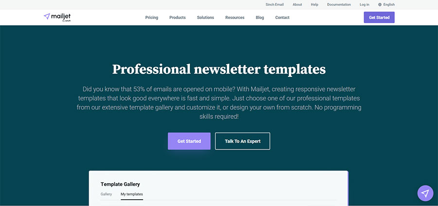
Screenshot of the official Mailjet website
2. Compelling Visuals
Once users have read the headline, visuals can keep them on the page longer. Visuals are images, GIFs, or videos that help you focus the readers’ attention on the product. How does a blank page with several lines of text look? Boring and unappealing. It will result in high bounce rates, lowering the website’s position in search results.
Numerous studies have confirmed the need to incorporate visuals into the landing page. We rely on visual information more than on words. Research shows that such information will stay in our minds longer: People only retain 20% of what they read and 10% of what they hear, but they remember 80% of what they see.
Create individualized landing pages with strong visuals to highlight your product rather than drowning consumers in lengthy segments of text. Pictures and videos not only help communicate your benefits and values but also improve text readability, increasing your chances of connecting with users.
Here are the top tips on implementing visuals on the landing page:
- Use unique pictures instead of stock photos.
- Place the image above the fold or use it as a background to liven up the page.
- Choose relevant pictures that match the needs of your target audience.
- Record a video to showcase your products, software interface, interviews with team members, or customer reviews.
Influencity leverages this strategy on its landing page. It displays numerous screenshots of the tool so that visitors can investigate its features before choosing it as a solution.
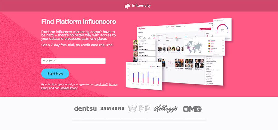
Screenshot of the official Influencity website
3. Engaging and Readable Copy
Good content is readable and helpful. The landing page should assist buyers on their journey and invite them to buy, subscribe to the newsletter, or schedule a call. Be concise but not vague. As Wyzowl’s research states, our attention span has shrunk since 2000 and now lasts 8.25 seconds. With so little time, you need to deliver the message quickly and show the business’s benefits over those of its competitors. Here’s what you can do to make engaging copy:
- Break the text into smaller sections with keyword-rich headings and subheadings.
- Get specific about valuable features and how they solve users’ problems.
- Leverage a sense of urgency and FOMO, spelling out the advantages customers lose by not utilizing your services.
- Answer potential questions and address unresolved issues.
- Emphasize the emotional and psychological satisfaction of using the product because it improves customers’ efficiency, reputation, or health.
- Make bulleted lists where possible.
- Choose the content length according to the product type. Long descriptions are more effective for pricey and complex products. Short content suits simple, cheap, or free products, or when clicking the CTA requires little effort from the user.
That’s how Hostgator presents its major benefits, followed by a table with features and FAQs.
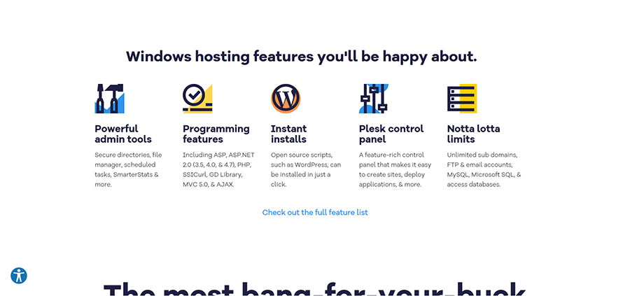
Screenshot of the official Hostgator website
4. Unique Selling Proposition
Another crucial landing page element is the unique selling proposition (USP). A USP is a statement that tells readers why you’re the best choice over the competition. It often comes in the form of a claim or headline and can be found on the landing page as well as within the main website. It demonstrates why the user visited this website.
A good USP resonates with potential customers and follows these principles:
- It addresses an issue people may have.
- It offers them something new or different, or a solution to their issue.
- It highlights what makes your company better than the rest.
You need to highlight what you offer to prevent people from leaving the website.
To best describe the USP, you need solid copywriting skills. Why? Because it’s not enough to say that you’re unique in your field. You need to know clients’ psychology and how to influence their buying decisions with words. You may want to hire a copywriter to do this job for you. So whether it’s a headline, subheadline, or closing argument, remember to present your USP.
For example, Zapier states its USP right at the top so readers can understand the tool without scrolling the page.
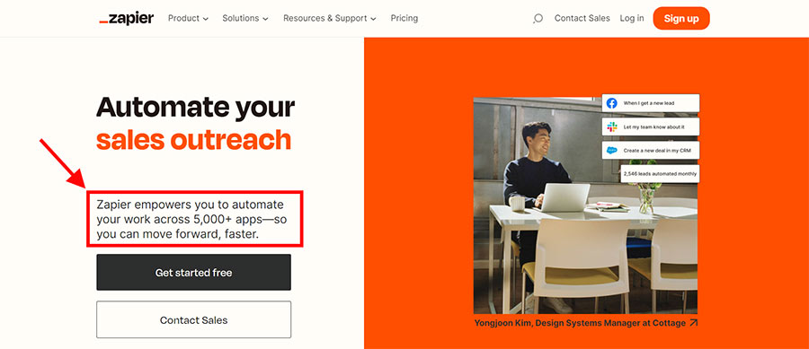
Screenshot taken on the official Zapier website
5. Reviews, Testimonials, and Trust Signals
Allow the reader to see what others say about you in order to understand your offerings better. Deliver this message on your landing page: “Don’t just take our word for it. Many of our satisfied customers become our best advertisers.”
Testimonials serve as references or endorsements from people who have used and loved your product or service. Social proof, also known as informational social influence, is when consumers make decisions based on the actions of others. For example, if an expert uses this product, you decide to buy it too. If someone is dissatisfied with a service, you decide not to contact the company.
Post clients’ testimonials, preferably with images, names, and positions. Video testimonials or interviews are also excellent in this case. You can include reviews and ratings from websites like Yelp or Amazon, along with case studies or company logos of happy customers. Be genuine and use real examples—don’t fabricate social proof.
The scheduling software WhenAvailable employs this tip on its landing page. You can read customer reviews and case studies to check whether the tool will be useful in your particular case.
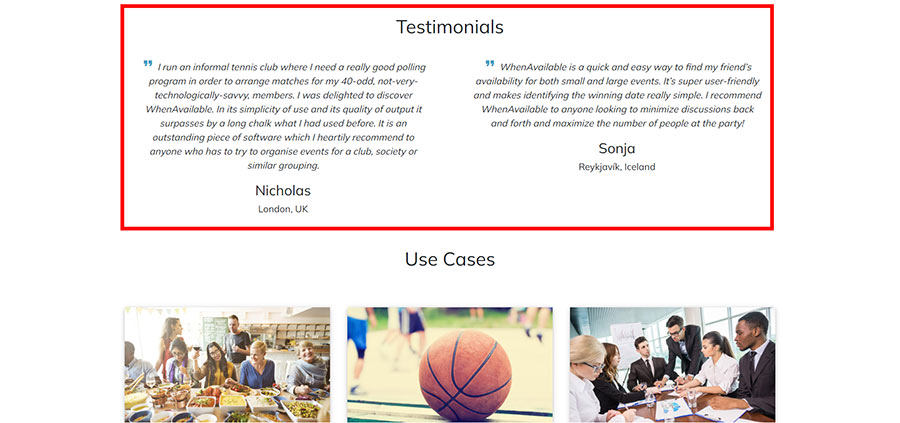
Screenshot of the official WhenAvailable website
6. Understandable Calls to Action
People have read information about the business and looked through reviews. They’re ready to convert. But where should they click? Include several calls to action (CTAs) on the landing page. These can be links or buttons initiating a particular activity. For example, they may lead prospects to another page, start an email subscription, or encourage users to buy a specific product or service.
CTAs help increase the number of conversions generated from your campaign. The most common CTA is an opt-in box, but you can also use lead generation forms or even a purchase button if it’s appropriate.
Be careful not to overdo it with too many CTAs. That can result in confusion among visitors and lower conversion rates. Two or three distinct CTAs should be enough, but they should be clear and easy to understand. Choose direct instructions, such as “Start my free trial” or “Send me the PDF,” rather than the more abstract “Click here” or “Get me informed.”
If the landing page features lead capture forms, restrict the amount of requested information. To make the process more transparent and safe, explain any use of personal information, guarantee data privacy, and ensure users can cancel their service at any time. That’s what makes CTAs from the Fiverr screenshot below outstanding:
- There are five CTAs, but the main one is the most obvious.
- The CTAs are a different color from the background, so they stand out.
- The biggest button draws attention and clearly states its purpose.
- Other CTAs look like links or smaller buttons with less importance than the principal one.
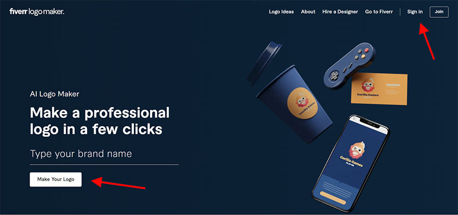
Screenshot of the official Fiverr website
Wrapping Up
A landing page is an effective lead-generation tool that you can use to achieve various goals. It can assist with gathering information from visitors about their interests and needs to customize the website content or encourage them to subscribe to your newsletter. Landing pages have evolved over time as technology advances, offering new forms and methods for developing them. However, certain unbreakable rules are relevant regardless of changing trends.
Use simple language, avoiding jargon and technical terms wherever possible. Keep the forms concise while still gathering enough information. Put your main CTAs front and center. Implement the suggested tips from this article and run A/B tests to find the best fit for your business type and audience.
If you’re looking to optimize your landing pages to increase lead generation, boost sales, or sell your products, the team at Lform Design is always happy to help. Just contact us about your B2B web design needs so that you can get started!
About Art Malkovich

Art Malkovich is a co-founding partner and CEO at Onilab. The company develops eCommerce websites and progressive web apps on a turnkey basis and offers store migration and UX/UI design services. Art has profound web development, project management, and data analysis expertise. He strives to keep the team one step ahead with a current focus on headless commerce.