Psychology of Fonts for B2B Web Design: What You Need to Know
If you are designing a manufacturing website, you’ll have all sorts of questions that need to be addressed. Details like layout, structure, color palette, user interface, and the like are often viewed as essential elements in a successful website strategy.
After all, without those key design points a manufacturing site won’t be able to fulfill its main purpose as a tool to show potential customers what the company has to offer.
But there are other factors that can make a difference in the success of a company. One of the most significant is font choice.
How do you know what type of font to choose for your manufacturing website? And what difference can it make to the overall look and effectiveness of the site?
How to Choose a Font for a Manufacturing Site
If you already have brand guidelines set, it is probably tempting to follow those guidelines during the B2B web design process. The font that you choose during industrial branding like agricultural machinery logos, for example, may seem perfect for the company.
It does make sense to use your brand fonts, to some extent. However, there are other factors to take into account.
One is considering the main purpose of your custom website. Typically, manufacturing companies use their websites as an online catalogue, demonstrating products on offer and giving potential B2B centered customers a little more information. As such, these types of sites are not usually heavy on written content.
Even so, though, the content that is there needs to be legible. It should balance text size and line height so that it is easy to read, and should show up well against the background color or image.
Outside of these typography concerns there’s even another consideration: the psychology of fonts.
What is the Psychology of Fonts?
Font psychology, like other aspects of design, relies on preconceived notions that are typically held by your target audience. As the website designer, you can expect people to respond well to certain features like a simple layout, good use of space, clean-loading images, and the like.
Similarly, the psychology of fonts tells us that certain types of fonts are likely to appeal in different ways to different audiences. Because of this, they have inherent qualities that are inferred with their use.
If you use a specific type of font it will trigger certain associations and emotions, and those will then be associated with your brand..
Putting Font Psychology to Use for You
With that in mind, it’s probably obvious that font psychology can be an excellent tool for a custom website designer.
Here’s a quick breakdown of the three main font types and how they are typically viewed.
Serifs
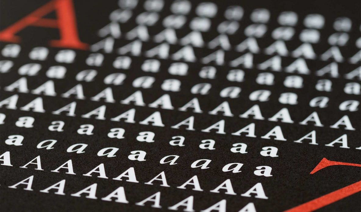
Serif fonts are those with the little extensions—called “serifs”—at the terminals of each stroke of the letter. One of the oldest types of print typefaces they were designed for mechanical printing, such as newspapers and books. Because of that, they are viewed as traditional, old-fashioned, and vintage, as well as seen as reliable, trustworthy, and responsible. They’re most commonly used in traditional print, where they are excellent for economy of space and ease of reading. In digital website design they are less frequently seen as many don’t display properly at smaller font sizes. When used they are best employed in headers and logotypes.
Sans-serifs
This type of font is missing that little “foot”—hence the “sans” part of the title—at the end of the stroke. Sans-serif fonts are a bit newer than serifs, and were originally designed as “display” type such as headers and graphics. They have evolved and been adapted and are now the most frequently seen font type for website design and development. Sans-serif fonts are viewed as modern, clean, stable, and objective. It’s interesting to note that they are often seen in a corporate context, especially in the world of tech and, by extension, manufacturing. This suggests that there’s an innate quality in sans-serif fonts that will be not only effective in a manufacturing site, but expected.
Script
Script fonts are calligraphically inspired typefaces the substitute style of legibility and may not be easy for everyone to read. They are typically seen as artistic, creative, and elegant. For the purposes of web design, they work best as an occasional artsy touch, if anything. Designing a site that relies heavily on script font would not be user-friendly.
Of course, it should be noted that, just like with the psychology of color, these general guidelines are just that—general. They won’t apply to every individual who views your site, and they won’t always fit the target user that you’re reaching.
However they are vital part of the early on in web designing strategies. Considering that there are some 550,000 fonts available out there, there are quite a few options.
Using Font Psychology to Choose Your Ideal Font
Out of the three main types that are listed above, the most commonly seen in the manufacturing realm is sans-serif. This makes sense, given the inherent qualities that come with this type of font.
Of course, just knowing the type of font you want to use isn’t the end of the custom web design decisions. There are tens of thousands of different sans-serif fonts. This list of the ten most popular font is a good place to start.
Remember that you will also likely use more than one font for the site, since contrast helps to establish hierarchy and help the user know what content is most important. But remember also that experts suggest keeping the number of fonts limited to no more than three, as throwing too many different fonts into the layout can confuse the user which may impede your user experience.
Your choice of font is up to you, and depends heavily on the type of manufacturing site you’re designing, the established branding, and the intended audience. But a basic knowledge of font psychology can be a big boost in choosing a font that will enhance the effectiveness of the site.
If you need help with choosing the right font reach out to the website development and design experts at Lform!


