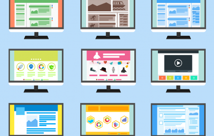
Minimalist Approach to B2B Web Design: Tips You Should Consider

What do you want people to see when they visit your business website?
You want to focus their attention on the most important content: your value proposition, mission, or some benefits for them.
In other words, you want to grab their attention and give them just enough information to understand why they need to do business with you.
To focus, though, one needs not to be distracted by some unnecessary noise. In the case of a business website, this means removing any distracting interface elements and marketing messages. A lack of distraction will be appreciated, 94 percent of people say that navigation is the most useful website feature.
That’s where the minimalist web design comes in.
Read further to know:
-
Why the minimalist design is a great strategy to engage visitors
-
4 tips to implement minimalist design for B2B businesses.
Let’s begin.
Why Minimalist Website Design is Effective for Visitor Engagement
When it comes to designing a website for an online business, less is definitely more.
Here’s why.
To engage your visitors and give them the information they need, you need to present your value proposition without unnecessary distractions.
This is one of the best reasons why minimalist design is ideal for businesses.
When we think about this web design approach, we think not only about a visual style but also a strategy. By minimizing the number of distracting UI elements on a web page, you’re focusing the attention of the visitors on your content.
Minimalist Web Design Example: Grammarly
Let’s consider an example.
The homepage of Grammarly has only a handful of design elements. There’s only one heading, CTA, and visual.
The heading – Great Writing, Simplified – explains the value proposition.
Just under it, there’s a short supporting message. The animation on the right side strengthens the message by showing how easily the users can benefit from the writing assistant.
That’s basically it.
No menu for navigation, no videos, no panoramic images, no contacts. Only flat, minimalistic design that fills the entire screen.
For anyone visiting this website, understanding how they can benefit from using Grammarly would be ridiculously easy and fast.
All because of one reason: the design was reduced to the most essential elements. It draws attention to the content and gives access to the information the visitor needs.
That’s what minimalist design is all about.
If you’d like your B2B business website to have the same design, here’s how to implement it successfully.
How to Implement Minimalist Website Design: 4 Tips for B2B Online Businesses
When we talk about minimalism in web design, we also mean an entire philosophy. Its main goal is to embrace simplicity and provide a comfortable and focused browsing experience.
To take an active part in conveying unique philosophy, many B2B business owners choose a custom website development instead of generic templates.
To implement a minimalist website design properly, consider these tips.
1. Choose the Dominant Visual Carefully
Although selecting a visual might not sound like a big deal, there’s also a lot of things to keep in mind.
Just think about it: this image will represent your brand. It will be one of the first things your potential customers will see. They will be judging your business based on that image.
That’s why you should choose the dominant visual very carefully. It might not be an image – as you saw in Grammarly’s example, graphics work fine, too – think very carefully what to use.
Another important thing is to choose a visual that makes the text readable.
Read: 10 Free Graphic Design Tools for Brand Savvy Entrepreneurs and Small Business Owners.
2. Write a Concise and Powerful Message
A brief and crisp copy is a must to make a minimalistic design work for your business.
Begin by thinking about your main value proposition for your target audience. Is it improving the customer websites’ performance with quality SEO services? Is it to improve their logistics and revenues with GPS tracking?
“Write a draft for the main message and edit it ruthlessly,” recommends Mia Danson, a senior UX writer at Subjecto. “Your purpose is to include only the bare minimum needed to explain your value proposition.”
If you need specific instructions, I’d say stick to one sentence.
Here’s how one of Barbara Feldberg, an amazing artist and Lform’s customer, explains the purpose of her website in just one, but a really powerful sentence.
Copy editing and revising could be a daunting project for non-writers. If your business doesn’t have in-house copywriters, use the help of WriteScout and Studyker or other online writing tools.
Feeling inspired by Barbara Feldberg’s website? See more examples of websites made by Lform.
3. Simplify Navigation
To make minimalist design work, you need to make navigation easy and simplified.
This means showing only pertinent navigation buttons. They need to take the visitor exactly where they need to go to get information.
For example, here’s the list of navigation options from Mattei, a manufacturer of rotary vane compressors: Company, Products, Industries Served, Transit Engineering, Resources, and Contact.
Clicking the View Compressors button on the bottom takes the visitor directly to the list of products. So, there’s no need to navigate the menu, browse categories, etc., to find a product.
4. Highlight Your Content
As mentioned, minimalistic design helps by focusing the attention of potential customers on content.
So you need to ensure that your content – the copy – is prominent and highlighted. Because that’s what your potential customers are interested in the most.
There are a few ways to accomplish that:
-
limit the use of colors on a website to make it cleaner
-
use a dominant visual as a background and keep the copy readable
-
consider placing the copy at the center of the home page (like Mattei) or on the left side (like Grammarly and Barbara Feldberg). Having the copy on the left side of a web page is a good idea because heatmaps show it’s the most popular area
Also keep in mind that in addition to the copy, you need to focus on highlighting product visuals on product pages. This could be done by using lots of white space.
Is Minimalistic Approach to Web Design Right For Your Business?
Using the minimalistic approach allows you to convey your main marketing message or value proposition clearly and immediately.
If you think that your company will benefit from a simple, user-friendly design, I recommend you review some minimalistic design examples.
It could work especially well for businesses with a limited product range that don’t need a complex design to direct users to numerous categories.
Also, remember, that a minimalistic design makes your company look bigger. Why? Because less is always more.
Donald Fomby is a self-taught content writer who’s enjoyed success with numerous popular blogs. Using his degrees in computer science and digital marketing, Donald writes quality articles and guides on content marketing, web design, UX, and SEO. Currently, he’s also a writer at TopEssayWriting and ClassyEssay. Donald focuses on sharing useful knowledge for small and medium-sized businesses on how to manage their web presence and content marketing strategies.