Six Lead Generation Forms Best Practices
Have you ever filled in a contact form? Maybe you wanted to sign up for a free trial, or you wanted the free template they are offering?
Well then, you have come face-to-face with lead generation forms.
Although there are various ways businesses can gather customer data, lead capture forms are generally the most effective. In fact, 49.7% believe lead capture forms have the highest conversion among lead generation tools. But as it continues to be a key focus for businesses and marketers right now—it’s getting harder.
So how do you stand out from the crowd?
While lead generation forms can attract audiences, they also can drive those people away. That’s why, alongside showing you six completely different types of lead gen forms, we’ll also discuss the best practices that’ll help you create a modern form.
What Are the Different Types of Forms?
Lead generation forms come in various shapes and sizes—just like the people who created them. But they all share the same vital goal—to enhance your brand’s visibility, credibility, and trust. They also help pique the interest of potential leads.
Pop-Up Form (Modal Forms)
When it comes to capturing visitor attention, pop-up forms are quite effective at grabbing a user’s attention, as users have to actively dismiss the pop-up form. Otherwise, they can’t view the rest of a page’s content. When it comes to these types of forms, certain incentives, such as free e-books and discount offers, are often more engaging to customers.
Banner Forms
Banner forms are fixed at the bottom or the top of a page. Often, they’re used to collect email addresses. When it comes to banner ads, it’s usually best to keep things simple—especially if they’re static. We recommend avoiding anything too busy. This will give it a professional look.
Inline Forms
Inline forms are embedded into the content of a page.
These forms are integrated into the content of the webpage, whether that’s a product, landing, or homepage. Inline forms can go pretty much anywhere on your website, which is what makes them so flexible. You can use them to gather a variety of information, allowing you to add, modify, or delete any field that appears on the form.
Single-Step Forms
Single-step forms ask for relevant information on one page, making them easy to edit, as the data is not spread into multiple pages. However, having too many fields can increase the cognitive load on the viewer, so it is recommended to use this type of form when you are looking for a small amount of information.
Multi-Step Form
Multi-step forms, also known as “guided” or conversational forms, are more engaging and interactive than their single-step counterparts. As the name suggests, they’re innovative forms that involve multiple steps, designed to make it easy for users to process an overload of information while still obtaining more accurate information about the lead.
Choose multi-step forms if your goal is to obtain detailed information and data to qualify leads and focus on relevant traffic.
Best Practices for Creating High-Converting Lead Capture Forms That Convert
Getting users to fill out lead generation forms can be challenging but not impossible.
TL;DR: Create them in an irresistible fashion.
Don’t just slop one onto your product page and hope for the best. Be clear and intentional with the design and placement of your lead capture form. That may mean you hire a UX designer or use a tested form template. Below are nine lead generation form best practices and a few examples to spark your creativity.
1. Segment Leads to Improve Customer Experience
People don’t like giving away their information, especially if it is not directly relevant to what they’re trying to obtain in return. If only our prospects were that forthcoming.
This is where lead segmentation comes into play.
Lead segmentation is the process of categorizing your leads. You do this by choosing their category based on their actions.
For example, suppose someone says they’re on a home builder website looking for tips on starting a renovation. In that case, they’re probably not interested in information about building a custom home.
You can segment leads by:
- Their use case concerning your product: You can use an interactive quiz to recommend different products according to individual preferences they specified earlier in the quiz.
- Where they are in the customer journey: Are they just browsing, comparing their options, or looking for more detailed information about your product or service?
Segmenting leads addresses that there’s no universal approach to sending marketing messages to prospects. To be more convincing, you need to send marketing messages tailored to their current position in the sales funnel.
Here are ways you can segment your lead generation form:
- Use custom block questions: Design specific questions for different kinds of leads. Then, based on the lead type, they can be given a particular set of questions. You want to ask questions that point you in the right direction to prevent vague or irrelevant questions.
- Apply conditional logic: Forms that use conditional logic change based on a user’s input. Conditional logic can reduce survey fatigue by making it personal and engaging and by eliminating irrelevant questions. As your lead answers questions in the form, you can hide irrelevant questions based on their answers and thereby avoid overwhelming your them with a huge form or alienating them by asking the wrong questions.
- Provide a specific value: Add checklists, tip sheets, and valuable resources to your form. Depending on which value a lead wants, you can determine the kind of lead they are.
2. Incorporate Brand Personality to Improve Customer Engagement
Do your forms look generic? Do they look like every Google form out there?
Technically, there’s nothing wrong with these forms. Though, to visitors, they can seem basic and automated—as if robots designed them. That does nothing to build trust or engagement with your brand.
But if the same visitors come across a form design that truly envisions your brand identity, that’s a different story. Especially if you’ve already piqued their curiosity about your brand, the form may entice—excite them, even—to fill it out.
Research shows that you have seven seconds to make a first impression, so your brand needs to be well-designed from the get-go, with a clear message.
Here are ways you can incorporate brand personality:
- Know your brand: Familiarize yourself with your style across your website’s other pages. This could include colors, typography, messaging, and graphics. And be consistent.
- Use a brand tone and style guide: This is a rulebook to help you choose your words and visuals wisely. And be mindful that your choices align with your brand’s voice.
- Use fitting colors and typography: The same goes for the colors, font styles, and font sizes you use. Ensure these sets match your brand.
- Understand your form’s purpose within the context of your brand: Focus on the bigger picture. And create your form in a way that helps you achieve your brand’s primary goal.
- Plan your visual layout and copy: 65% of all people are visual learners and prefer to gather their information this way. As such, images and graphics have the unique ability to create momentum, evoke emotions through visual content marketing, and make a genuine human connection in the narrative of the form.
Branded Lead Capture Form Example

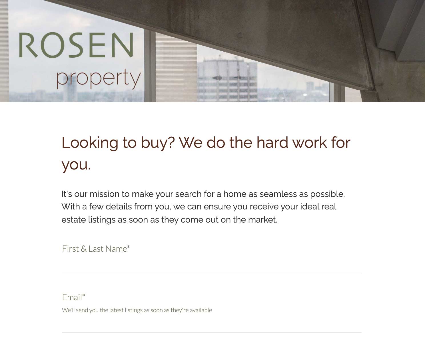
For Rosen property, all the elements within the form align with their brand and make sure the first interaction a user gets is a testament to its brand’s values.
They have kept their typography, graphics, and colors in line with the rest of their website, making people feel connected to the brand when filling in the form. It’s as simple as that. It’s not obtrusive or overwhelming but keeps everything easy to use.
3. Make It Fun for Your Target Audience
Can you recall a time you enjoyed filling out a form? Probably not, and that’s OK.
Generally, people don’t find forms attractive. There’s usually not much you can do to resolve this issue without overcomplicating the process and losing leads.
But you can approach this another way. Don’t make your forms look like forms.
This may sound counterintuitive, but using nonstandard UI elements, such as large clickable images and toggle sliders, makes the form more fun and interactive. With such an abundance of online content, the more engaging and exciting your content, the more interaction and conversions you’ll receive.
4. Use a Compelling Headline and Description

Compelling headlines and descriptions trigger people to take the extra step and fill up a form.
Remember, while 8 out of 10 people will read a headline, only two of those people will proceed with the entirety of your content. If your headline doesn’t pique their interest, you’ll lose them.
Tips on using headlines and descriptions:
- Create an emotional connection: Emotional headlines are more effective. They create curiosity, thrill, joy—and more.
- Be clear and concise: Use keywords and be as descriptive as possible.
- Include a CTA: Encourage visitors to take an actionable step. And make it easy for them by placing your CTA button at an identifiable location.
- Use persuasive language: Choose words wisely. Words like “you” and “we” are conversational and personal. Meanwhile, “now,” “book,” “call us,” and “download” stimulate action.
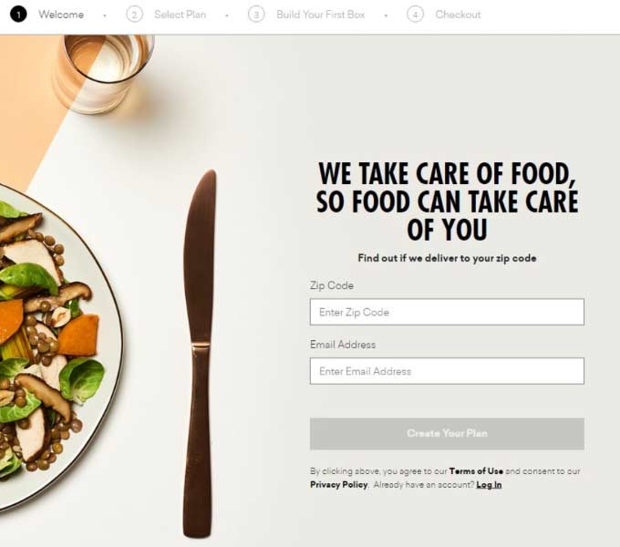
Daily Harvest, a company that distributes nutritious and easy-to-eat fruit and vegetables, features an exemplary form with a compelling headline and description.
“We take care of food, so food can take care of you” is an attention-stealer. A bonus is, on top of this powerful web copy, the form is in a dedicated landing page to eliminate distractions.
5. Place the Form “Above the Fold”

Everything we do on a landing page is to increase engagement, right? And a simple way to increase engagement is to optimize the above-the-fold area.
The reasoning for this is that elements in this real estate get maximum exposure. If your lead generation form is one of the first things your visitors see, it increases their likelihood of filling it up.
The Nielsen Group conducted a study on this. And the result, indeed, corroborates how engaged time peaks in this area. Regardless of screen size, the average difference in how users treat information placed in the above-the-fold section versus information in the below-the-fold section is a whopping 84%.
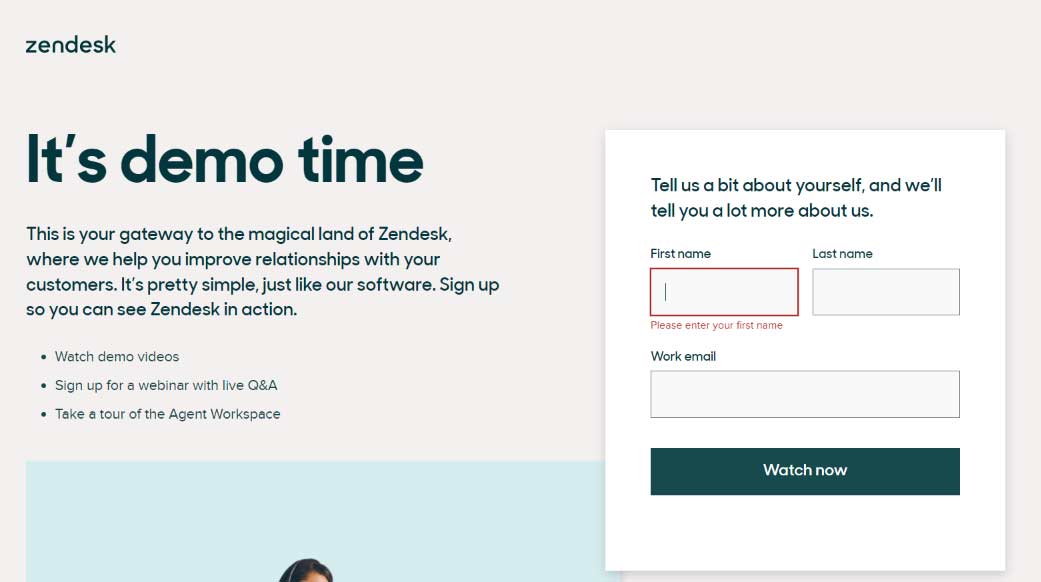
To see an example, check out what Zendesk, a company that provides customer service software and sales tools, has in store for you. The moment you arrive on one of its landing pages is the same moment a form greets you—asking for your first and last names and work email.
Inarguably, the form’s strategic placement is impressive. Aside from letting visitors see the form easily and clearly, it also features no other clickable elements on the above-the-fold section. This results in a distraction-free environment.
And from there, visitors don’t have much choice but get reeled in by what Zendesk has to offer. In this case, their only options are down to exiting the website or clicking the CTA button (Watch Now).
6. Automate Your Sales Funnel to Improve the Capture Process
In this digital age, many automation tools can help you improve your lead capture strategy as part of your sales funnel. These tools are cost-effective, and some are even free to use.
Without a doubt, using these tools will take a load off your shoulders and accelerate how you capture leads. They can also minimize human errors and collect more accurate data on your behalf.
Remember, though, not to leave everything up to automation. Learn to handle some components, too. If not, your lead generation form will be impersonal and robotic.
Tips on using automation:
- Analyze data: Go through form data and identify important variables. Note things like completion rate and the time it takes for people to complete your form.
- Use spreadsheets: Organize and compile the information your leads provided in a spreadsheet for easy use.
- Follow up: Get back with the prospects you attracted. And automate follow-up email campaigns.
- Collaborate with sales: Automate the sending of information to sales reps if necessary. And use sales enablement.
Recommended Automation Tools
Form Builder Software
Using a no-code form builder, like Paperform, is the easiest way to collect feedback, gather data, and get real insights from your customers, clients, colleagues, or anyone else whose opinions you value. You can also integrate Paperform with over 3,000 tools like Trello, Squarespace, Webflow, and Asana.
Nurture Mailing List Subscribers
When you do acquire a new lead, getting them into the proper email marketing channel is critical. Tools like Moosend or Mailchimp can help you send newsletters, welcome sequences, and automated email responses at the right time.
Integrate Your CRM With Your Form
The goal here is to remove the need for your sales team to manually review your list of leads frequently. Instead, purchase-ready leads are automatically identified by your automated CRM system. Using CRM systems like HubSpot’s free marketing tools or Zoho’s CRM can save your team hours of work and be able to get in touch with qualified leads at precisely the right moment.
Ready to Create Better Forms?
Lead generation forms are not just a means to an end.
They’re crucial in converting casual visitors into leads. And this relies on them trusting and liking you.
We all want our customers to choose us over our competitors, and a well-designed lead generation form could do just that.
While all of the above are best practices in general terms when creating lead capture forms, it’s important to remember that they might not be suitable for you. You need to test your lead generation to see whether it resonates with your audience when having a form. If your site’s landing page elements do not resonate with your audience, you’re losing conversions.
Before we end this blog, here’s a quick recap of the seven steps:
- Segment leads
- Incorporate brand values and personality
- Automate the lead capture process
- Make them fun!
- Place them above the fold
- Use a compelling headline and description
With all these best practices and tips mentioned above, and the help of a customizable form builder, you can create a form that wows your audience. You’re now equipped with the best practices. Go and create your form!


