The 10 Best Examples of Manufacturing & Industrial Website Design in 2022
Most businesses in the manufacturing space have only recently turned to digital marketing to generate sales opportunities. For decades, manufacturers and distributors relied on traditional forms of sales and marketing, including print ads in trade publications, trade shows, conferences, and sales promotions.
During the first decade of the 21st century, most manufacturing businesses viewed their websites as necessary to have, but not as a critical piece of the puzzle in building their sales pipelines. For the most part, industrial corporations simply built websites that mimicked their existing printed collateral in a digital format.
However, as the world moved online during the COVID-19 pandemic, manufacturers drastically accelerated their adoption of digital marketing. With this shift came the realization that a sophisticated, well-designed website is of paramount importance to getting ahead and staying competitive.
But what makes great manufacturing and industrial website design in 2022? We have put together 10 examples of great websites in the manufacturing, industrial, and distribution spaces, and we will discuss what makes each website so successful.
As you read, please keep in mind that we are viewing these sites from a desktop perspective as opposed to a mobile interface. This is because a large majority of business-to-business (B2B) website visitors view these sites on a desktop and so they are designed with those customers in mind. Let’s dive in.
1. Atlantic Equipment Engineers
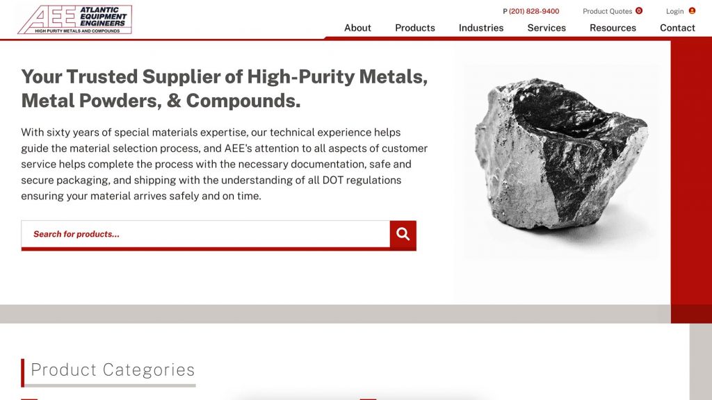
Atlantic Equipment Engineers has been providing metal powders and compounds for industrial applications for over 60 years. The company got its start providing products to NASA. More recently, the tech sector—with its ongoing and increasing need for high purity compounds—has been the biggest driver of Atlantic’s growth.
Atlantic’s homepage greets users with a prominent search box. When a user begins typing in the name of a product (e.g., “titanium”), the search automatically provides suggestions. In this way, the large search box field not only captures the user’s attention to begin their journey but also acts as their guide as they move through the website. This works well because in many cases, prospective customers landing on Atlantic’s page will already have a fairly clear idea of what they are looking for.
Once they have clicked through to a product detail page, the user can easily view cost per amount and request a quote using a modified version of a traditional checkout page.
2. CAST Lighting
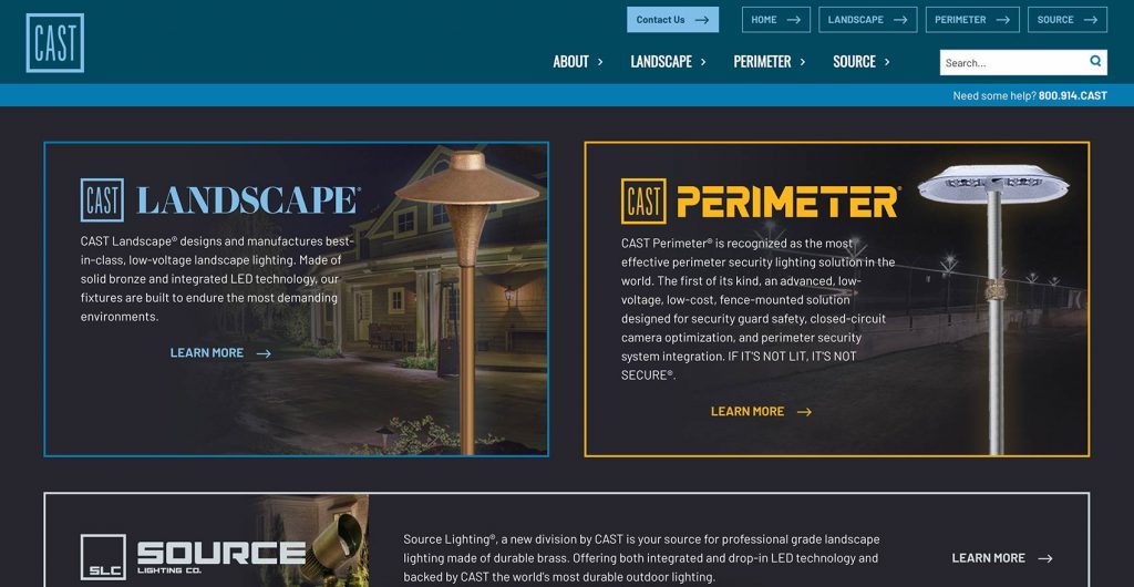
CAST Lighting is a manufacturer of landscape lighting and commercial security lighting products. CAST’s unique selling point is that its solid bronze castings are extremely durable compared with its competitors’ products.
CAST’s homepage clearly showcases its three distinct brands: Landscape, Perimeter, and Source. This allows users to quickly find what they are looking for. Once they have selected a product line, the user can easily switch to view a different one by clicking the appropriate button in the top right.
The products section of CAST’s site features detailed filtering options, allowing users to filter by lighting type (path lights, directional lights, etc.) or by style. Once a user lands on a product page, they can not only view the product on a clean white background but also see images depicting the product in situ in the type of environment where it will be utilized.
Depending on the section, the user is then able to purchase the item directly, locate a distributor in their area, or contact CAST for more information.
3. Hockmeyer
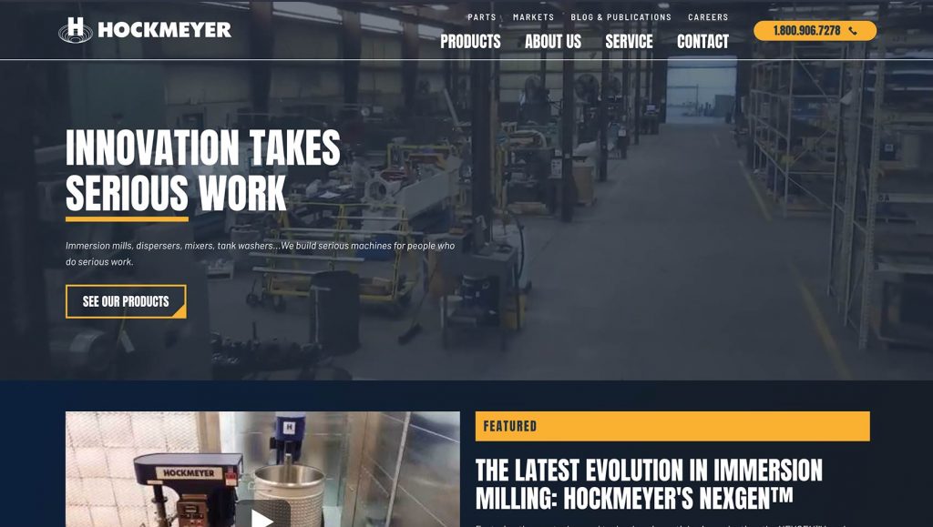
Hockmeyer is one of the largest, oldest, and best manufacturers of wet milling equipment in the United States. The company’s machines are used by some of the biggest paint brands, including Sherwin-Williams and Benjamin Moore.
The Hockmeyer site is easy to navigate and distills key information into an easily digestible format. The “Products” dropdown menu reveals the company’s seven major machine categories, allowing users to easily select the most appropriate area of interest.
Once the user has clicked through to a product category, they can drill down into subcategories to find the exact product they need. Hockmeyer’s product pages not only provide detailed diagrams and images of its different machine models, but also offer downloadable spec sheets for deeper analysis.
4. Applechem

Applechem is a manufacturer of specialty ingredients used in cosmetics and personal care products. Though it is a small business, Applechem provides products to some of the largest international cosmetic manufacturers, such as Burt’s Bees and Milk.
The background video on Applechem’s homepage greets visitors with a showcase of the company’s clean and well-organized facilities, lending a sense of pride and professionalism to the organization.
Directly below, users can select a specific product to explore or contact the company to request a sample. Each of Applechem’s product pages provides an amplitude of information, including a list of product variations, a comprehensive list of features, diagrams comparing Applechem products with its competitors’, and downloadable product documents.
Furthermore, the Formulations section of the site provides chemists with a simple and useful way to peruse the ways that Applechem ingredients have been used in finished products.
5. DCI Signs & Awnings
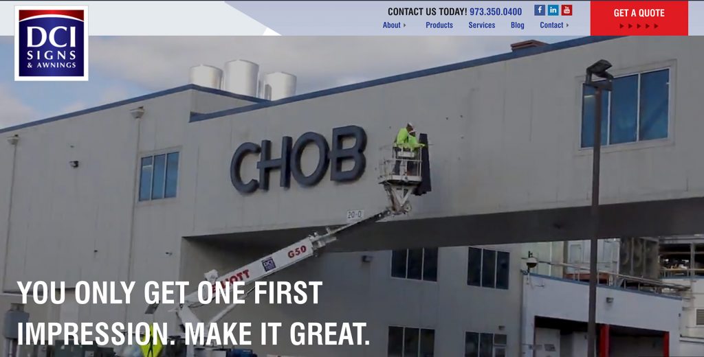
DCI, a nationally recognized custom outdoor sign company, has created signs for countless household name brands, including AMC, Santander, and American Eagle Outfitters.
DCI’s homepage declares, “You only get one first impression. Make it great.” With an enticing video highlighting some of the company’s best custom signs, this homepage does exactly that. It is easy for customers to navigate through to the relevant page for their industry or for the service they require.
DCI’s Spec Builder is an innovative and intuitive web app, allowing architects and engineers to build a custom canopy or sunshade. The simple nine-step interface with thousands of permutations allows users to quickly spec out a custom build and receive a quote.
6. AMARCO Products
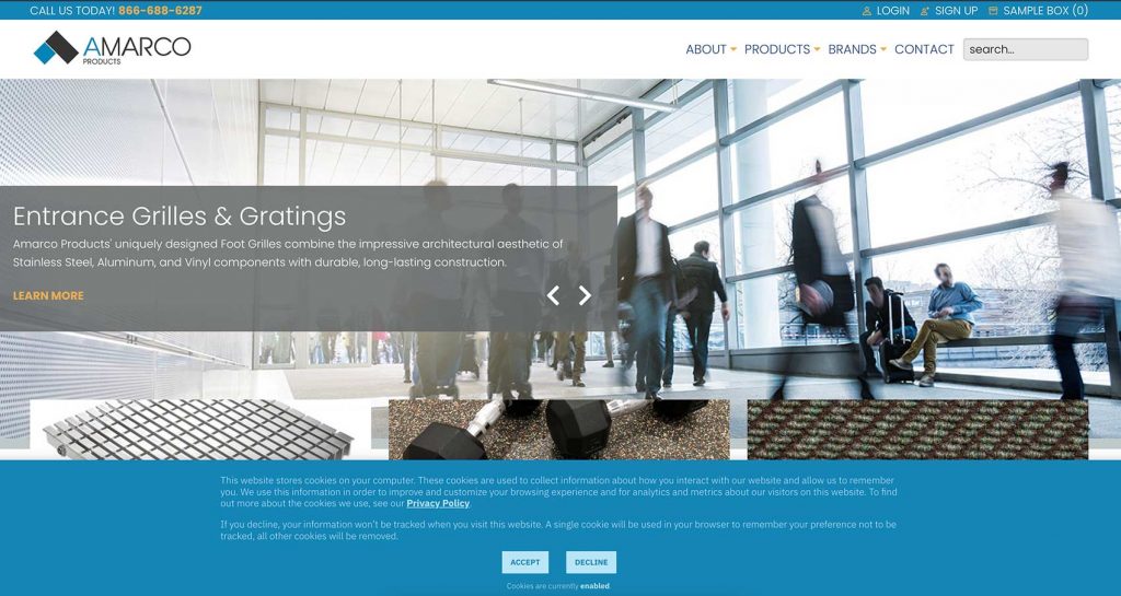
The American Mat and Rubber Company, or AMARCO, manufactures and supplies entrance matting and rubber sport flooring to commercial clients both in the United States and internationally. AMARCO’s audience is primarily made up of the architects, engineers, and interior designers creating the kinds of commercial spaces that we all use and visit every day.
AMARCO’s clean and easy-to-navigate website allows customers to quickly find the products they require via homepage directionals and product categories listed in the navigation bar. Though it is not an e-commerce site, customers are able to request sample products by adding appropriate samples to a shopping cart.
Each product page includes detailed specifications and a showcase of related items that may also meet the client’s needs.
7. First Continental International
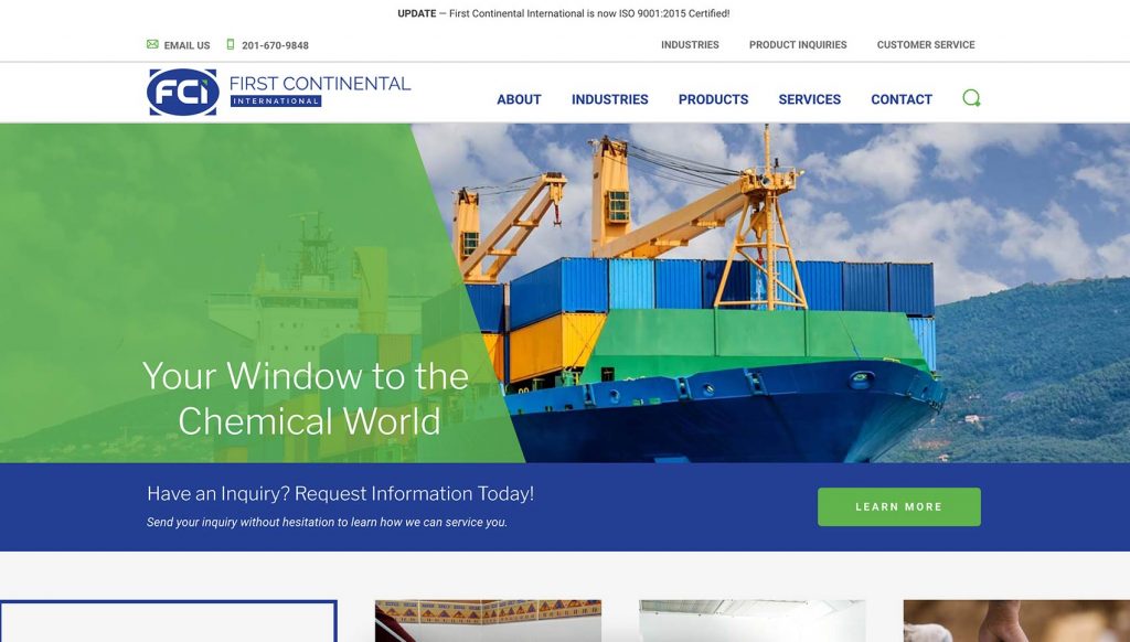
First Continental International (FCI) is a global chemical distributor that supplies raw chemical materials to both large, well-known brands and small to medium businesses.
FCI’s extensive product catalog can be easily browsed or searched via the “Products” tab and the search bar located on the homepage. There is also an “Industries” tab, allowing prospective customers to quickly find the products and services that are most relevant to their field.
Customers can search for products using different pieces of information. For example, each product page shows the Chemical Abstracts Service (CAS) registry number, the European Inventory of Existing Commercial Chemical Substances (EINECS) number, and various synonyms by which the product may be known.
Since many of FCI’s products are highly regulated, customers cannot purchase directly from the website. Instead, they can click through from the homepage or any individual product page to the “Product Enquiries” page and request more information and a quote.
8. L&R Ultrasonics
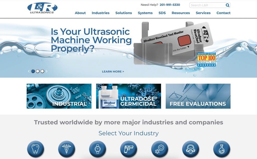
L&R Ultrasonics is a manufacturer of ultrasonic cleaning systems, solutions, and accessories made in the U.S. L&R’s clients include businesses and organizations in fields such as medical and dental, scientific and laboratory, watches and jewelry, and firearms.
It is easy for website visitors to sort L&R products by industry, allowing them to quickly find the most appropriate products for their needs. The specifications on each product page are laid out clearly, with useful downloadable resources for customers looking for more information.
L&R’s website utilizes a minimalist color palette based on its brand colors of blue and white, and clear directionals in the homepage and in the navigation bar allow clients to find the right page with ease.
9. ZAGO
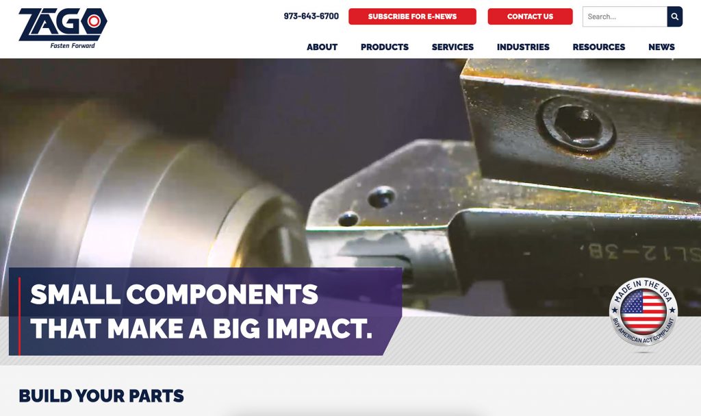
ZAGO is a manufacturer of sealing screws made in the U.S. This award-winning family-owned business has grown to become one of the world’s most respected producers of clean, green, and high-tech sealing solutions, supplying products to clients in industries including automotive, medicine, robotics, electronics, and many more.
With a large product catalog, it is imperative that customers be able to find what they are looking for quickly and easily. ZAGO’s website divides products by categories, subcategories, sub-subcategories, etc., allowing visitors to zero in on exactly what they need.
Site users can use ZAGO’s “build your part” function to specify the exact thread type, size, and length they require. The user then simply enters their contact information, submits the request, and receives a detailed quote within 24 hours.
10. Rheogistics
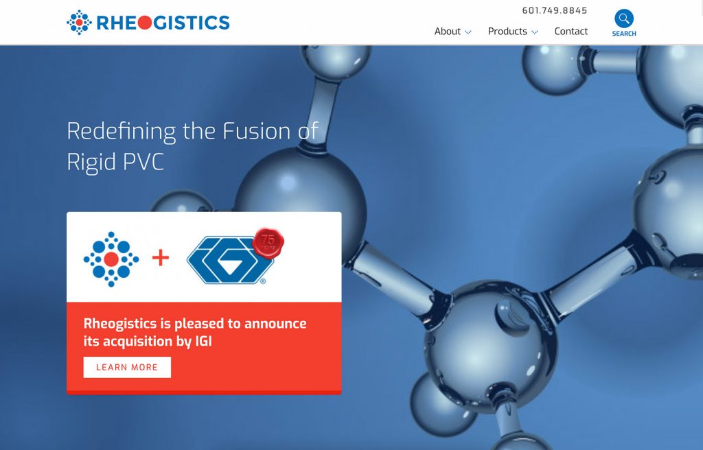
Rheogistics is a manufacturer and supplier of paraffin waxes, lubricants, and mechanical stabilizers to the rigid PVC industry.
Rheogistics’ website features a clean design built around its red and blue color scheme. Product pages showcase the various product options available, and downloadable datasheets offer customers additional information. When prospective clients are ready to buy, they can simply click “Contact Rheogistics” from any page and go straight to the contact form to start the process.
Looking for a Great Manufacturing or Industrial Website?
Here at Lform Design, we have over 15 years’ experience creating sophisticated, functional websites for clients in the manufacturing and industrial spaces. With a robust understanding of the challenges faced by B2B businesses and the best practices that drive results, we are well placed to help you bring your website to life.
Need help making your B2B website the best it can be? Contact Lform today and one of our team members will be in touch for a no-obligation chat about your needs and how we can help.


