
9 Copywriting Mistakes That Plummet Conversion Rates
It doesn’t matter how strong your product is–if your conversion rates are poor, you’re just not going to make money online.
Obviously, you want high conversion rates on all your key landing pages. But those rates are impacted by numerous factors. For instance, we can see that conversion rates change from one industry to another:
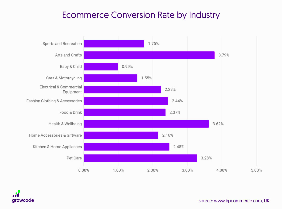
Source: “12 Ecommerce Conversion Rate Statistics (Updated January 2021)” | growcode.com
Not just that, but they also vary by location:
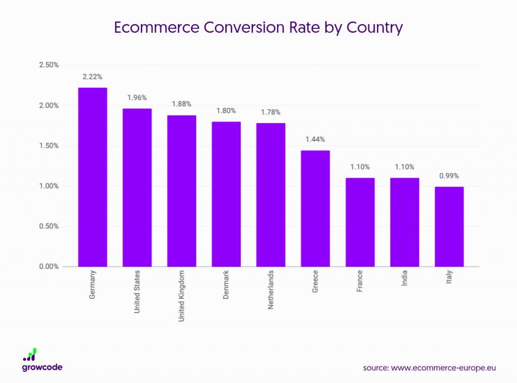
Source: “12 Ecommerce Conversion Rate Statistics (Updated January 2021)” | growcode.com
And that’s just within the e-commerce space!
Clearly, there are multiple factors that will impact the conversion rates you’re likely to achieve, some of which are largely out of your hands. So the last thing you want is to damage your chances of converting at a decent rate by making any of the following copywriting mistakes.
Mistake #1: Ignoring Your Value Proposition
Whatever your business does, there must be something you do better than anyone else. Maybe your product costs less than your rivals. Maybe your turnaround times are faster. Or maybe you have a unique process or tech stack that helps you deliver better results.
Either way, one of the biggest copywriting mistakes you can make is to overlook those core business strengths.
Of course, the first step here is to define exactly what sets you apart from the competition. To figure that out, you need to dig into your audience, asking questions like:
- Where are they located?
- What pain points are they facing?
- What are their short and long-term goals?
- Are they aware that solutions like yours exist?
- What language resonates with them?
- What’s their financial situation?
Once you’ve answered those questions, you should have a clearer picture of what your potential customers want to hear, which will help you craft high-converting copy.
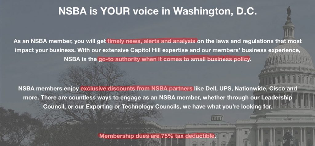
One organization that’s clearly done its homework is the National Small Business Association. Take a look at its signup landing page and you’ll see a bunch of key points likely to resonate with its target audience:
Mistake #2: Assuming Shorter Is Better
There’s lots of research out there that suggests our attention spans are getting shorter.
Unfortunately, as marketers, this can lead us to draw inaccurate conclusions that result in copywriting mistakes.
You might assume that in a world of limited attention spans, concise copy and shorter landing pages will drive the best results. But this isn’t always the case.
For example, heat-mapping and A/B testing software company Crazy Egg tested two different versions of its homepage–one was the original, and the other was a longer variant. As you can see, the challenger page was approximately 20 times longer than the original:
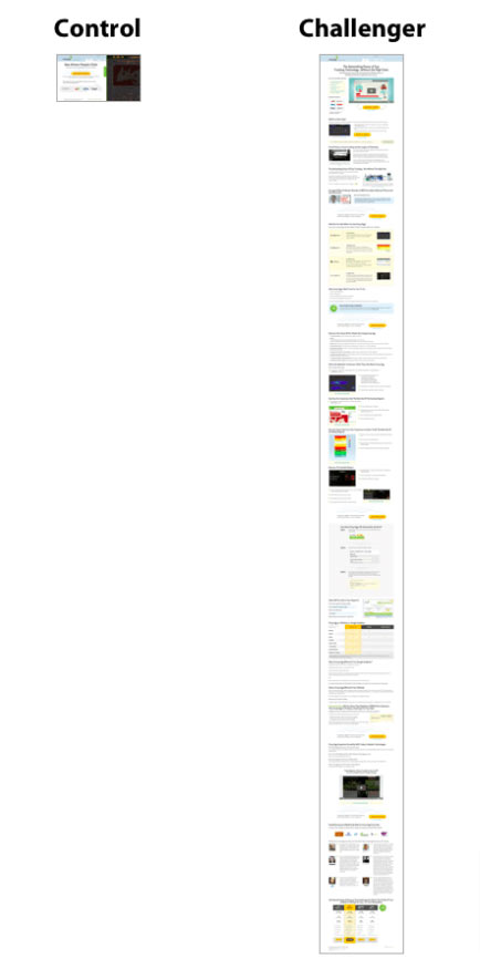
Common sense suggests the shorter page would drive stronger results. After all, who’s going to make it all the way to the end of that super-long variant?
Yet the exact opposite turned out to be true! The longer page actually outperformed the original by 30%.
What does this tell us?
Firstly, we shouldn’t use gut instinct to make key web design and copywriting decisions. Instead, we should rely on real-world data.
And secondly, shorter pages aren’t necessarily better. Sure, if you’re selling a simple product, you don’t need to write hundreds of words of copy to explain it–that’s overkill. But for more complex services, it absolutely makes sense to take an in-depth approach.
Mistake #3: Failing to Map the User Journey
A lot of brands view email marketing as a numbers game. They might think: “The more we send, the better the results.” Or: “Once we find the email frequency that delivers good results, we’ll stick with it no matter what.”
But this approach gives no thought to what your users actually want, and it doesn’t consider how your goals might change over time, or from one campaign to another.
The upshot of this is that we end up with a lot of email campaigns that start by arbitrarily choosing to send X number of emails, and only then deciding what those emails should actually say.
If that’s how you approach email marketing, stop right now and start doing the exact opposite!
Before doing anything else, you need to plot out the user journey. Figure out what (if anything) the audience knows about your product right now, then identify all the information you want to communicate to them through the campaign that would drive them to convert.
Another key point here: each email should have its own unique purpose. Therefore, once you’ve worked out all those individual “purposes”, you’ll know how many emails should be in your campaign. For instance:
- Purpose 1: Announce your new product launch
- Purpose 2: Clearly explain the unique selling points of your new product
- Purpose 3: Explain the use cases of your new product
- Purpose 4: Share testimonials from your existing customers
- Purpose 5: Persuade your audience to book a product demo
Hey presto, there’s the roadmap for a five-step email sequence!
Mistake #4: Stifling Your Copy Through Poor Design
Technically, this is less a copywriting mistake and more a design mistake, but it’s still worth referencing here.
When you’ve written a bunch of persuasive copy, you want it to be presented in an impactful manner. But some design layouts just don’t do this effectively.
For instance, multi-column landing pages often act to hide information, especially when you have multiple columns of text standing side by side. This replicates the aesthetic of a newspaper–and people are used to flicking through newspapers to pick out the detail they want to see. That makes it all too easy to ignore key details of your product.
Instead, try to stick with a single-column layout, with a logical progression from one point to the next. This makes it obvious that you expect your audience to read the whole thing, rather than cherry-picking information.
Mistake #5: Poorly Positioning Discounts & Promos
As consumers, we’re not often prepared to scrutinize the numbers presented to us in discounts and special offers.
What do I mean?
Well, in a classic study published in the Journal of Marketing, participants were asked to identify which of these two deals is better:
- Deal 1: 33% extra free
- Deal 2: 33% off the regular price
According to the participants, those two deals offer more or less the same value. But actually, a 33% pricing discount is equivalent to getting 50% extra free!
Copywriters should use this to their advantage, as writer Derek Thompson explains in The Atlantic:
“Getting something extra ‘for free’ feels better than getting the same for less. The applications of this simple fact are huge. Selling cereal? Don’t talk about the discount. Talk how much bigger the box is! Selling a car? Skip the MPG conversion. Talk about all the extra miles.”
Mistake #6: Forgetting to Drive Action
The whole purpose of your landing pages is to drive sales or leads. You’re not just building them for the fun of it.
That means each and every page needs to drive a clear action–and that action should be simple for the user to understand. Don’t make them guess!
Sure, this might sound like an obvious point, but I see so many instances of brands failing to get it right. They’ve built beautifully designed landing pages with excellent copy, but they stumble at the last hurdle by failing to include a clear call to action (CTA).
Personal injury lawyers Attorney Brian White & Associates show how simple it can be to avoid this common copywriting mistake:
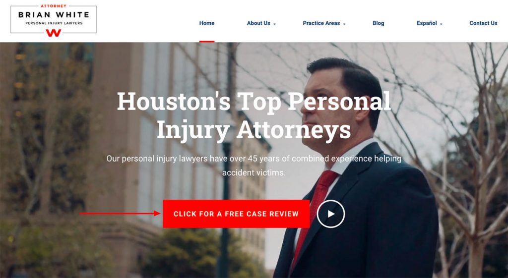
Right there at the top of the homepage, beneath the headline and a sentence explaining the firm’s value, you can see a big, bold CTA. It’s immediately obvious what my next move should be.
If I land on that page and I’m looking for a personal injury lawyer, there’s a good chance I’ll hit that button and request my case review. If not, I’m likely in the wrong place anyway.
Another good example would be Business Insurance USA—since insurance tends to be an expensive service, their ‘Get My Quote’ button is the perfect action driver. Not many site visitors are willing to spend thousands on insurance after visiting a page for the first time but once they get their free quote, they have entered the sales funnel and are more likely to buy in the future.
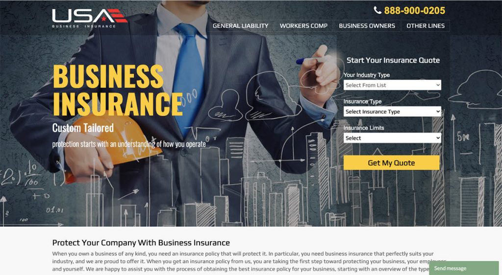
You could aid conversions by adding a live chat plugin to your landing page if you can afford to have someone constantly manning the incoming questions and requests. If you cannot, you could even consider adding an AI live chat option.
Mistake #7: Never Trying Anything New
You might be happy with your conversion rates. But how do you know if they’re as good as they could be?
Industry benchmarking will only get you so far. At some point you have to be prepared to take a few risks to see how much further you can push things.
I’m not suggesting you need to rip up the rulebook. Your brand and audience will stay the same, and so will the fundamental features and benefits of your product. But that still leaves you with plenty of room for experimentation. For instance, try:
- Targeting new audience segments: Is your product aimed at small marketing agencies? Segment it further into small B2C-focused agencies, B2B-focused agencies, or maybe agencies that focus on clients in a specific sector, like fashion or SaaS. That gives you an opportunity to switch things up and personalize your messaging.
- Varying your tone and style: Do you always write in short, punchy, one-sentence paragraphs? Try longer, more descriptive blocks of text, interspersed with imagery and bullet points to break things up.
- Pushing different selling points: Have you always promoted your product on the amount of time it saves your customers? Instead, try talking about the financial benefits of saving all that time. Or highlight a different feature, like how it improves collaboration.
Mistake #8: Believing What Works for Other People Will Work for You
It’s easy to assume that big brands know what they’re doing, and that by replicating their approach, you can drive your conversion rates through the roof.
Unfortunately, marketing is rarely that simple!
Those big brands are often successful now because people already know who they are. They’ve put in the hard yards before, and now they’ve become household names, which gives them a huge amount of freedom in their marketing.
For instance, take a look at Twitter’s signup landing page:
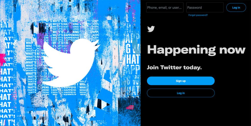
That works well with social media giants like Twitter or Instagram because everyone’s heard of them. But it’d likely deliver pretty terrible results for you, because it doesn’t offer any further information about the product or why people should sign up.
By all means, use big brands for inspiration. But don’t expect to copy what they’re doing and immediately see fantastic results. Instead consider taking a few minutes to spread brand awareness- hire influencers, create a more detailed landing page, promote your content/ products on social media, and create a marketing plan that is crafted with your company in mind.
Mistake #9: Telling, Not Showing
Ever heard the phrase “show me, don’t tell me”? Often attributed to the Russian playwright Anton Chekhov, it’s a concept that speaks to the importance of helping your reader experience what you’re telling them through words and actions, rather than simply describing it to them.
That’s all well and good, but how does it help us avoid making copywriting mistakes?
I’ll explain. Too many brands make bold claims that they never substantiate. They might describe themselves as being “number one” in their market, or insist they offer the “best” customer service.
Those are all empty, meaningless sentiments–unless you can back them up.
Doing this doesn’t need to be complicated. You don’t need to be a legendary Russian playwright; you just need to provide clear evidence that the things you’re saying are true.
For instance, Rosenbaum & Rosenbaum claims to offer skilled legal representation in personal injury cases. Importantly, after making that claim, the firm demonstrates its credentials through examples of the results it’s achieved for recent clients:
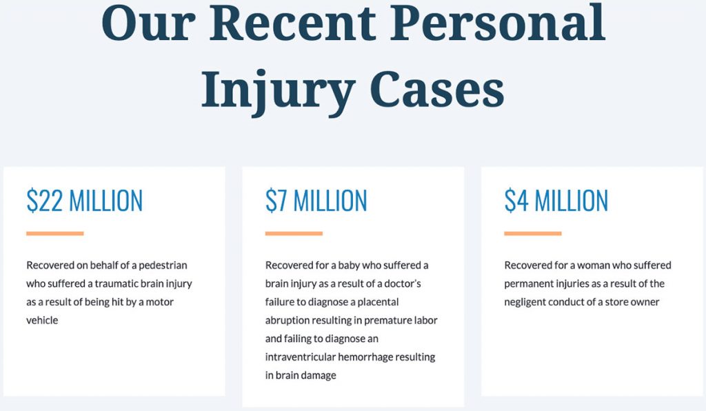
Do this yourself by incorporating testimonials, case studies, and key statistics into your marketing copy to drive up conversion rates.
Wrapping It All Up
One thing cuts through every single one of these copywriting mistakes.
Have you fallen into the trap of believing shorter pages are automatically more effective than longer ones? That’s because you haven’t considered what would be best for your audience.
Have you overlooked the user journey? That means you’re ignoring your audience.
Have you “borrowed” a tactic used by another brand, only to discover it didn’t work for you? That’s because what appeals to their audience might not resonate with yours.
As with so many things in marketing, understanding your audience holds the key to writing more persuasive copy and improving your conversion rate.
So do yourself a favor–before you start planning another landing page or email sequence or social campaign, take the time to think about what your existing and future customers most want to see and hear from you.


