The Future of Web Design: 3 Ways Web Design is Moving Forward

Let’s begin at the beginning.
At the start of every year, like clockwork, you see everyone talking about trends that will dominate the year: fashion, decorating, politics, and, of course, web design trends. When it comes to latter, a lot of people focus on the small stuff like specific layouts or typographic styles. Others, like Pantone, make broader predictions—and in Pantone’s case, it’s about color. But movements in web design don’t happen quickly or even on a timed yearly basis each January. They take long, slow steps that occur over greater periods of time, and it’s really difficult to pinpoint them.
So let’s take a look at where web design is moving as a whole and make a few predictions of what we might see solidify in the next few years.
Before we can do that, however, you have to know where we currently are and have been. From the late 2000s to now, graphic design on the web has been about clean, utilitarian design. Websites have been mainly white-background affairs, simple in their elements, and easy on the eyes—or boring, depending on your viewpoint.
A lot of this was a reaction to responsive design. Because web design needed to fit multiple screens and viewpoints, from your 70-inch flat screen TV down to the smallest smartphone, it made a lot of sense. These simple designs scaled well with the simple development we could do. However a side effect of this was that all websites ended up looking very similar—so much so that people have mocked this transition.
Part of this movement wasn’t just due to technology limitation, though. The web from the 90s until the 2000s was a kind of wild west of crazy designs. This aesthetic was partly due to the newness of the web’s designers—many either amateurs or coming from print design—and the grunge look popular at the time.
As everything old becomes new again, the modern look of web design is taking notes from that 90s-era grunge and post-modernism, and applying it to our own current neo-modernism. And the results are looking pretty good…or in some cases pretty strange.
Brutalist Web Design
Because websites have been very clean and sterile for the past ten years, it’s no surprise that when the pendulum swings the other way things get a little weird.
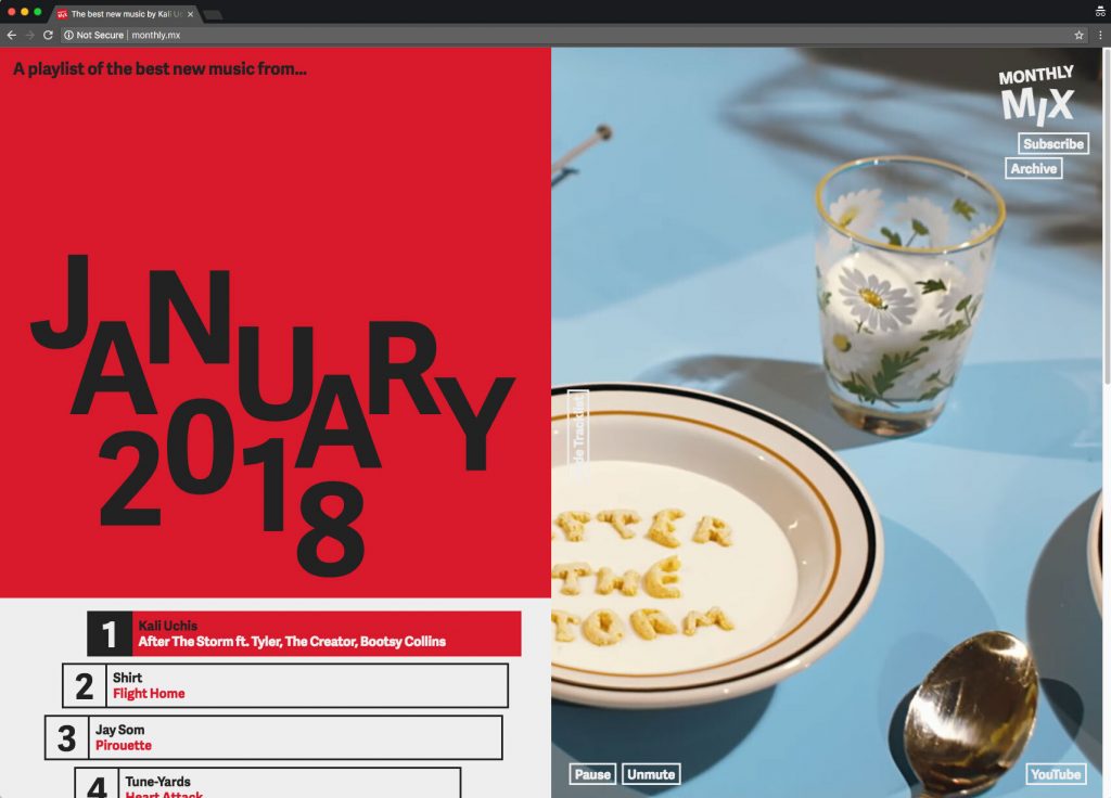
Brutalist web design is a direct reaction to simple user interfaces, sparse design, and trying to fit in. The designers practising this type of design aren’t unlike punk rock from the 1970s: a DIY, let’s throw the baby out with the bathwater movement. Complicated interfaces that are more like puzzles than traditional user interactions litter these sites. Typography is utilitarian in the extreme or down-right brutally garish. Emojis and images are used within lines of text.
While many of these sites are experimental and consumer-facing, there is a lot we can glean from them. Most notably, the new(ish) Bloomberg.com has taken a lot of these principles and implemented them into a usable news site. Strange gradients, text cropping into photos, and other tricks meld well. Some featured articles even play around with more hardcore elements of brutalism for editorial effect.
While you might want to stay away from this look and style there is a lot we can learn from this movement, picking and choosing what works and what doesn’t as we go.
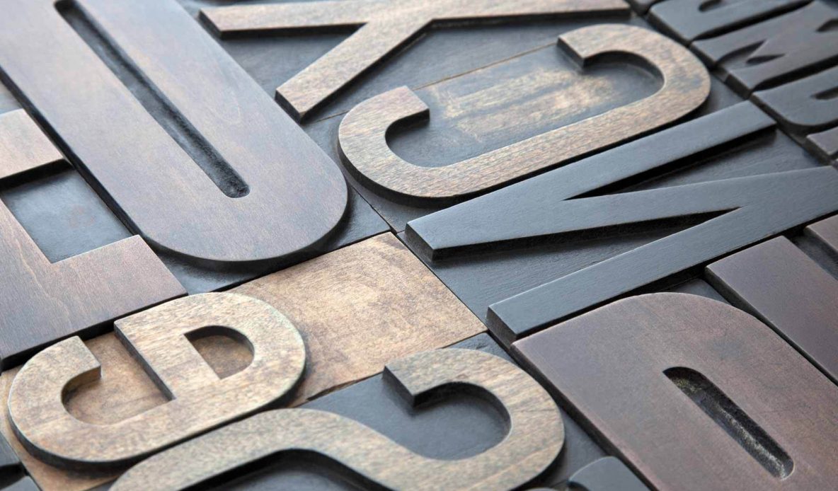
Swiss Typography Rises from the Grave
Ah, the Swiss. Our neutral friends in central Europe. While they may mostly be known for humanitarian conventions, army knives, and their Alps, they are also known for some of the most influential design philosophies in the last century.
Swiss typography set the tone for print design from about 1925 to the late 1960s, and much of the logo work that has been done through that time is with us today (ABC, Crate&Barrel, IBM, and many others are examples). A lot of Swiss design holds up to this day really well, it’s clean and timeless.
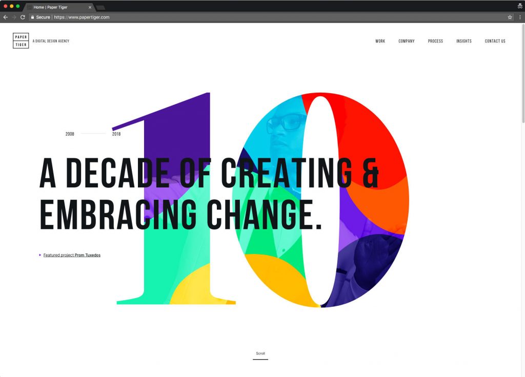
The style was notable for its clear headlines, bold and limited use of primary colors, and impactful imagery. This look, mixed with a dose of the 90s grunge style, forms an interesting blend that breaks free from the website typography today. This “New Wave Web Design” or “Punk Swiss Web Design” is a fresh look at how to communicate a message through bold, unorthodox typography.
The presentations of sites such as BullyingAndBehavior.com very carefully tell their stories with and expert use in typography. Even Nike’s Cortez 45th Anniversary site and adidas’ Speedfactory site have jumped on board this style of bold image and type. Both these brands have shown time and time again that they are a herald of things to come.
Photos That Speak One, Loud Word
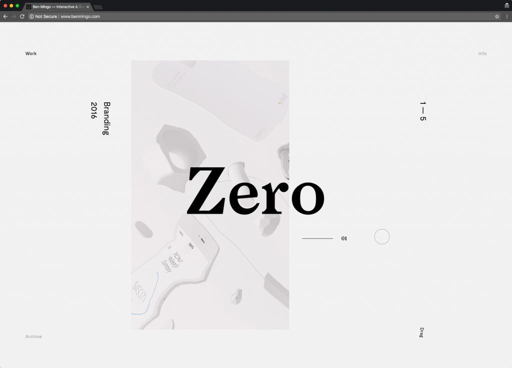
Photography is an important part of modern day websites. From a well-done bio shot on a company “About Us” page to the hero image greeting the user immediately on a homepage, the web is a visual place for visual creatures.
It’s not surprise that finding ways of making those images even more impactful. Overlays of color over black and white photography, interesting photographic layouts inspired by decades of editorial design, and the replication of print styles like offset printing are all ways people are experimenting with photography in web design.
These techniques call back to the time when photography was beginning to take over from illustration as the main way that advertising and print design communicated to their audience. Many of the best examples coming out recently take a lot of inspiration from editorial layouts, which, for decades, were the leader in experimental design.
Design for Your Market—And in Moderation
It’s been a theme in this blog that a lot of what’s fresh and new these last few years has deep historical roots. Whether it’s people totally throwing out the rules, making new ones, or just looking to stand out with creativity and charm, we’re anticipating the resurrection of old design rules to break and define new ones in 2018 and beyond.
While these new web design movements might not be useful to you as you refresh your own website—they may not fit the bill for your target audience and what you’re looking to accomplish—it is, however, generally useful to keep an eye on industry changes and influences. Taking what works for you and leaving what doesn’t can give you a swift advantage when someone is considering your products and services.
It’s also good to remember to be moderate with a lot of these styles. It’s easy to get stuck on the creative roller coaster and realize things have gotten out of your control, however by keeping an eye on major movements in web design, you can avoid missing the train ride entirely.