Lessons in Branding and Identity from the New York City Transit Authority

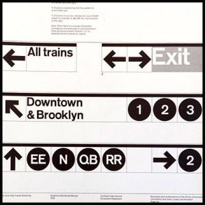 Recently unearthed by NYC designers Niko Skourtis, Jesse Reed, and Hamish Smyth, the New York City Transit Authority Graphics Standards Manual is a virtual master class in branding that transformed an urban transportation system into an international icon. With strictly enforced guidelines on everything from typeface to color, and diagrams showing exact positioning for signage, the guide written by famed graphic designer Massimo Vignelli of Unimark International stands as a testament to how forethought and hard work can lead to timeless, recognizable brand identities.
Black’s Law Dictionary defines brand identity as “The outward expression of a brand, including its name, trademark, communications, and visual appearance.”
The New York City subway systems’ outward expression before 1970 was a mélange of elements including mosaics, ornamental details, and serif and sans serif typefaces, with signs made from stone, terracotta and enamel. Efforts to unify the system started in the mid-1960’s, and culminated in the triumph of Helvetica, a clean, easy to read typeface that became ubiquitous and immediately identifiable with the Transit Authority.
How does this pertain to web design?
Effective online communication is about organization. End users need to be comfortable enough to peruse your site effortlessly.
You can apply the same sensibility as the Transit Authority to your website. Let the colors, typefaces and design elements reflect one cohesive voice that defines your company. The same way a wayward commuter feels more at ease when he spots a familiar sign for the “L train,” give your viewers a sense of familiarity.
Know Thyself
First things first: who are you? What defines your identity? A brand is more than just a logo and name.
An exercise that can help you determine the strength of your brand is to ask yourself, “If the logo was removed, would consumers still recognize my company?” Martin Lindstrom, a 2009 recipient of TIME Magazine’s “World’s 100 Most Influential People”, describes the instantly recognizable image of a glass Coca-Cola bottle. Even if it were smashed to pieces, the average consumer could identify it instantly. This is known as “smashable” branding. Does your brand stand up to the “smash” test?
Here are a few more questions to ask yourself in regards to your brand:
- If my brand was a tattoo, what would it look like?
- What celebrity best personifies my brand?
- If my brand was a person, what character traits would exemplify its personality?
Next Stop, Results
A successfully branded design is hard to achieve but easily recognizable. Consider the following:
Will the design help users achieve their goals?
In the case of the NYC subway system, the answer is easily quantifiable. The newly redesigned signs guide thousands of tourists and commuters daily to their correct destinations by providing clear guideposts.
Is your brands’ personality reflected in the design?
The Transit Authority is organized, clean, and optimized for ease of use. The simplicity of design belies the complexity of the organizational effort behind it. How will your brand’s personality shine through? By whittling down your company’s true corporate identity, you can clearly define your consumer base.