6 Common Web Design Mistakes Businesses Should Avoid
While a good restaurant is determined by its high-quality dishes, having a good ambience is also a key factor for success. The same measures of success apply to website design.
Your website is the face of your business, and your first impression is everything. Just like you would not want your restaurant to have a lousy ambience, you do not want your website to have any glaring web design mistakes.
Good web design is essential for businesses today. Not only does it create an excellent first impression, but it can also be a powerful marketing tool.
However, many businesses make common web design mistakes that can hurt their online presence and negatively impact their business. This article will outline six of the most common web design mistakes to avoid.
1. Using Generic Design Templates
Using a generic template is one of the most common mistakes businesses make when they design their websites. There are many pre-made templates available online, but using one of these will make your website look like everyone else’s. It’s like using stock photos all the time: sooner or later, someone will recognize the images on your website and call you out for it.
The template below, for instance, is free for download on the Shopify website. It’s also a very popular—and overused—template for different kinds of businesses. Using this template will result in your website looking like thousands of other business websites.
There are other issues that come with generic website templates. For instance, they are often poorly coded and can cause problems with your website’s loading speed and overall performance.
A custom website design will help you stand out from the competition and create a better impression with your visitors. If you wish to build a successful membership website, or any other type of website for that matter, you need to use a template that is uniquely yours.
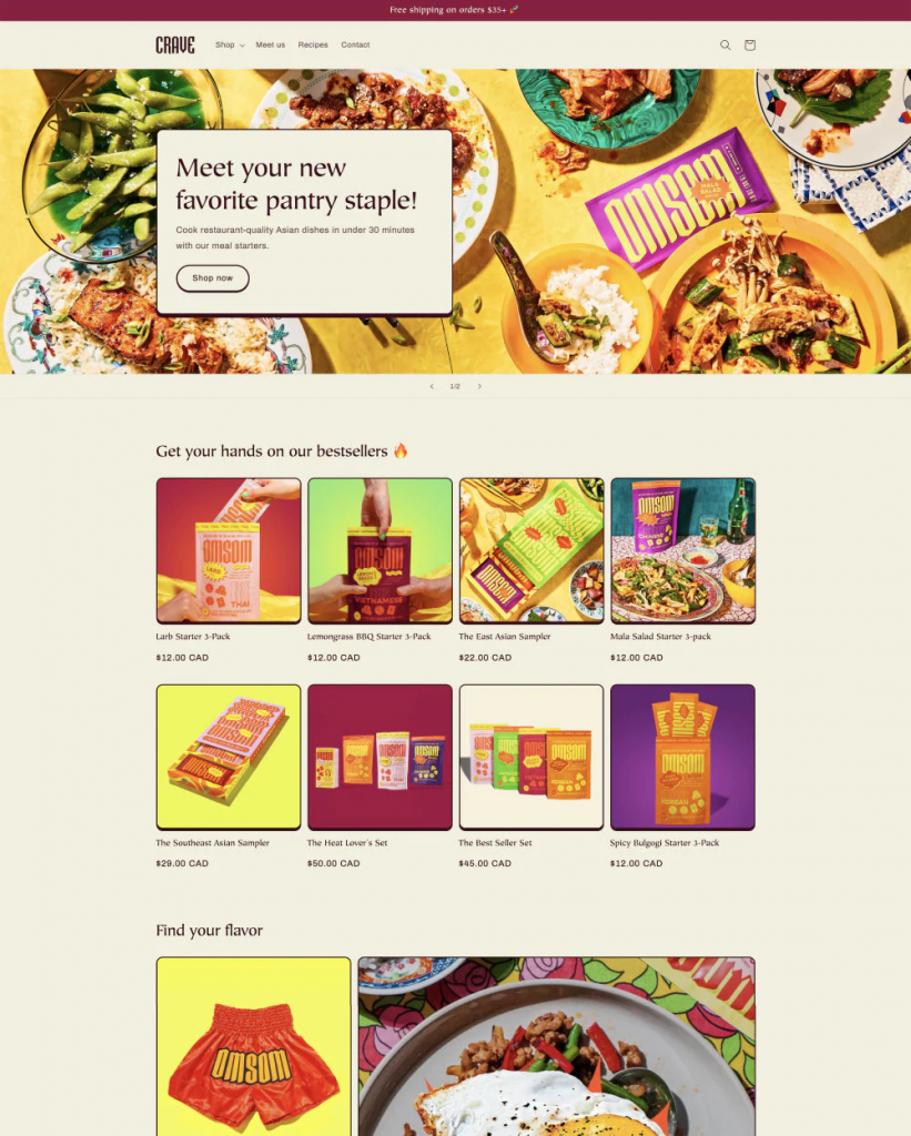
2. Creating an Overwhelming Homepage
Another common mistake is creating an overwhelming homepage. Your homepage should be simple and easy to navigate. Too much information or clutter will confuse your visitors and make it difficult for them to find what they are looking for.
Take a look at the homepage below. You will notice that it contains too much text, the search bar is not easily visible, and the visual elements are all over the place.
Keep your homepage clean and organized, and include only the most essential information. You can always add more pages with more detailed information if needed.
In addition, you can make use of white space, also known as negative space, which refers to areas on your website that you intentionally leave blank. It separates different website elements like text, images, and buttons and gives site visitors the space they need to relax their eyes. It will also highlight the most critical elements on your website.
When designing your website, be sure to use negative space to your advantage. Use it to break up your content and make it easier to read. Your users will thank you.
3. Offering a Disappointing User Experience
Your website’s user experience (UX) is how visitors interact with your site. Creating a positive UX is essential for keeping visitors on your site and ensuring they have a positive experience.
Many factors contribute to a good UX, but navigation is one of the most important. Your website should be easy to navigate, with clear and concise menus. If your visitors have to spend time trying to find what they are looking for, they will quickly leave your site.
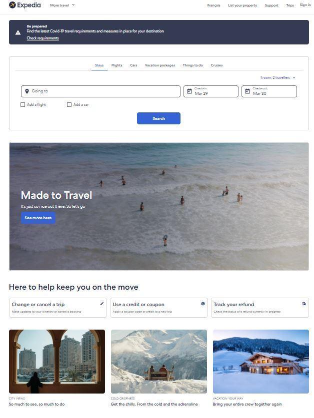
The Expedia homepage is a good example of web design that’s built around the user experience. You can see the search bar at the top of the page, along with the trip start and end fields. The search button is also easily visible. Even an untrained user can start booking trips with this user interface right away.
Another factor that contributes to user experience is website speed. A slow-loading website can be a major turn-off for visitors and cause them to leave your site before they even have a chance to see what you have to offer.
Here are some points to note about website speed:
- 47% of users expect a website to load in 2 seconds or less. If your website takes longer than that to load, you will likely lose those users.
- Page speed is also a ranking factor for search engines like Google. So, if your website is slow, you may be impacting your SEO without even realizing it.
There are many ways to improve website speed, including optimizing images, the smart use of website caching, and minifying code. Be sure to test your website’s speed and make necessary changes to ensure a positive user experience.
4. Neglecting Search Engine Optimization
One of the most common web design mistakes is neglecting search engine optimization. Search engine optimization (SEO) is the process of optimizing your website so it will rank higher in search results.
SEO is essential for getting your website seen by potential customers. If you don’t optimize your website for search engines with the right SEO components, it will be difficult for people to find you online.
To optimize your website for search engines, you need to include relevant keywords in your content and title tags. While using keywords, don’t use buzzwords, as they will not add any value to your website.
You should also use alt text for your images and make sure your website is mobile-friendly. In addition, you can use social media to promote your website and publish guest posts on relevant high-authority websites in your niche. Both approaches generate traffic to your website and improve your overall search ranking.
5. Not Optimizing for Mobile Devices
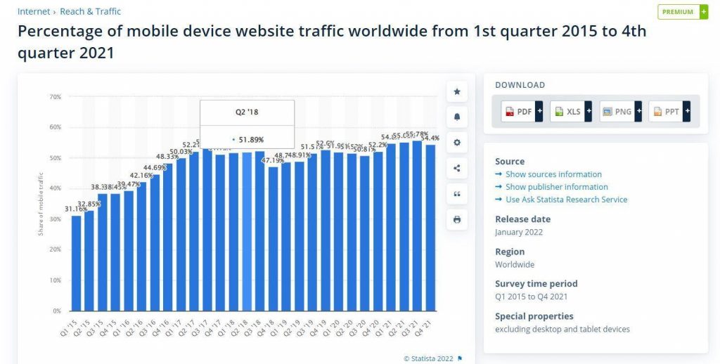
More people use mobile devices to surf the web than ever before in today’s world. In fact, according to Statista, approximately half of all website traffic worldwide is generated through mobile phones. Yet, many businesses still have not optimized their websites for mobile devices. This can be a costly mistake.
If your website is not optimized for mobile, it will likely harm your SEO ranking, as Google now uses mobile-first indexing. This means that Google will primarily use the mobile version of your website to determine your ranking, even if someone is searching on a desktop computer.
In addition, a non-responsive website can be frustrating for users and may cause them to leave your site. This results in losing customers and increases your bounce rate, further impacting your SEO ranking.
To avoid this mistake, be sure to design your website using responsive web design principles so it automatically adjusts to any screen size.
6. Unclear Call to Action
A clear call to action is essential for any website. Without one, you may be losing potential customers without even realizing it.
A call to action (CTA) tells the user what you want them to do. It is usually a button or link that says something like “submit” or “buy now.” It is vital to make your call to action stand out on your website, as it is the most critical element for converting visitors into customers.
Your call to action should be easy to see and use strong verbs that urge the user to take action. For example, “find out more” or “discover now” is much better than “click here.” In addition, the call-to-action button should be a different color from the rest of your website so that it stands out.

The Nomadic Matt website is a fine example of what not to do with your CTAs. The first issue is that the main CTA (“Search nomadicmatt.com”) is barely readable and the button doesn’t look like a button. The second issue is that there is more than one CTA—one leads to the site’s trip search feature and another allows you to subscribe to the email newsletter.
What the site owner could have done differently is to choose a brighter color for the main CTA. They also could have used a more inviting copy, such as “Start exploring!” to entice users to click on it.
Summary
If you want to build a successful website as a business owner, it is vital to avoid making the common web design mistakes outlined in this post.
Generic design templates, an overwhelming homepage, and a disappointing user experience are just some of the ways you can ruin your website’s chances of success.
You’re also limiting your potential customer base by neglecting search engine optimization and not optimizing for mobile devices. And finally, if your call to action isn’t clear or compelling enough, people may not take the action you want them to take on your site.
I hope this article has been helpful and has provided you with some valuable insights into creating an effective website that drives results.
About Baidhurya Mani

Baidhurya Mani is the founder of SellCoursesOnline.com. He regularly shares tips, tools, and strategies to help creators and entrepreneurs build a successful online course business.